
Ah, it’s spring…time to clean out that house so you can bring more stuff into it…time for people to trade each other’s junk via garage sales. It’s time to drive around squinting and nearly killing everyone on the road while trying to read the tiny, light, thin scrawling on a sad poster board that’s flapping in the wind….
Oh, honey. You don’t have to die this way.
So time for the public service announcement: if you’re throwing a yard sale, be kind and use your mind. People driving by are supposed to keep their eyes on the road as much as possible. Your job is to make that sign as succinct and legible as possible, so that a glance or maybe two – not scrutiny – is all it takes to get folks to turn that wheel – safely.
I understand there are store-bought garage sale signs but you still have to fill out the day/time and the address on those – and a lot of folks rush it and it’s awful. Still, many choose to make their own, because the pre-made signs are small, but not cheap.
There are several factors that go into a winning yard sale sign:
- Substrate (the sign itself) size
- Substrate strength
- Contrast between lettering and background
- Lettering/type/font height
- Type thickness
- Type clarity
- Content pertinence/relevance
I’ve seen little flaps off cardboard boxes with ballpoint pen scrawled on them, taped to a signpost before. I don’t know what they said, because I wasn’t willing to park my car, walk over to it, and use my Dick Tracy decoder ring to figure out what was written. I can’t be alone in that.
It’s best to consult your local ordinances before planning your signs!
Some cities have ordinances that you cannot affix signs to telephone poles or street sign poles (mostly because people are lazy and forget to remove them when the event is over – don’t be that guy). In that case, you may have to prop your signs up on something, and you’ll have to be prepared for that before the time comes for your sale. You could go to the office supply or hardware store and get one of those wire-frame sign holders like realtors use, but you can achieve the result cheaper with a simple cardboard box with some bricks or stones inside so it stays put – roll some duct tape backward over itself in a loop and firmly attach the back of the sign’s corners to the outside of the box – and this is great for two- or even four-sided signs as well. Ideally, you’re posting at or near one or more intersections, so you want people to know about your sale no matter what direction they’re traveling. Also know that cities may require that your sign be back from the intersection a given distance, which could increase the number of signs necessary. Some municipalities even limit the number of sales you can have a year without having to obtain a permit or even a business license, so make this sale count! Some cities are even more restrictive, and some less. Do your homework and avoid pesky charges for breaking ordinances.
I’ll describe how to make the signs (and why to do it that way) first, but if you need a visual while you’re reading, scroll down a little bit and you’ll see that I provided you some examples to illustrate what I mean. Pay attention to the following CONSIDERATIONS:
AUDIENCE: Keep in mind that drivers are already busy going somewhere, and you need to make it as easy as possible for them to spontaneously come to you. Also remember that many people have impaired vision – some of them don’t even know it. They still have money, though, and they just might want to buy your stuff – if they can see your sign.
SIZE: Even on a two-lane road, your sign needs to be at least 22”x28”, in order to allow enough room for letters large enough to be legible while driving from any direction. This is a standard size for both neon poster board and for foam core, which you will want to glue your neon poster board to for strength, if you’re not already going to stick it firmly to a box. Unless you can find neon foam core, you’ll have to combine them this way. On windy days, flimsy poster board alone will flap and fold, and possibly even blow away. That won’t help you (or those trying to find you) at all. If there’s going to be precipitation, you ought to re-schedule your sale, because even if you protect your signs (and your merchandise), your possible customers will likely not want to get out and shop in the rain, no matter how good your deals are. If inclement weather forces a reschedule, update any of your online/newspaper ads if at all possible.
COLORS: Neon poster boards are not necessarily a bad thing. It’s just that some colors lend more visibility than others. Your hot pinks, reds, and neon oranges and blues are in the middle of the value scale (to read about value, check out this post and scroll almost half way down to the heading “Value and Intensity – In Theory“). Reds, blues and purples are the worst for this. Don’t even think about black with white lettering – it’s a black hole no one will see. Also do not do happy little colors on a white or colored background; there’s not enough contrast. If the background is in the middle value range – not really light and not really dark – there’s nothing that you can write on it with that will really stand out in contrast. Electric yellow is the lightest, most visible and highest-contrast background you can get, with bold black ink writing on it. White is technically lighter, but it’s more common and people may overlook it because it looks like other elements in the landscape (e.g., street signs, trash, etc.), whereas fluorescent yellow is not that normal, and draws the eye. Get neon yellow, or if the neon orange you find is as light as the yellow (rare), you can get that if you prefer.
CONTENT: Now, you have a limited amount of space to work on, and you need to make that space count. This means telling only what is necessary – but all that is necessary. Think of making the sign the way reporters used to be trained to get the whole story, by using the W’s to consider what questions your readers may ask to get enough about the story to follow it. Who isn’t really important to tell them, (yes, you’re awesome, and they’ll learn that when they get to you), but Where, What and When are essential to bring them in. How comes into play when you’re trying to lure your quarry back into one of those rat mazes that builders call subdivisions, and to do so may require subsequent directional signs. But your initial invitation, out on a well-traveled road, must have all your W’s: What – SALE…When (both day and time) – FRIDAY-SUNDAY 9AM-2:30PM…Where – 1790 THISISA ROAD. If you put nothing else down, put down these vital bits of information, or no one will come, or they’ll come at the wrong time and get mad. Below these things you might write a word or two about the main content of the sale, which is more What: BABY STUFF or FURNITURE. This will pique the interest of those looking for just that, and if that’s all you’re selling, it may weed out those who aren’t interested in your wares. However, if you, like most people, have an even variety of items, then I do not recommend highlighting one thing for just that reason – people will assume you have nothing except what you mentioned – so in that case just leave it off – and then you’ll have plenty of room for 3 lines of text announcing the vital info above (the sale, day/time, address). You have to decide if your sale is the “yard” type or the “garage” sale (and “moving sale” excites buyers who will think your desperation will mean better deals), but I’ve always hated the term “rummage”; it sounds like people ransacking your undesirable castoffs and making a general mell-of-a-hess. It’s just not the image either party wants.
PREPARATION: Lay out on some scrap paper, roughly to scale, how you’re arranging the letters and spaces and count how many there are. Spaces between words should be a full space that a real letter would have taken up. I know it seems like more work to do a mock-up, but it saves you driving to buy more materials because of poor planning. Once you’ve worked out your mock-up on scrap paper, it’s time to lay it out on your neon board.
LAYOUT: So if you have 3 lines of text to draw on something 22” tall, you can use approximately 6” tall letters with enough breathing room between the lines and around the edges (it’ll be about an inch between lines, and between lines and edges). If they’re touching from line to line, it hurts legibility – space is important. If you’re caught without a ruler, you can use a dollar bill for a guide as letter height, since it’s 6” long – and a quarter is about an inch wide – everyone has these available. Measure out along edges where lines should be for top and bottom of letters, and then find something to use as a straight edge (even another piece of poster board) and lightly pencil in some lines on which (and between which) to letter.
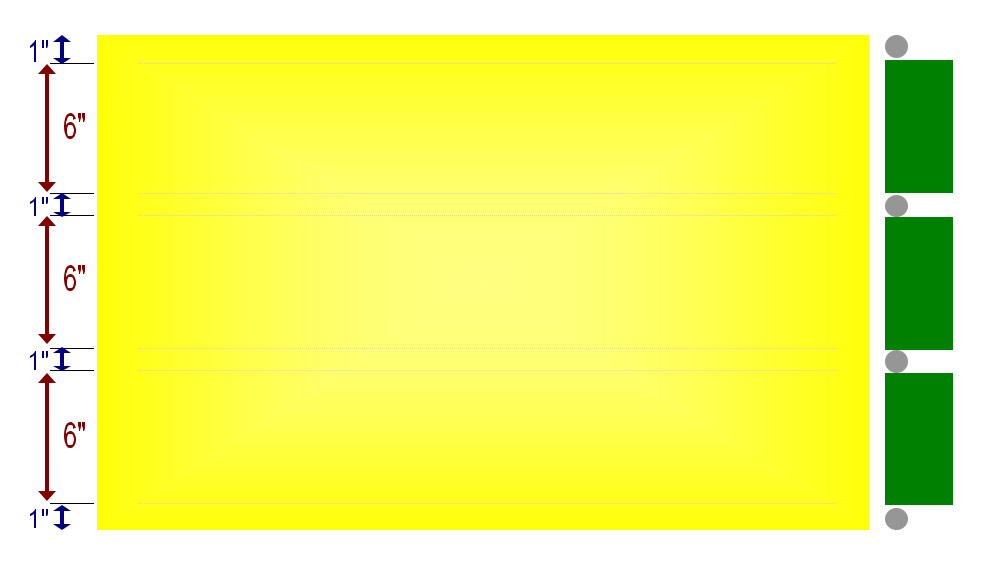 TIPS: Note that this is based on a standard 22″ height. If your material is a different size than this, try to apply the same spacing principles as best you can. In the next step, you will need to find the center between left and right. If you don’t have a yardstick or tape measure, but merely a straightedge, you can locate center by finding the intersection of lines connecting opposite corners of your board in an “X” – you don’t have to draw the entire line, just make a little hint of each toward the middle. That’s how you find the center of any four-sided shape.
CENTERING AND LETTERING: Count your letters and spaces to figure out where center would be on each line of text, and lay out your letters one by one, on each side of it accordingly, from the middle outward. When you sketch out each letter, use clear all caps…and lightly pencil where they fit in, either by making evenly-sized boxes for them to fit into first (don’t forget a little space between), or if you’re more confident, by directly (but still lightly) drawing the actual letters to trace over with a marker – but remember you’re going to use a fat marker, so loops on letters like “P” and “D” should not be wimpy, or they’ll look filled-in, or like fat lines instead (and don’t over-exaggerate the loops either, or letters start looking like different letters). Also remember to allow for ample spaces between words and enough between letters; having either run into each other also makes it very hard to read.
Is everything spaced nicely and visually centered? Now you’re ready to ink it in. Use the fattest black marker you can find.
INKING: Draw your letters carefully, smoothly and clearly. Don’t get overly frilly: it’s not an art object; it’s a form of communication that only works if it has clarity. Use letters that are like the ones on charts from which you first learned to print – very clear, with no serifs (those funny little lines clinging to the ends of some kinds of letters). If your marker tip/surface is longer one direction than another, angle it so that your “down” strokes are thicker – and hold it consistently. If there are “skips”, you can fill them in using a small edge of the tip later. Don’t rush this. If your hand printing is abysmal, ask someone with decent writing to help you, or get some stencils (make sure they’re the right size). Follow all the above instructions for each main-road sign you need to make (perhaps you even have two main roads nearby, lucky). You know your area.
ADDITIONAL SIGNS: Unless you live right on the main road, you’re going to need secondary signs to direct traffic to your house. Map out your neighborhood and all the ways that the most people are likely to come in to your address. Take note of how many left turns and right turns there are for each, and make arrow signs accordingly, to place along each route. You could use ½ sheets of the board instead of the full 22×28, say 14×22 (a little bigger than necessary), or even make 4 to a sheet of 14x11s if your arrows are nice and crisp. You might put the address below the arrow, as many people will forget it, but they already know now that it’s a sale today, so you really don’t need anything more. You could even just print out or (since ink is “spendy”), draw and color in arrows on coordinating neon sheets of printer paper if you’re just doing arrows (if you’ve placed arrows well, you won’t need the address with arrows, and once they see your set-up they’ll know they found the sale). Any of these you can affix to smaller boxes with their respective bricks, and once they’re all out, you’re in business – so put the main road one out there last, right before you open for commerce, or you’ll be inundated with early birds low-balling your already reasonable prices before the rush. For this reason also, if you’re posting your sale in advance on your local craigslist.org page or in the local paper, do NOT put your actual address, but instead just put what-hundred block of your street the sale is to be on, and they can find the address when they drive there – when you’re ready. Otherwise, you may get precocious or even creepy strangers ringing your bell in the wee hours of the morning or the night before, looking for a bargain (or casing the joint). Such inconsiderate vultures are not to be borne; do not enable them.
COMPETITION: It may so happen that yours is not the only garage sale in the neighborhood that weekend. If your competitors happen to use the same colors as you, it could confuse folks, but don’t fret! You can differentiate your sign by putting something of a little unofficial logo in the same corner of every directional sign that you put on the main signs. It could be a trio of stars or some scrollwork or a square with a monogram letter in it. Whatever it is, it should be simple, and consistently used on every sign between the beginning of each route in to the house itself, and always in the same corner (top right figures well, if your type isn’t crowding it). Or you could do a shallow border, of a line or dotted line, or zigzags or scallops, or just do something little on the corners if the border is too shallow and you’re crowding letters. Or you could affix something unique to the whole assembly, like a blue balloon or a large hot pink feather, or anything else, as long as it’s consistent through all of your signs.
EXAMPLES:
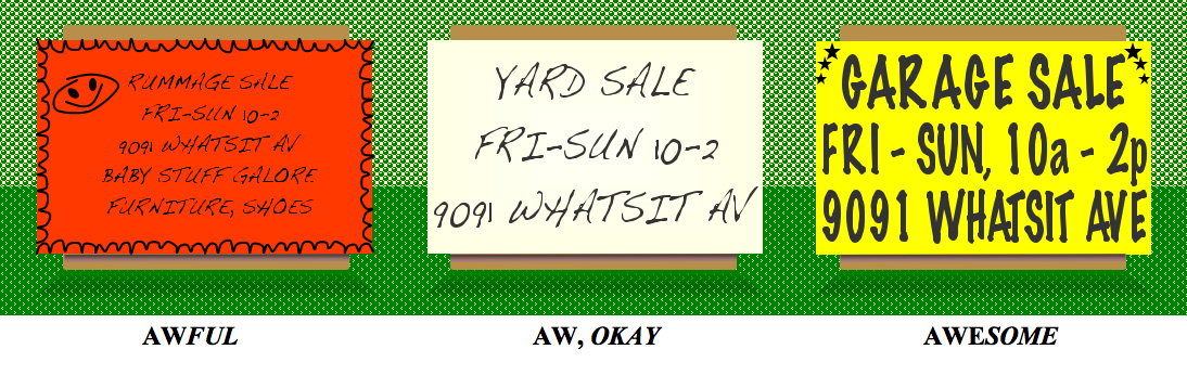
Now, which one of these three examples above is easier for you to read from across the room? Which one impresses you more? On the left, the red doesn’t allow for much contrast to help reading from a distance. The border is hurriedly applied and would best be left off. The smiley face is too dominant and looks a little creepy. Most importantly, all the words are too small, thin, and poorly written to read except right up against the sign. There’s no prioritization through sizing of text to differentiate vital information from extra unnecessary details thrown in as an afterthought. This one is a fail. The one in the middle is a sad off-white; it looks a tad dirty. Is that what you want people to think of the things you’re selling – or of you? Your advertisement reflects you and your product. Make it look good. It’s barely legible but not impressive at all. The one on the right looks crisp, clear, it pops, it says all it has to and it has a unique mark on it to distinguish it from others.
ARROWS: Now for your auxiliary signs to direct traffic through the ‘hood. We’ve decided the color and marker, and you’ve decided your size and picked boxes or stands, but how are you doing your arrows?
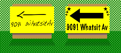 …Do I really have to ask? I’m certain you already know the answer. There is a reason ONE WAY signs use arrows in that proportion: optimal visibility, because lives very well may depend on heeding those. The same reasoning applies here, believe it or not. Make it easy for them.
FURTHER TIPS:
Now that you know how to make signs to get people there, get to polishing up and pricing those items, and setting up a tidy atmosphere; turn on some tunes, pour some lemonade, lock your doors, put on a fanny pack for your cash/change reserves/payments (it ain’t a fashion show) – and make some road-trip stash/gift fund/pocket change. Remember to be safe: have some backup watching folks who come in groups and try to distract you, and never let strangers in your home – know where you can tell them the nearest public restroom is – there are common scams out there and that’s just a couple of many. As soon as your sale is finished (each day of a multi-day sale if your take is good), take the cash straight to the bank; houses have been broken into after sales. Be sure and thank your neighbors for putting up with the increased cars, and be understanding with them when they have their sales. Better yet, do a neighborhood sale and market it well to get more traffic (again check your city’s rules).
–
I hope that with these tips and your (undoubtedly groovy) merchandise, that your event is a booming success! Happy sales!
– Eilee
All content on this site © 2013-2018/present L. Eilee S. George; all rights reserved.