Your teacher Eilee George here, with a lesson on color. One of the most obvious properties of a painting is color. Artists (and scientists) have analyzed and categorized them in various ways, in order to understand working with different aspects of how color is used.
Hue (Color) – In Theory
In our world, color can be first of all and most widely broken down into two major categories: additive color and subtractive color. They are separated because they work differently than each other. Additive color is made with light – it’s what you see on your cell phone screen or your TV or computer. Pixels change to different colors to give you an impression of some blend or other, in order to make an image – an image made of light. In additive color, mixing all the colors of light together produce white. Also in additive color, the three primaries are red, blue, and green. This can get very confusing because what most people know a bit about is subtractive color, but I’ll get to that in a little bit. With light, red and green make yellow. The other primaries mix much as they do in subtractive color, but this difference is significant to note. You are probably familiar that if you pass white light through a prism, the colors are refracted differently and a rainbow of color-blocked light results on the other side of the prism. In additive color, white is all color, while black is absence of it.
Unless you plan to work in light, a lot of that won’t be useful…but it has its place. Today I shall focus instead on subtractive color – the realm of the painter.
A first difference you’re likely to know is that in subtractive color, the primaries are red, yellow, and blue – and that red and yellow make orange while yellow and blue make green. Blue and red make purple (usually called “violet”) as always (well, in additive color it’s more magenta). When you mix all the subtractive colors together equally, however, instead of making white, they create black. In subtractive color, white is basically the absence of color – that is, if your paper or canvas is white!
Subtractive color, which I may from here on refer to as just color or hue – another, more technical word for color – can be divided up further, in different ways. First, let’s take a look at a color wheel – a tool to help organize colors and their relationships to each other.
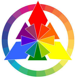
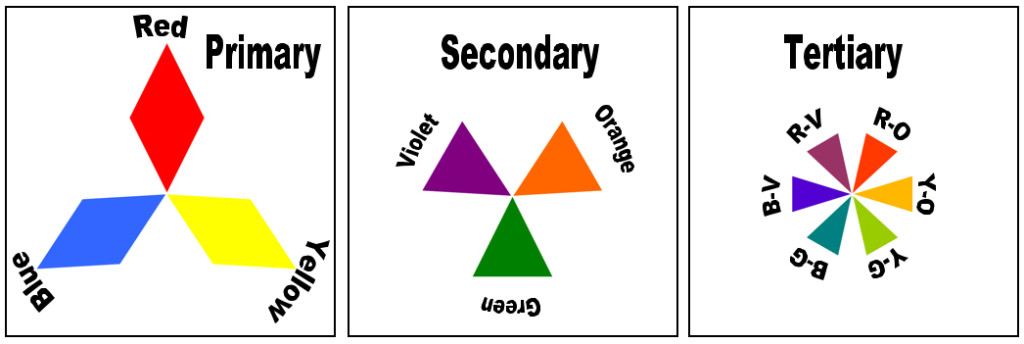
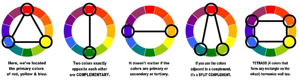
If you take it apart – as I have in the picture below – you can see, from left to right, the Primary colors (red, yellow, blue), the Secondary colors (orange, green, violet), and the Tertiary colors (red-orange, yellow-orange, yellow-green, blue-green, blue-violet, and red-violet). Note that the hyphenated names for tertiary hues are named with the primary color first.
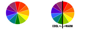
Put them all together and you can see how they relate to each other. This makes it easier to find what colors look really good together. The line shown below separates warm colors from cool colors. Warm colors have a visual “heat” and contain dominant amounts of red or yellow. Cool colors seem to lack “heat”, and mostly have dominant amounts of blue. This is known as color temperature.
Colors that are next to each other on the color wheel are called analogous colors. Examples of analogous color scheme would be blue-green, blue, and blue-violet. Analogous colors are harmonious together and do not contrast strongly against each other. There are lots of ways to use colors together:
So far we’ve only talked about rather pure, basic hues. What happens if you start mixing them up?
Value and Intensity – In Theory
Both black and white are relevant to this topic. They are neutral: one being the very darkest, and one the very lightest. When you add one of them to a color, you create new categories.
Value is how light or dark a color is. If you add white to make a hue lighter, it is then a lighter value. This is known as a tint of that hue. In popular culture, tints are often called pastels. Not all tints have common names, but an example would be if you added some white to red – the resulting pink color is a tint of red. If you add a lot of white in proportion to the red, it’s even a lighter tint of red – but it’s a tint all the same. Conversely, if you add black to make a hue darker, it is a darker value of the same color. That is known as a shade of that color. An example of that would be navy blue – a shade of blue made by adding some black to it. These terms tint and shade, as well as value, are very specific in the art world and it’s best not to confuse or misuse them. The most notable property with tints and shades is that you have NOT altered the base hue’s identity by adding any different hues.
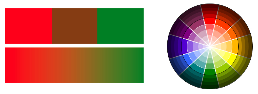
Intensity is a property of a color in relation to how pure it is, versus how much of its complement has been added to it. To really understand this, we must refer to the color wheel again. Note that red and green are complements. If you were to add a little green paint to a lot of red, you would take down the intensity of the red; it would be a less pure, less intense, less true red. (Note that in some texts the word “intensity” is replaced by the word “chroma”; they are the same thing.) Likewise, if you were to add a little red to a lot of green, it would be a lower-intensity green. Any mixture of complements is known as a tone. You can vary the amounts of each of the complements to achieve any tone you wish that is in the range between those two complementary hues. When you reach equal strength of pigment (your colored paint), then you should (ideally) have something close to black (you usually have to tweak it a bit). On either side of black in that middle ground should be some rather muddy-looking colors that possess very low intensity, and are difficult for many eyes to distinguish from what most would consider simply ugly browns. You can see this in the rectangular illustration below to the left. What you get in the middle depends on how much of which colors you’re mixing. It is significant to note that the value contrast between complements yellow and violet is far different to that between, say, red and green. Yellow particularly is not a very strong color in pigment and by its nature is a very light value compared to other primary and secondary colors.
In the circular diagram below right, you can see that all of the lighter tints inside the white circle are tints of all of the hues, and all of the shades outside the black circle are shades of all of the colors. The space in between holds the pure colors without any black or white added. Note that there are no tones in this model, because at no point do any of the complementary hues mix with each other.
Also note that the complement of any primary is a secondary – made of the other two primaries, which, in effect, means that you’re mixing all the colors together, which is another way toward black. Then, if you add white to make a tint of whatever mixture you’ve made, it’s more of a gray or a lighter brown, or a lighter grayish hue, depending on how much of each paint you added. The same goes for any other complementary pair of hues – you can mix value and intensity modulations to get an infinite number of subtractive colors. Below you can see some ranges between complements, and how tints and shades affect those ranges, as well as a value gradation between black and white.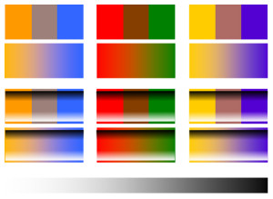
Note how complements theoretically make a black or dark gray between them, but sometimes you get something else. This is especially true in these samples because I’m generating them on a computer screen, polluting the issue with additive color, since your screen illuminates with light. But once you start mixing paints, you will see what really happens. Play around with it and get familiar with what happens with different combinations.
Hue, Value, and Intensity – In Practice
Of special note for those working with transparent watercolors: since there is no “white” in this medium, you have to thin your paint with water to let the whiteness of the paper show through. If you’re a beginner in paint and you want to get the feel for mixing with actual white pigment, use gouache, which is an opaque watercolor, or acrylic. Oils are more complex and need a certain type of environment to be used safely. You can add water to acrylic because it is a water-based medium, but do not add too much or the paint will not adhere properly to the substrate (paper or canvas). Remember that acrylics can dry quickly, so to keep them workable, get some medium – I like soft gel medium, personally. If you instead find and want to try a fluid retarder for acrylics, then remember to use it very sparingly – or the paint will not dry at all. And do not run acrylics through an airbrush (see previous post). Always read all instructions thoroughly.
For those using drawing media like colored pencils, you can lay them over each other in light, layered overlays; I find that laying lighter colors over darker ones works best, as does altering your stroke direction very slightly and keeping strokes tight to each other while working. If you use pastels, remember that there is a limit to blending because of their texture. You can get nice textured paper to hold more pigment, but think before you blend because once you crush the tooth of that paper, it won’t hold any more…plus you have to seal it heavily with spray fixative or it will smear and disintegrate with time. Oil pastels and crayons blend similarly but with a little less mess. Other drawing/blending tips can be found here, all through the “In Practice” section.
You will find that finer points of blending colors vary from medium to medium, and that’s okay. If you find a medium you particularly enjoy, you can do lots of experimenting to get really familiar with its properties and idiosyncrasies, and develop your technique to an expert level through trial and error and refinement.
Hue, Value, and Intensity – In Cyberspace: Master Works

You’d be hard pressed to find art that didn’t use some version of the element of Hue. Still, some just sing with it. Artists that seem to have a winning ability with hue are often labeled colorists, but it’s supposed to be a more specific term than is often used. Impressionists like Claude Monet, Pierre-Auguste Renoir and Georges Seurat are probably most popularly associated with special attention to color theory and how it works, even figuratively dissecting how the eye visually blends contrasting colors placed next to each other in small amounts and capitalizing on that to allow the viewer to “complete” the works. Fauvists like Henri Matisse and Maurice Vlaminck used riotous, bright colors in expressive strokes. De Stijl artists like painter Piet Mondrian, architect/designer Gerrit Rietveld and sculptor Georges Vantongerloo reduced hue to its most basic primary colors. Black-and-white photographers like Ansel Adams showed how sparkling value contrasts can be even when limited to a gray scale. Art Nouveau artist Maxfield Parrish liked to work with a complementary color scheme of blue and orange to contrast warm light and cool shadow. Since the works of many of these artists are still under copyright I cannot always put images here, but search these artists online and get a feel for how they use color by studying their works at various great museums, online or, even better, in person.
Be sure to check back occasionally for more lessons on the Elements and Principles of Design.
If you have any questions or need clarification concerning any of these design concepts, feel free to contact me using the Contact Form. Be sure to put the words “Lesson Question” in the Subject line (but the quotation marks aren’t necessary). I run several sites as well as my fine arts production projects, so I will get back to you as quickly as I can. Thanks!
– Eilee
Master work images courtesy of nga.gov (National Gallery of Art)
All other content on this site © 2013-2018/present L. Eilee S. George; all rights reserved.