Hello, this is Eilee George with another art lesson. This one focuses on form, texture, and pattern – they are each Elements of Design. I do recommend going through these in the order posted, since I may refer to previous lessons in subsequent ones. If you don’t know what the Elements of Design or the Principles of Design are, you can read about them here (it will open in a new window). If you like, you can just start from there and you will be led from lesson to lesson in the order of their creation, but plan on reserving a block of time for each in advance.
In this lesson, I won’t include any of the Principles of Design, as these three present LOTS of material to cover on their own. There are explanations as well as theory and illustrations. This entry also includes lots of drawing technique tips in paragraphs that are in italics. All you’ll need for the exercise in this lesson is some sketch paper, a pencil (and eraser), and some good colored pencils. So let’s get to it!
Form – In Theory
Form is the three-dimensional (3-D) extrusion of the two-dimensional (2-D) shape. But first let’s put that in context by going backward to how 2-D shapes work. 2-D shapes exist within an x,y axis – each shape exists within a single flat plane (in which could exist, say, a flat square or circle). 3-D forms exist in an x,y,z axis in space (in which cubes and spheres can exist). A line would theoretically be one-dimensional, if you could perceive it without thickness – it theoretically has a length and no width or height. A rectangle is two-dimensional because it has a length and a width, but theoretically, no height (or depth). A sphere, cylinder, cube or cone is three-dimensional because it has a length, a width, and a depth.
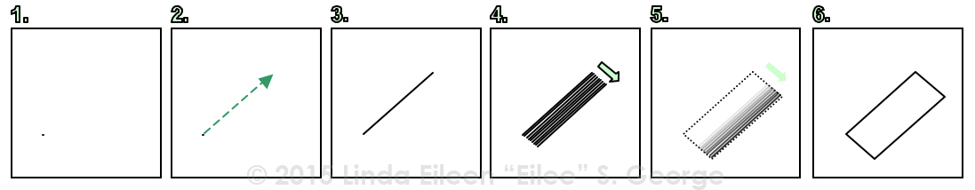
To visualize the difference of some of these, try this: imagine first that you have a point. It really has no thickness – no length, no width, and no depth, but for all practical purposes, it’s a speck. See Figure 1 below. If you were able with magical powers to move that point in one consistent direction for a little while, its path would create a line, as in Figure 2. Now we have an entity: a line, with one dimension: length (see Figure 3). Now (as in Figure 4) take this line, and drag it sideways from its former path, and it leaves a trail of its new path: it would form a rectangle as you go (see Figures 5 and 6). The movement created a second dimension, and a shape known as a rectangle, which has length and width. That’s two dimensions.
 Now, imagine you can move this rectangle in a direction perpendicular to the plane it lives in, and collective path that all its sides create will make the planes of a 3-D box – a box with three dimensions: length, width, and depth. You could do the same exercise with a square (shape) to make a cube (form), or with a circle (shape) to make a cylinder (form).
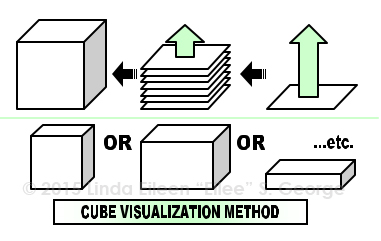
So how, you may ask, do you get a cube? In that case you would simply move a vertically-oriented square forward or backward (or, if you prefer, a horizontally oriented one up or down) in space – and only move it the precise same distance as it is from any side to its opposite side. To get different proportions of boxes, simply move differing distances, and/or differing proportions of rectangles to deal with. Here’s an illustration for the cube or various boxes first:
 Interestingly, there is more than one way to make a cylinder with a shape. You can also make one with a rectangle or a square. Pretend that there is an invisible line that passes through the center of the length of that rectangle, and you spin the rectangle around that axis in place – really fast. The corners of the rectangle would always be the same distance from the centerline, tracing a radius. Those corners, spinning around that axis at that radius distance, would trace lines around in a circle around that axis. The top (or bottom) edges would at their widest width become the diameter of the circle made when the rectangle is spun. Therefore, the path that its vertical sides traced would in effect illustrate the form of a cylinder. This is the method shown on the right side of the following illustration, whereas the previous explanation of making a cylinder from extruding a circle is on the left half; each results in the same goal of a cylinder.
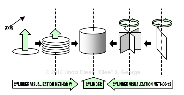 Similarly, if you spun a triangle around a central vertical axis, it would make a cone, and if you rotate a circle around a central axis, it would produce a sphere. Now, a square, if rotated the same way, would also create a cylinder – just a shorter, wider one than a vertical rectangle would produce. I made an animated gif to better demonstrate the concept; click on the image.
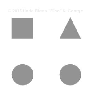
Now you can see why it is important to not use the words shape and form interchangeably – they are quite distinctly different things!
Now that you understand the basic forms…what do you do with them?
Well, we must understand that these basic forms, or some version of them, make up a very large percentage of the objects we see (and draw). Breaking down complex forms into the simple ones that make them up is a far less scary way to analyze and draw things.
Look at your television. It’s pretty much a flat box. Chairs may be a series of long, skinny boxes (or square prisms), or their legs might be cylinders. Spheres are all around in globes, tennis balls, even the rough shape of some more perfect trees, excluding, of course, their cylindrical trunks. Other trees look more like cones (especially those in the evergreen family). Look at your own hand. Your fingers are somewhere between cylinders and cones – they taper toward the end although they don’t come to an absolute point. Yes, there are lots of modulations and bumps but try to look at things in simpler terms, like you did as a little kid. Little kids are naturally gifted at simplifying things: “Every child is an artist. The problem is how to remain an artist once we grow up.” – Pablo Picasso
Knowing what the basic shape is will help you as you decide to draw and to shade the thing you’re drawing. Light wraps around cylinders and spheres in different ways than it bounces off of a cube.
Texture and Pattern – in Theory
You must also take these light-and-shadow characteristics and apply them loosely if you’re drawing something with texture or pattern.
Texture is an element of design that, in drawings, is mostly only simulated, through applying a pattern of pencil strokes to make it look like the thing you’re drawing is made of stone, or burlap, or whatever. It isn’t actually those textures, but it looks like them, and that is what is important. The paper is still smooth-ish in most cases (although we can beat up the paper a little bit, shy of actually tearing through it). Texture can appear smooth, rough, toothy, furry, cobbled, woody, grainy, etc. – whatever look you’re going for. In painting and sculpture, texture can also be literally a tactile surface quality as it would be on an actual object.
Pattern is a similar element of design, and is more of a surface application that looks decorative, like a floral motif, or stripes, or something more graphic in nature rather than trying to depict the way an object feels. Pattern can be on an absolutely smooth surface, like the silk upholstery on a throw pillow, but still have a very busy design -such as polka dots, plaid, stripes or paisley, or a floral pattern. Pattern quite often repeats in a regular fashion, at regular intervals. Texture can be either regular or random, depending, again, on what you’re trying to achieve.
Examples of texture include grass, fishnet, sandstone, woodgrain, velvet, carpet, gravel, bark, or fur. These are things that you can feel the distinctive bumps and consistency of on objects in real life, without even looking. In a drawing, an illusion can be created that suggests that you could feel those bumps and textures – but really on a drawing you would just feel the texture of the paper and perhaps some minor dents created by the pencil or other media (and likely you would ruin it by touching it because it would smudge – so don’t do this literally!) Conversely, pattern you may not be able to feel at all in the real world or in an artwork. A store-bought notebook cover may have a busy design on it that you can see, but when you touch it, it is still just smooth and flat, and you couldn’t tell which (if any) design was on it if feeling it while blindfolded. It doesn’t appear to have a texture, just a flat design.
Understand also that these two elements, texture and pattern, can also both exist together at the same time. An example of this would be a piece of velvet that has been printed with a floral design, or a nubby rug with different colors woven in to make a geometric pattern.
But texture and pattern have to be on something. That something, in your drawing (be it a landscape or portrait or still life), is likely a form of some sort.
Form, Texture and Pattern – in Practice
Let’s start simple. A tennis ball is a sphere, and it’s fuzzy. Know that you needn’t get so detailed as to draw every single hair on it. Although some people like to get into such painstaking detail, it simply isn’t necessary to get the point across. All you have to do is suggest a texture with a few well-placed and well-spaced strokes. Experiment and you’ll get the feeling for it.
You met some of the basic forms in the Line lesson. The still life in that was drawn and “shaded” by using lines in different ways. What you may also notice is that those lines that were used to “shade” those forms – those lines created a pattern. It’s mostly stripes, but that’s still a pattern. The sphere in the example drawing was “shaded” by using concentric lines that seemed to bend around upon the surface of the ball, closer to each other to make darker areas. Those long lines could be replaced by tiny little lines – tiny little lines that go in all random directions that are straight, curved, bent, multi-directional, and rather light and delicate – much like the tiny pieces of fuzz you see on an actual tennis ball. It’s effective to draw the lines very lightly and softly in the areas where light is strong, and as shadow creeps across the ball, start drawing the little lines a little darker. You can even start shading the surface “beneath” the fuzz more smoothly in addition to those darker lines – as long as the “fuzz” lines are a wee bit darker than their background – unless the shadow is dark and heavy, as it would be in a stark spotlight in an otherwise dark room – then the eye tends to lose its perception of detail so you could blend it.
So, you may wonder – why on earth would I draw a tennis ball? Well, for the sake of a drawing exercise, they’re pretty accessible…and you can control the light they’re in and they won’t go bad and they’ll sit still for you – and – they’re a basic form. Hey, lighter and heavier fuzzy textures are on plenty of other drawing-worthy subjects: peaches, puppies, moss, caterpillars; even clouds. The way that you apply your strokes is going to differ with the details of what you’re drawing – peaches have very fine, short, and almost transparent fuzz. Puppies have longer furry fuzz. Moss is a little more stiff; caterpillars have rather long hairs compared to their overall size, and clouds can be kind of…curly or feathery, depending on if they’re cumulus or cirrus clouds (stratus clouds get blended more). The thing with the tennis ball is that it is a simpler form for you to begin with, and then you can work into more complicated, compound combinations of forms in more complex subject matter like animals, still life scenes, and landscapes. Walk before you run. And, whenever it’s possible, draw from something that’s directly in front of you.
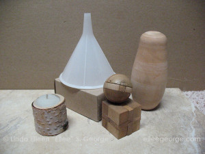
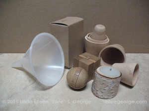
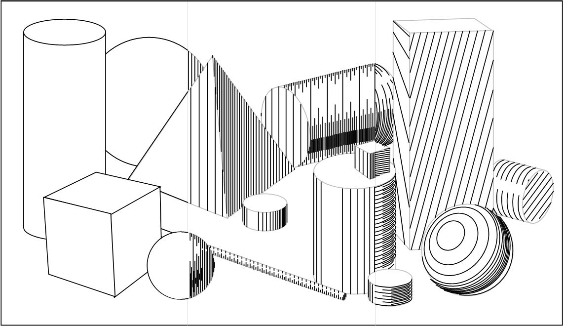
So let’s set up a little still life for you to draw – just regular household items that are representations of the basic shapes as you can find them. It doesn’t matter if you have the same things as I use in my examples; it’s the principles that I point out that are important. If you don’t have a tennis ball, try an orange, or a baseball, or whatever simple spheres you can find that have just a little texture or pattern to them. Grab a roll of toilet paper, a can of beans, a short can of tuna, or some other simple cylinder. Grab a party hat or a funnel or a megaphone or whatever odd cone you have around your place, or make one with a piece of paper and some tape. If you’re desperate, a lampshade might work. Boxes should be abundant in your pantry and all over the house. Just try to find good representatives of each of the basic forms, that are of a size that you can work with. If you can get these things in a solid color, that’s best for the beginner. The fewer patterns and printing on them the better, but feel free to experiment with that if you are more advanced or feel adventurous or confident (practice is always good). Scattered through this I’ll put some still life setups that I gathered. At first the photos will be rather monochromatic (shades and tints of mostly a single color), to ease the translation into a graphite pencil drawing (or charcoal, etc.)
 Put the items on a table under a light source, and study how the light and shadow wrap around them. Note how the light and shadow and the gradation between them change depending on how smooth and how reflective they are. Shiny things have stark reflections without a lot of gradation between light and dark. Dull things have a more gradual and even transition between light and dark.
Draw a light outline of the still life once you have the objects arranged in a way that pleases you. Don’t do heavy cartoon outlines; that will flatten things no matter how well you shade them. Save that for more expressive work down the line, if you decide to get all political or emotional about things. For now, let’s just learn to draw what we see – and we don’t see lines around everything in real life; this is just a little guide for you to shade up to, either on the object, or on whatever’s behind it, depending on whichever is darker. You can see in the adjacent illustration that there isn’t even much contrast between the box and the background. It’s up to you whether you want it to stay that way or punch it up to make the box stand out a little more. Take note of the pattern in the tile and the texture on the candle, and the differing wood grains in the puzzles, and the slightly shinier reflectivity as well as the partial translucency of the funnel. And study the different shadow appearances. You’ll note shadows act differently in hard light than in soft light, or in areas with multiple light sources (even more exciting when those light sources are different colors, but let’s not get too advanced yet).
A note about sketching style: I see a lot of beginners drawing short, loose, almost “furry” lines when they aren’t confident about getting the shapes right on the paper. I find that such a technique creates a lot of erasing and mess. Try drawing the outlines in a single line whenever you can. The secret to getting a smooth line is to draw not with the fingers, but with the whole arm, and if you are able to draw at a table or counter standing up, that’s even better because you can move your whole body in a fluid line to get smoother results from your pencil. The further back your force comes from, the steadier the line will be. It’s almost like a graceful dance, or like the fluid motions of Tai Chi. If you’re drawing only from the knuckles in your fingers or even from your wrists, your range of motion is too restricted and you won’t like the results when you’re drawing larger shapes – they’ll look bumpy and stiff. Draw with your whole body if you can find the space to do it. Practice it if you like – that’s how I do straight lines – horizontal, vertical, whatever – and circles, and arcs, and serpentine lines – and the results are fantastic. You won’t have to practice much, just till you get a feel for how all your body joints work in harmony for the common goal.
Once you add color to your still life, you’re going to have to be extra careful to not let that throw you off on light-and-dark values among them. There will be another lesson on value and hue in the near future (here it is), but a little of it was touched upon in the Shape lesson.
 Once you have your outlines and they’re nice and clean and you like the proportion, it’s time to start shading in your value modulations. I like to start light and go dark, but it’s a matter of personal preference and not a rule. My rationalization for it is to reduce the possibility of smearing all over the paper by my hand touching some dark spot before I’ve done other areas and “contaminating” an area I really didn’t want dark. One can wear cotton gloves, or put a piece of paper under one’s hand, or position one’s hand in a manner where it wouldn’t rest on the paper (putting your drawing pad on an easel and standing at it is ideal). I don’t know your setup so you’ll have to find what works for you. Another possibility, although it’s rather stiff feeling, is to shade from the corner opposite where your hand is coming from and work your way back. This isn’t really natural, and you get better results working the whole composition rather evenly phase by phase. I used to do detailed areas one after another, leaving other areas completely untouched, and sometimes never finished the drawing, and it looks unfinished because there was this photographic detail in one area and a mere outline in others. Some people dig that, but it’s often better to work around the whole drawing in stages…that way, if you’re interrupted, it’s cohesive and can be developed further, and you can record the stages with a camera if you want to analyze it. This way, if, like I was, you tend to be too tight in your style, you may find that an earlier stage is “enough” and even beautiful in its simpler, stylized or even more abstract form – or you may want to even take off more in that stylized or abstract direction and abandon photorealistic accuracy for expression. You can add life to that still life that only your imagination can breathe into it. But that’s likely not going to happen on an initial still life of a bunch of boring stuff of basic forms. Thank goodness you can choose to only do boring basic forms once or twice or however many times it takes to get you ready for more complex subjects. But this is a fantastic foundation, and I highly recommend it; the payoff is great in the next phase.
Here’s how to shade really light areas: instead of grasping the pencil solidly as one does while writing, hold the pencil loosely between the thumb and index finger, letting the weight of the pencil itself be the only force laying marks onto the surface of the paper. It should be so light it’s hard to see at first, but patience and repetition will let you shade it gradually from white to successively darker values. Eventually you can find where you can hold the pencil more naturally for the mid-tones, and then for the darker values. Make sure you don’t get so regular in your motion that you create edges that shouldn’t be there; move around evenly but randomly, and overlap your strokes so there is no one line between passes, and fade them out at the edges from pass to pass until they blend together seamlessly where they meet. Try to angle your stroke direction to relate to the perceived “direction” or “grain” of the surface you’re modulating.
Now, the difference between shading spheres, cones, and cylinders is largely the shape that the light and shadow take on these forms. Light and shadow follow the “shape” of the forms – on a cone, you will see both highlights and shadows that are triangular – narrower toward the point. On a cylinder, they’ll be more rectangular in nature, and on a sphere they will be in ovals with crescents wrapping around them.
Again, I’m assuming you’re starting with pencil or charcoal or some other drawing medium (pencil is best at first). Whatever drawing medium you use, the stroke of the implement will show as you shade; therefore, care should be taken as to how that stroke is applied. Whether you’re shading an object, a cast shadow, a background or whatever, make your marks and strokes work with whatever you’re depicting.
With cubes, there is very little modulation on the flat planes – but they are rarely completely one flat tone per side. Let atmospheric perspective step in to make a side a little lighter or darker as it recedes away from you or advances toward you – and exaggerate light and dark in a way to create maximum contrast along where the edges visibly meet, to emphasize their sharpness and make them pop. You can do a little of the same with the flat ends of the cylinder versus the curved sides. (You can read about atmospheric perspective on this page about Shape in Simple Space, around the 12th paragraph, between the two colorful flat shape graphics that look exactly alike).
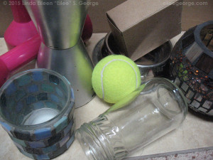
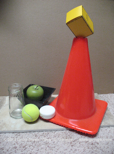
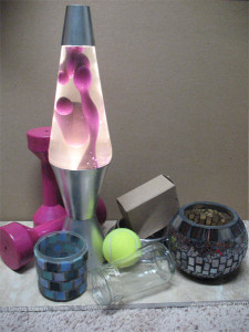
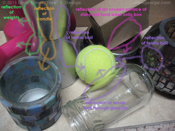 Here are some more photos of objects that show how they reflect upon each other in more detail. Note how the glass jar refracts and warps the shape of the tennis ball as you view it through the bent glass. Note how the reflection of the tennis ball is a duller yellow in some of the objects near it because of those objects’ local color mixing with that reflection, making a relative color. (Local color and relative color are also discussed in the Shape lesson.) See how the silver base of the lava lamp is dull rather than a mirror finish, and how it tones down the color of the objects that it reflects. Notice the reflection on the box from an area we can’t even see from this angle. In the other photos above, note how shadows act under the jar, as they recede away from more opaque objects – they go from sharp to blurry as they go away from the object that casts them (for instance, under the weight). Look at how shiny objects’ reflections are very sharp and sudden, but the highlights on dull objects are smoothly gradated.
If one of your objects has a pattern, design or printing on it, note that within the shadow, you can’t really see as much detail or contrast – embrace that. Remember to draw what you see, not what you know. What that shaded side of the box would look like in good light is unimportant. Draw it as it looks in the shadow you’re looking at now.
If one of your objects is rough, like a box made of rough stone, you can use a loose pattern to depict that roughness, like a toothy crosshatch pattern or a pointillist bunch of dots or even controlled scribbling. On the other hand, if it is smooth, try this:
For shading very smooth objects, shade in light layers over each other, with your strokes a little longer, overlapping randomly as possible, and when you change stroke direction, only change the direction by a couple of degrees, so that they’re almost parallel – this will give you much smoother results.
Also, pay attention to how shadows are cast from the objects onto the surface upon which the objects sit. Note that in most cases, the shadow is darker closer to the object, and the line of the shadow edge is sharper closer to the object. As the shadow travels away from the object, it may become slightly lighter and blurrier. Shadows also follow the form of whatever they fall on, so if that surface bends, the shadow bends with it. Showing shadows accurately will give as much believability to your drawing as drawing the object itself precisely will.
Also note that if the surface the items are sitting on is a bright color or white, it may cast a tiny bit of reflected light (or reflected color) back onto the shaded part of the objects. The usefulness of this is twofold: it helps to make your object pop more – to look more three-dimensional – and it is very useful for making a darkly-shadowed area of an object stand out a little from an area of background or cast shadow that is also dark. You can emphasize that, if necessary, to make your depiction a little easier for the observer to look at and understand what’s going on. This is just another example of “taking artistic license” – manipulating how things look just a little to make the picture “clearer” – or to create a mood or to emphasize an object the artist may feel is especially important. Once you work in color, you will notice on close observation that colors also reflect on each other within an environment, and this can make for very lively work when you freely express those reflected colors. You will come to understand that there is no such thing as a “white” wall, because it reflects everything around it to some degree – as long as there is any other color in the room, that white wall is a rainbow of very subtle variation in relation to those colors, to their intensity, their proximity, and their hardness or softness. Life and art and vision just got a lot more interesting.
A final note on blending in graphite, charcoal or other pencils or chalk pastel:
Although it’s tempting to do so for the convenience, I recommend never, ever using your fingers to blend your work, because the natural oil on your hands will make the paper shiny in those areas when it isn’t anywhere else, and it looks unprofessional and sloppy. Use a tortillon, or a blending stump. These are available in art supply stores near drawing tools. They are tightly-rolled bits of paper that taper at one end to allow for detailed blending. This allows you to control the blended area much better and keeps the quality and matte/sheen of the media consistent with the rest of the work. It also keeps you from transferring, with filthy fingers, color onto areas and objects you may not want it! In a pinch, you can substitute folded bits of tissue, cotton swabs, or fluffy cotton balls, particularly for larger, appropriately scaled areas where detail isn’t an issue.
Form, Pattern and Texture – in Various Examples
It occurred to me that it might be helpful to see some beginning work when learning these lessons. Here are some old student works of mine as I was progressing through the topic in school. Some of them are incomplete, as they were executed under strict time limits and I was still trying to judge how fast and how much detail to go into in relationship to the time given. That being said, it doesn’t reduce the usefulness of these examples to show some of what I’m talking about here. The one thing that bothers me is that in those drawing classes we didn’t do much in the way of color (it was saved that for painting class) and I’m just trying to teach you to draw right now. When I find some basic forms (or pretty basic) I’ve done in color, I’ll insert them. I have an enormous library of archives to sort through.
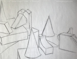
This was an early assignment – yet still after we had done many, many drills on individual forms, one at a time. Now we had to figure out placement, proportion and perspective as they existed together in space. Before we tried shading, we had to accurately draw positions in relation to each other, and to ground. This drawing was done in vine charcoal on large sketch paper. You can see there’s been a lot of erasing. That’s okay.
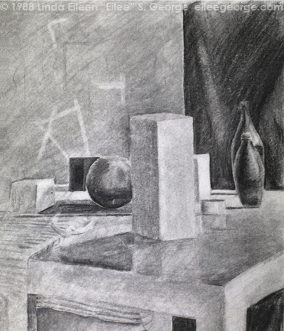 This one is a little more advanced. Bottles have been added, and they represent some composites of different forms together. Also, of course, it’s more than a line drawing; it is shaded to represent the light placed very near the still life and the shadows that the objects cast, not to mention some degree of reflection of the objects on the slightly shinier table. Due to the age of this piece it has smeared, and some of the details have been lost. The strange lines in the background represent random pieces of masking tape stuck to whatever that was (I don’t even remember). Overall, this technique was achieved by taking vine charcoal and coloring the entire page gray with the side of it, blending until it was nearly homogenous, and then darkening objects and shadows with heavy brick charcoal and pressed charcoal pencils, and erasing out the highlights to varying degrees with a moldable kneaded eraser. It’s one of my favorite techniques, giving a soft, sculptural feel to a drawing. I also can’t sing enough praises for kneaded erasers; I simply won’t use any other kind since discovering them years ago during my first art degree program.
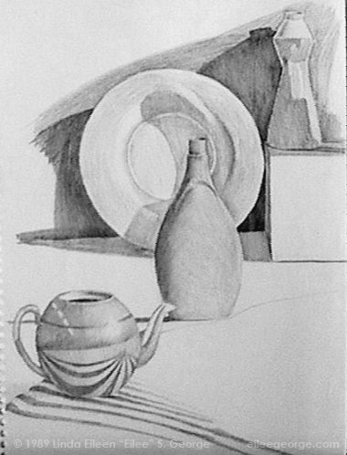 This one with the kettle is just a little later and was never finished (due to another time limit I fought with my detail level – I did eventually get that timing thing down very well on much more complex subject matter: figure studies). Here we see a few more complex shapes and then pattern, in the unfinished striped cloth in the foreground, as well as an excellent bent reflection in the shiny surface of the tea kettle. Looking at the dish behind the central bottle, you can see some very odd and unpredictable shadows in its recesses. This sort of thing is precisely why it is best to do still life work from actual objects instead of from your imagination, because it is those quirky, difficult-to-imagine details you see in real life that make a drawing come to life – even if it isn’t finished. It is graphite on paper, totally pencil blended, meaning that nothing was smeared to blend, giving a fresh, lively yet delicate appeal.
I’ll throw in some more student work in future lessons. I thought it might be a little more encouraging than simply showing you master works…but those are good too, to give you something better to aim for. So….
Form, Pattern and Texture – in Cyberspace: Master Works
Try looking up images by these artists for more appreciation of these concepts:
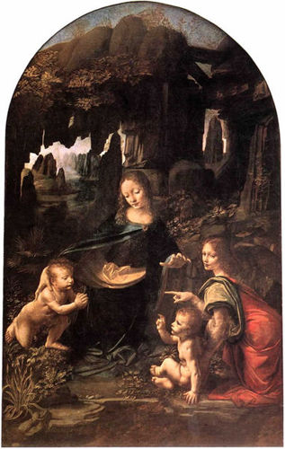
Artists who work well with Form include: Edward Hopper, John Constable, Jacques Louis David, and Leonardo da Vinci.
(More images below…)
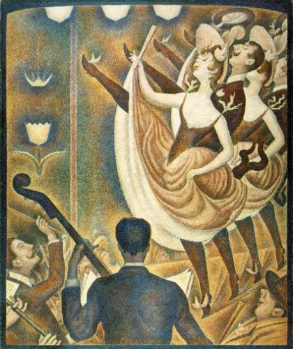
Artists who work well with Pattern include: Henri Matisse, Gustav Klimt, Jackson Pollock, and Georges Seurat.
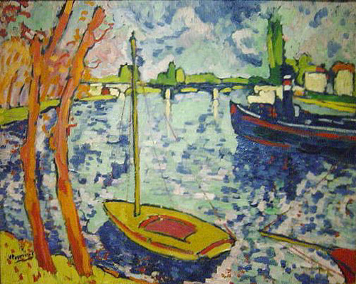
Artists who work well with Texture include: Jean-Antoine Watteau, Edvard Munch, Julian Schnabel, and Maurice de Vlaminck.
Be sure to check back occasionally for more lessons on the Elements and Principles of Design.
If you have any questions or need clarification concerning any of these design concepts, feel free to contact me using the Contact Form. Be sure to put the words “Lesson Question” in the Subject line (but the quotation marks aren’t necessary). I run several sites as well as my fine arts production projects, so I will get back to you as quickly as I can. Thanks!
Master painting images in this post courtesy of the old Ookaboo.com
All other content on this site © 2013-2018/present L. Eilee S. George; all rights reserved.