The year 2020 has been one of incredible disruption and adaptation. It has been an opportunity to grow, although not everyone was up to the challenge, but many were compelled to be and are better, in ways, for it. The phrase “new normal” is already tired, but nonetheless appropriate. We are weary, but we trudge onward. We are a flexible species and we shall survive. Yes, we need to breathe and work through some mental health moments now and then, but that was always life. We’ve learned to do that and that we can best cope by keeping ourselves productive.
Throughout the year I have been creating little components of media, with which to ultimately redesign this site, and at long last, December has been the month to implement it all. EileeGeorge.com has a new, more responsive and modern theme as its substructure – but in keeping with my styles of art, music, and writing, it has only emphasized the vintage look, sound and feel that are so integral to my output and my brand.
I’ve taken pains to create and include relevant animated banners to each section, and I made pertinent animated GIF files to adorn each page (posts mostly excluded) for a cheeky bit of fun. I’ve constructed a flowchart-icon style Site Map, that is separately referenced (in part) on most pages of the site as necessary, and left breadcrumbs all over, in order to keep you aware of where you were, are, and can be. As some of the old pages have moved or been retitled, it’s necessitated some housekeeping: I’ve double-checked most of the links so far, but if you find any that I missed, please email me here! (And thank you ahead of time.)
Fun facts about many of these icons…most of the antique items are in my own home, and a few others still at my parents’ home. Mine now include the record player (my Dad’s, from the 40’s when he was wooing my Mom back in school), Dad’s old Chicago phone, 8mm camera, film projector, the Model A he restored, and the radio that he listened live to FDR’s “Day of Infamy” speech as a little kid. The piano is still at Mom’s; she played on it; she taught on it; I learned on it. The typewriter is the one I learned to type on; the palette is the one I use (the other side of it is quite stained); the cash register is a vintage toy from my own childhood, the uke mine, the paint and pencils and Brownie camera are all mine. This reinforces the homey feel of the site.
I have loads of old books and frames and artist mannequins, and since I taught myself to do calligraphy in about 7th grade, the quill and inkwell are also mine. And the house on the Home page is actually that of my grandparents. There’s a lot of personal history worked into these (usually merely utilitarian) elements. Despite the fact that I need this site to do its job and encourage commerce in a year that’s been unprecedented for its hostility to any income in the arts, I wanted the entire site to feel like home: familiar, comfy, welcoming. It has a story. Not just my story, but my whole family’s story, as they are part of me. Welcome.
I hope that you find this new iteration of the site as stimulating, informative, warm, almost-analog-homey, and visually lovely as I hope it to be for my visitors. Thank you for browsing.
DIGITAL PHOTOGRAPHY: How to Organize Your Inventory
Organizing digital photos isn’t necessarily fun, but if you’ve any volume of them, it’s necessary.
If you’re anything like me with a digital camera, you take a lot of pictures hoping for that one really good one or few, in each batch. In the interim, there are lots of keepers, and for one reason or other you might want to find them again. The more photos you take, the more desperately you will need to stay on top of organizing them when you first file them away in your computer, or it will mushroom on you. Organizing digital photos is part of what the graphic design industry terms “digital asset management”, although it involves more than that, but organization is key.
This post is about photos from digital cameras being stored on a laptop or other PC. Trying to organize photos on a phone or tablet device is different as they are not quite as user-friendly (or dumb it down to do it for you assuming you never want to edit them and make them very difficult to access for that purpose), and are best to be figured out on forums or tutorials specific to your device.
My system probably isn’t the best, but it works for me, and you have to be flexible and alert to your own particular needs, but I have a base that is scalable for just about anyone.
Number one thing, to house your photos in an area separate from all the other guck on your PC, create a folder called Photography. That’s level One. You’re going to make many more, but they all go in there. If you also use and store stock photography from online that you’ve purchased, by all means, make a MyPhotography folder instead, or in addition, in order to differentiate.
Digital cameras typically assign file names and sequential numbers to their photos, and sometimes put them in folders that are numbered, before you ever copy them to your computer. However, those names don’t describe what’s in them, and what those folders contain are not necessarily all the same kinds of photos (you may have taken photos of your kid’s play, that car part you need replaced, and a bunch of other unrelated stuff, all within one folder, because they are often by date and we rarely have days where only one thing happens). So those need to be in separate folders to find them again. The good news is that you are not bound to the organization that these relatively useless camera-generated file and folder names impose on you. There’s nothing really relevant and meaningful in those names and that arrangement; they’re mere placeholders, and you will forget where certain pictures are, wandering about in a bunch of odd numbers. If you haven’t already, figure out how to rename files on your computer (sometimes just clicking or right-clicking will lead you to the option). Sometimes I leave a tad of the original folder number or filename, in case I forget what I had already uploaded by the time I grab more off of a large photo disk (I don’t like to delete old folders off of photo disks before I’ve backed up my laptop).
Organizing Process
When I’ve just uploaded a disk to my laptop, right away I sort through the pictures to identify what categories they are, and rename the folders accordingly, and create/name new ones and move appropriate photos to them, to accurately reflect what photos are in each folder. Do it as you go, because if you let it pile up and you’re a prolific photographer, amateur or not, it will snowball on you!! Often I include, in the new name, a truncated notation of the year and month, as well as an abbreviated hint as to the folder contents. Now, all individual photos don’t get renamed unless they’re really good ones – you could waste a lot of time doing this for every single photo, but every single one won’t be worthy: …oops, took a picture of your feet by accident between photos of the kids playing ball. Well, you should actually delete that one; save space on your drive for good ones. On my Mac I view whole folders at a time in icon view, bumping up the size of the thumbnails so I can get a real feel for the composition. From there I can add an “a” to the front of the filename of each individual image I find that is exceptional, so they all go to the top together, making it easier to rename those special few when I’m ready, but more on that later. Big picture now.
You can use this reference screen grab illustrating some of the organization I will be describing, for you visual learners:
If you prefer something of a flowchart, a simplified version of it might go a bit like this:
On with it.
Folder Hierarchies
Still, at first I had a lot of subcategories and not a lot of top-level organization. So I created, under the Photography folder, three Level 2 folders to sort things into: People, Places, and Things. Most photos fall into one of those categories. You could make more if needed (I did) but hear me out. Now, it’s probably not an exaggeration for me to say that I have over a million photos on my 2TB laptop drive. Insane, right? Okay; I own it. I have my own version of photo stock for my web clients’ sites, my graphic design, painting, music promoting and book writing resources, so it suits me. I’m also something of a family archivist. Obviously, with SO much going on there, the top three categories aren’t going to be enough to corral so much content, and retrieve what I want effectively. So under People(Level 2), I have folders with names of groups of people I know, and then under that, individuals within that group; then folders within those folders of different events with each of those people. For example, on the level under People, I have folders like Family, Friends, In-laws, Church, etc. – these represent Level 3. You can add what is relevant to you, like: CarClub, SoccerTeam, Workmates, or whatever else. Then on the next Level (4), say in the Familyfolder, I can list individual names like Mom, Dad, etc. Now, if it’s more than one person (which it often is), and a grouping that occurs a lot, I make bilaterally located combo folders (also Level 4), like MomNDador NuclearFamilyor GeorgiaCousins. You personalize it how it works for you of course. If there’s too much overlap, and you can’t decide between two equally appropriate locations, you can always commit to one, and in the second, make an alias or shortcut to the first folder, so you can find the photos in either place; cross referencing takes a little time on the front end but months later you’ll have saved hours trying to figure out where things are. Now, you can have another Level (5)under, for example, NuclearFamily, and have events like birthday parties and family togetherness. An example of a Level 5 sub-folder name would be 1988DadBdayLake, which right away tells you who and what event are featured, and when and where. With a name like that, I can later search file names based on any part of that folder name and find it and others like it quickly.
File Naming and Keywords
Now, say there’s a favorite photo in that little sub-folder that you really want to be able to recall. If the camera named it “IMG_3878.jpg”, that’s useless to you. You know it’s an image, and 3878 means nothing. Being sure to retain the extension, you could name it “DadCatSleepLap.jpg” and stand much better odds of finding it when you want it in a jiffy. I normally retain the 3878 part, discarding what’s before it because it’s the same for everything, but if I Photoshop multiple versions and place them in different places I can search for all of their locations at once, fast. Also, the cuteness of Dad sleeping with the cat asleep in his lap may have warranted more than one photo, and that number is conveniently already there, making that unique.
Going back to Level 2, if you recall, I had People, Places, and Things. Under the Placesfolder are sub-folders Colorado(where I happen to live and therefore take the lion’s share of photos), and EverywhereElse, where I put my traveling photos and visits to out-of-town family. Yes, there are overlaps between that and People, and I make aliases to navigate between these areas as a cross-reference. Hey, if bothering to do it at all, do it right.
How to make an Alias/Shortcut between folders:
On a Mac you make an alias by right-clicking on the folder you want to refer to, and choosing “Make Alias” from the pop-up menu that results; on a Windows machine it used to be about the same thing except it was called a Shortcut. I haven’t used a Windows PC regularly since Windows XP, so it could have changed, but try right-clicking to see what shows up. After you’ve created the Alias or Shortcut, you have to drag and drop it into the new location that you want to connect to it from, while leaving the original folder in its original location.
Separate the Good from the Mediocre
Sometimes I have lots of good pictures in a folder and don’t have the time to think of how to rename them all just yet, and just so I have them handy together to rename, I will simply change their filename by retaining all of the original name but putting the letter “a” in front of it, like this: “aIMG_3878.jpg” (that filename less the “a” being the default naming pattern by my Canon). Since the computer automatically lists photos in alphabetical order, all my favorites in that folder are now at the top of the list column, easy to find. Sometimes that’s enough, but it’s no help in searches from outside of that folder. If your filenames are numeric at the start; numbers will be above letters, so using a zero instead of “a” in front might behoove you better.
There are renaming applications and other programs you can use to facilitate this. Adobe Bridge gives you the ability to put the same metadata on a group of files as well as a renaming prefix that you designate. If you’re just renaming a few things this isn’t really necessary, but for bulk renaming these are great tools.
But this post isn’t how to use those programs. It’s about how to name things so you can find them and how to arrange your folders of information in a manner that’s logical to navigate.
Now, back to Places. You may have an EverywhereElsefolder too, if it’s useful to you. If you travel both domestically and abroad, I’d then make Level 4sub-folders of those. Then you can separate by country or state on Level 5– whichever is appropriate for the place. After that you can separate by city, specific location, and/or date (and abbreviated detail) on Level 6, especially in cases of places you’ve gone to multiple times. Note that you may not need the same number of levels in different categories. Your Level 5 might not be a folder but be actual photos in a particular area, where a Level 6 doesn’t even exist there. That’s okay; this system scales up and down to all needs.
Filename Abbreviation Codes
I take tons of nature photos for paintings. Since I have so very much content on my laptop, and since I’m a tad obsessive-compulsive, I’ve developed a consistent abbreviated nomenclature in my filenames that uses partial keywords that I can search, in order to find all of the photos in that category. Let’s say I took a photo on Mount Evans that has mountains in the background, forest and a stream in the mid-ground, and a flower in the foreground. The camera-assigned filename we’ll say was originally “IMG_7211.jpg”. The new filename would include MtEv for Mount Evans, Mtn for mountains, 4st for forest (or Tr3 for tree if one is dominant), H2o for a water feature, and Flr for floral. It was originally from 306CANON folder, and was taken in May of 2014. All the photos in that folder would be in a folder renamed “306c14MaMtEv”and the file would be renamed “MtEvMtn4stH2oFlr211.jpg”. The 211 is retained because I may have taken 20 pictures within that folder that have those same features in different configurations, and they can’t all have the same exact filename. The folder name retains the 306 because I may have gone to Mount Evans 3 times in the same month and I’m remembering visit number two. The “c” (from CANON) after the 306 is just there to separate it from another number: the 14 representing the year. Note that in my ‘feature’ abbreviations, each starts with a capital letter and ends in a lower-case letter or number (e.g., Mtn, Tr3, H2o). This makes it easier to distinguish between each abbreviation when looking at the file name as a whole. I try to keep each to three characters but sometimes four are necessary to discern what the abbreviation stands for as opposed to another one. I do keep a cheat sheet of abbreviations to refer to in case I forget or develop a new one, so I always use the same one consistently.
The reason I do this is: if I need, or a client requests a photo for their web site or a painting, that has this or that feature, I can use the search feature on my laptop to key in these consistently-applied abbreviations, and quickly have displayed for me every filename on my entire computer that I’ve renamed that includes those abbreviations, without the litter of unrelated files hiding them. If someone wants something with mountains and water I can search H2o and get all the ones with water and easily focus on those that also have mountains by looking through the search results for ones that also contain Mtn. Just about on the spot I can see or show a client a bunch of thumbnails of relevant images.
You very well may not need that much detail, but it’s nice to know it’s possible if you ever DO need it.
Again, here’s that screen grab illustrating some of the organization I’ve described above:
And the (simplified) flowchart:
And so on and so forth; you know there’s more.
Of course you would add more to and under that, but this is a general illustration. For instance, under Paintingone might want subfolders entitled Still Life, Portrait, Landscape, Abstract, etc. Under that level on Level 6 I arrange things like individual work by title, and even progress photos while making each work – usually for more complex things like paintings, sculptures and furniture designs – not so much for drawings. As I’ve said, you will need to tailor this method to your own priorities and content. You also may have to create some temporary sorting folders while you’re in the process of organizing things. Be patient with yourself; you’ll get there, step by step.
Sometimes organizing large amounts of data is daunting, but if you stop and think about how it is identified, that is truly the key to organizing it by category.
Some other abbreviated nomenclature that I use for filenames are: Nat for nature, Aml for animals, Txr for textured background shots (like for wallpapers), Cld for clouds, Cty for city shots, Rok for cliffs, bluffs or large rock formations that are dominant, Rd for roadways, Sno for winter shots, Roz for roses (since a lot of my flower shots are roses; we have quite a few growing in our yard), Bld for buildings (architecture), Brk for bricks, Brj for Bridges, Aut for fall scenes, Spg for spring and Smr for summer, Brd for birds, D3r for deer, B3r for bear (yes we see them occasionally), and so on…. With generally 2-3 letters, you must choose so that it doesn’t look like another word, so choose wisely. Windows machines, as I recall, are fussier than Macs with file/folder name lengths, so this is where the extreme abbreviating comes in (and why I don’t use spaces). Years only need be 2 digits. Months I abbreviate with 2 letters: Ja Fb Mr Ap My Je Jl Ag Sp Oc Nv Dc. You could easily mix up the J months – but note that the second letter is one that no other J month possesses in its full name. Sometimes I’ll even note a dominant color in a photo if there is one, especially floral shots: Rd, Ylo, Blu, Grn, etc. because some clients will choose things based on color, whether it is to go with their logo or their bedroom curtains.
Obviously you can pick and choose from these methods for what you actually can use. I just wanted to present as many examples as I have found useful.
I hope that with your dedication, your photos become more organized than this post! Photos are great when you can find them. Happy shutterbugging.
Fine artists and math aren’t usually friends. Math is a necessary evil at times, but visual and wordy creative types generally avoid it. (And for those of you who know my fanaticism concerning grammar and spelling, yes, the title above was intentional, and no, I do not have a fever. I do however suffer from a fascination with terrible puns. And no, there isn’t any other kind of pun.)
However, math skills are incredibly useful in many areas of drawing, painting, printmaking, sculpture and more. Linear perspective is based on mathematical relationships, lending realistic proportions to depictions. It translates into sculpture getting anatomy in proportion; into fashion design measuring for pattern sizing. Ancient cultures, Michelangelo, and modern artists alike utilized measuring and drawing grids for enlarging paintings. Mathematical volume ratios are important in timing and recipes, from acids for etching printing plates, to mixing paints, to formulating ceramic glazes and kiln temperatures and firing times.
I didn’t like math much, except geometry. It actually has saved my art projects on many occasions. It isn’t just figuring square footage for a rectilinear wall (length x width) before you buy too much paint. It can be handy to figure out the perimeter of various shapes depending on a project’s needs, and you may not be able to predict all the needs you’ll have in future projects, so it’s good to already have a working knowledge of math embedded in your grey matter before a problem crops up (especially if you’re under a deadline).
The point is, for example, at this particular juncture you don’t know how big the circle is or the radius or diameter from the info you have right in front of you. This is how you find out. Once I had a project into which I had to figure out how to fit a circle exactly between random elements that were not making it easy to just measure a diameter; the three places crowding into the space formed a triangle. Using my existing knowledge of geometry, I could figure out the precise point at which I needed to place my compass point, based on a principle that didn’t even require actual measuring. No measuring? Cool. I did have a couple of extra steps because the space was already halfway enclosed and I did have to take measurements to recreate a triangle from those three points to get the angles right, but I’ll start by the main concept, which, barring such constraints, really requires no measuring.
Figure 1
First, some basic vocabulary, like you need to know that straight line segments connect singular points. Simple enough. Then you must understand what perpendicular means: that would be a line that is exactly 90 degrees difference from another line. Then you should know that “bisect” means to cut in half. Also know that the center point of a circle is theoretically where one could put a compass point to adjust the business end to scribe a circle around it, and the distance between the circle’s edge to the center point is called a radius, and the distance across the widest part of a circle from edge to edge is a diameter. Sorry if that seems a little too elementary, but I’m trying not to assume too much (I haven’t limited who visits here other than spammers and other mischief makers).
Figure 2
That introduction should prepare anyone for the following rule: the center point of a circle that will pass through all three of any three points (in any orientation to each other) may be found by determining the respective perpendicular bisectors of two line segments connecting any two pairs of the three points, and locating the intersection of these two bisectors. For example, on Figure 2 one line segment paired with its perpendicular bisector is in purple, and the other pair is in green; where the green and purple bisectors intersect is where you put your compass point; adjust it to the span between that point (the center point) and any one of the random three points, and you will see that the circle drawn with that radius will pass through all three of those points.
Figure 3
Now, your three points can be in any proportional orientation to each other; they needn’t be lined up anywhere close to a regular sequence as they nearly are in Figure 2 above. Alternatively, as in Figure 3 here, two points can be rather close to each other, while the third is relatively distant, yet you will find that the principle of the intersection of perpendicular bisectors functions every bit as accurately with any configuration for finding that common radiusat that intersection point. You’ll notice that the intersection seems to be more “between” some of the points in this second example; whereas before, it seemed more “outside” of the area of the more lined up points. And that’s okay, either way.
Figure 4
Figure 5
Figure 6
So…how does one determine that perpendicular bisector? Well, there’s always measuring it out, which is a fat pain in the neck, but the easy way is with any straightedge and the compass with its pencil. Even if all you have is a piece of scrap paper, you can fold it over a few times and the fold will make a nice straightedge if you don’t abuse it too much. You don’t need a ruler with measuring marks, and you don’t actually have to calculate anything; the laws of physics do the heavy lifting, and you’re just an apparatus. So let’s try it:
1. Draw a line segment between any two of the three points.
2. Draw a second segment between (either) end of the first segment (since you only have the two choices left), and the third point.
3. The same procedure for finding the perpendicular bisector (steps 4 through 7) will be applied to each segment, so choose just one to perform it on first.
4. Stretch your compass just a little farther than the length of line segment #1. A distance that could produce a nearly equilateral triangle would be sufficient distance to get a good bisector length.
5. Place your compass point on one end of the segment.
6. Estimate about where you think a perpendicular line would pass on both sides of the segment and mark an arc (just part of a circle) lightly but generously in that vicinity, to be sure it crosses it on both sides fully. Do not readjust your compass after making these lines. Figure 6 may help you see what I mean on placement.
7. Repeat the arc process from the point on the other end of segment #1. Again, don’t readjust your compass by mistake; these arcs must be equal from either side to stay centered. This will produce a little “X” on either side of segment #1. Drawing a line that passes right through those two X’s willbe the perpendicular bisector of that segment.
8. Now repeat steps 4 through 7, only for (whichever your choice is for:) segment #2.
Now if you have a physical project that you needed a circle shape for, you can cut out the circle you just made, and use the circle itself (either it, or use the hole it left in the paper or cardboard you cut it from) as a drawing template. Cut it out of chipboard or whatever and it’ll be a little sturdier than just on paper, but a little harder to cut out. Or match a circle template to it if you can…you may not be able to, though, since available sizes of templates are so limited. If you’re an adult, I suggest cutting it out carefully by hand with and X-Acto knife instead of scissors if you can (but kids, DO get help from an adult; X-Acto type art knives are notorious for slicing even adults if one isn’t very careful and steady), or if you’re lucky enough to have a circle cutter, go for that if you’re working in wood. (It bears mentioning that in every school, furniture, design or model building shop I ever worked in, these art knives had way more accident reports than any of the power tools! Don’t be overly confident; be extra careful!!)
My project for which I first had to use this knowledge had a key area that was very difficult to access, because other elements were already in the way to just being able to measure easily. Knowing the (perhaps obscure) three-point rule about circles was already in my brain, patiently waiting for a use when I found I needed it. It paid off!
But sometimes you’ll need actual measurements for a triangle. The thing one has to remember is that any 3 points (that can locate a circle) also makes a triangle, and all triangles have 3 sides. Those sides (like the segments we made in the last exercise) have center points, (and therefore, they have perpendicular bisectors). Triangles also have 3 vertices (vertexes if you prefer), or corners, and no matter what proportion the triangle is in (right, obtuse, scalene, equilateral, isosceles; whatever), those 3 vertices always total 180 degrees when you add their angle measurements together. Always! And that means that there is always a way to figure any single unknown measurement, so long as you have the degree measurements of at least 2 vertices, or of at least 2 sides. This is why the Pythagorean theorem works for right triangles; but I’ll explain that later. Don’t worry: the formula is almost easier than the pronunciation. (You can scroll down to Figures 8 and 10 for triangle references, where these two triangle paragraphs are expanded upon.)
What if you don’t have a right triangle? Well, how much info do we have? Is it enough? You pretty much need measurements of 2/3 of the sides or 2/3 of the vertices degrees to get that last third of either. There are ways to do combinations of a vertex and a couple of sides and things like that, but I have neither needed that combination nor have I any recollection of how to do it, and it’s late and I’m too tired to look any of this stuff up; I’m going purely on memory in this whole post…literally from decades past.
Practical Applications
You might wonder why we even want to know any stuff about sides. Well, if you’re edging a shape with some sort of trim, you’d need to figure out the perimetermeasurement, or the distance around it, so you’d know how much yardage/board footage (or other type of length) of trim to buy. If you’re painting a big shape, you’d want to know how much paint you’ll need, and need to calculate the area of a shape. Most containers tell builders or DIY remodelers how many fluid ounces or gallons or whatever they contain; some will say how many square inches or feet or whatever that liquid volume will cover…but they may not. And having far too much or too little is often a problem if you fail to plan. Paint can get pricy, and it’s bad for the environment to waste it and many people don’t even bother to look at recycling. So waste not!
Area, a measure of the surface of a two-dimensional entity, is good knowledge for many things: ordering sod for your yard, or raw canvas to stretch z number of qsized stretched canvases plus their borders, or concrete for your patio, or to help calculate how much x number of cows will eat grazing a pasture in y amount of time before you have to rotate them to a different pasture and let the other pastures grow again for the next round. Cows? We’re talking about cows? Heck yeah! Math is super useful in almost any topic. So there are formulas to help us figure this stuff out for almost any shape, even if you have to take a big weird shape and break it up into smaller components that are easier to define and then add it all together.
Quadrilaterals, Triangles and Circles
I guess I’ll start with quadrilaterals, or four-sided figures; they’re the easiest. Perimeter for a square would be S x 4, where S stands for Side. For a rectangle it would be (length x 2) plus (width x 2), or L2+W2. For a parallelogram it would be the same as for a rectangle, and for a rhombus, perimeter formula would be the same as for a square…but not so for area.
Figure 7
The area (A) of a square or rectangle is simply A=L x W. For a rhombus, you measure the lines connecting the opposing corners and multiply those: A=D1 x D2 (D stands for diagonal). For a parallelogram it’s a liiiittle more complicated, because you kind of break it up into components, one of which is a triangle, so I’ll shelf the parallelogram and teach you about triangles first, with a quick detour to trapezoids in between.
Triangles are nearly their own field of study and I do believe that relates to the term “trigonometry”. All I remember from trig is how to figure the sine, cosine, and tangent, and I’ve not yet had practical cause to use it, so I’ll skip that for my audience. We’ll concentrate on perimeter and area.
Figure 8
The perimeter of any triangle is just derived by adding the sides’ values to each other. The area, however, is obtained by using the formula A=½ h(b); in other words, area equals ½ times the height, times the base (when you see parentheses in a formula, it means to multiply the value within and the values outside the parentheses…it saves confusion using the old-school multiplication symbol x alongside variables which also may look like x). It makes more sense when you look at a right triangle and notice that it’s like someone sliced a square (or a rectangle, or a rhombus) in half diagonally…base times height is a whole lot like length times width for a square…then you divide it in half, because it’s only half of the area of the quadrilateral it would fit in. ½ h(b). Picture that while looking at the different triangle types in Figure 8 above. So…what are height and base?
Well, you can take any triangle and assign one side (generally the bottom) as the base. From there, the top corner opposite that base is what determines height, but only if you measure on the perpendicular. It doesn’t matter if the height is directly over the base or hanging out in the “air”, as it might with an obtuse triangle. The height is always completely perpendicular to the base (see Figure 8 above, on far right; the obtuse triangle with the dotted lines; note how that also translates to the acute triangle in center).
Now I’m just going to give formulas for shapes, and if you have questions on how to execute them, please email me…or contact your local math teacher, who is probably (hopefully) far better at explaining this than I am.
Figure 9
A trapezoid at first seems like a Frankenstein’s monster of shapes, but its formula is pretty easy, kind of ripped off from the triangle, but it acknowledges measurements for a top AND a bottom base: A=1/2 h(b1+b2). You don’t double the height, because it’s still just one height. Note that the formula below the parallelogram in Figure 9 says “either base”, not “both”, because you only need ONE. Since they’re the same (they’re parallel and so are the sides that connect them), you can choose either one of them.
Figure 10
Right triangles of course have special rules all their own. In geometry they always have a little square in the corner reminding you that their angle is 90 degrees. The single side exactly opposite that right angle is called the hypotenuse. The example shown on the far left is actually an isosceles triangle (two 45-degree angles plus one 90-degree angle equals 180 degrees), but sides a and b could also be different lengths, and the other two angles can be different measurements as well (as they would necessarily be, what with having different length sides). For example, the triangle on the right has one 30-degree angle, one 60-degree angle, and the (right) 90-degree angle, again adding up to 180 degrees.
Right triangles are where the Pythagorean theoremcomes in: a2 x b2 = c2. If a triangle with sides abc is a right triangle with c being the hypotenuse (the side opposite the right angle), where the number of length units a=3 and of b=4, and you don’t know c, you can calculate that using the theorem: a2 + b2 = c2, and a=3 so 3×3=9, and b=4 so 4×4=16, so 32 + 42 = c2, then 9 +16 = c2, then c2 is obviously 25, and the square root of 25 is 5. So 5 is the measurement of that hypotenuse. Obviously, the measurements rarely calculate so they fall into such neat round numbers; this is just an easy example. You can figure other square roots manually, but it is admittedly tedious; I highly recommend using a calculator for this component. Similarly, if you change the same proportion around so that b is the value missing instead of c, you can just subtract a from c to get b, or: c2–a2=b2, instead of adding like we just did.
Figure 11
Hmm…we’ve done quadrilaterals and triangles quite enough. So back to circles – let’s do some actual math. One of the most “famous” formulas in geometry is “Pi R squared“, or πr2. In truth, that’s not a complete formula; it’s only half! You need to know what that combination yields. In this case, it’s the Area, so A=πr2 is the whole (balanced) formula. The A again represents Area; the r represents the radius, or the distance from the center point to any edge of a circle (and it’s the same distance to any edge of the same circle). Another useful formula for circles is for the Circumference, or the distance around the outside – and yes, basically it’s the same thing as perimeter for other shapes; “circumference” is just a specialized term for the perimeter of a circle. The formula looks a tiny bit like the one for Area, but don’t confuse the two: C=2πr or in longhand: Circumference = 2 times pi times the radius. (It really is quite different in function.) Now, anyone who’s paying attention will notice that 2 times radius is the same thing as (one times) the diameter, since the diameter is the distance across a circle at its widest, which necessarily runs through the center point…essentially, 2 radiuses. So you could alternately say π(d) and be done with it. Except, of course, until you need to plug in a definition for π (pronounced pi like the Greek letter). Pi is a “magical” circle-specific value represented by 22/7 – which, since those numbers don’t ever make human sense together, have a decimal equivalent something like:
3.14159265358979323846264338327950288419716939937510582097494459230781640628620899862803482534211706798214808651328230646…blah blah, random constant ad infinitum…but for most practical purposes, 3.14 is adequate. If you don’t dig doing immortal arithmetic using top-heavy improper fractions with anemic prime denominators, go for the decimal shorthand instead. I think I’ve done more with circles than with any other shape, save for squares…obviously.
Formulas For Forms
Artists also work with 3-D geometric forms as well as simply 2-D shapes. Remember from our art lessons on Forms that forms are essentially mere spatial extrusions or rotations of shapes, expanding 2-D to 3-D. Formulas abound for forms as well, but instead of needing formulas for area and circumference or perimeter, they need formulas for things like volume and surface area…things like for the sphere: V=4/3(π)r3. Prisms are easy; calculate the shape on the end and multiply by the height of the prism to get the volume of it. Surface area of those, you just calculate the areas of rectangular sides and add them all to the areas of each of the ends. Pyramidsare 4 equilateral or isosceles trianglesplus asquarebase for surface area. Volume for those is a little weirder. Cubes are made of 6 squares, so their surface area would be the area of one square times 6; its volume would be Length times Width times Height (LxWxH). Tetrahedrons are 4-sided forms with all equilateral sides. When you get into dodecahedrons, icosahedrons and the like, you’ve gone beyond what I’ve ever had use for personally, but there are mathematic resources on the web you can search for with any question – or, again, contact your local friendly math expert and he or she will likely be glad for the inquiry.
Grow Further from the Foundations
Of course, shapes and forms may not always conform to geometric proportions; sometimes they are organic shapes or forms (see lesson on Shape). But usually you can guesstimate parts based on similarity to a geometric counterpart…or five.
Now, you may be wondering…how on earth again can any of this be useful to an artist? I’m certainly not saying it comes up with every project. But when it does come up, it is good to be prepared, and know what you’re doing. I had to figure out how to draw proper gothic arches for my 3-tree triptych. I had to figure out perspective for Catreedral. I had to stay aware of paint to medium to water ratios in all of my acrylic mixtures so my paint didn’t lose adhesion viscosity effective in relation to the canvas or other substrates. I do commission work to fit in certain spaces in situ.
A lot of times it’s like my first example: you’re trying to fit an element into a composition with only part of the information you need to execute it, and you should know how to generate that missing information from what you do have. It can help you assemble 3-dimensional forms; it can help you understand proportion when drawing things either freehand or by perspective. It can help you organize radial or concentric arrays or grids in regular intervals to make patterns. It can be used in symbolic capacities. It can help you distribute elements on a certain shape and size of substrate. Perimeterand circumferenceare good for figuring minimum linear measurements for physical materials to wrap around the outside of a shape. Volume is good for figuring out how much resin you can fill a hollow form with, or how much airspace a solid one will take up, or how much water or glycerin it would displace if submerged; while areaand surface area would let you know how much paint or flocking or whatever you would need to color or coat the thing with. When you get into large shapes or forms this sort of calculation takes on a more significant importance with budgeting supplies, as well as figuring sale price from a root of cost of materials, times your hourly rate, differentials, incidentals and whatever is relevant for your medium and project. It’s not always formulas; sometimes it’s understanding the theory and relationships behind the formula and applying it in a custom situation. I’ve gotten to the place where I know some of this stuff so well, I can visualize it accurately without doing computations, which saves lots of time with sometimes impatient or unrealistic clients.
Model of Ruvo Center for Brain Health in Symphony Park (formerly called Union Park as a project) in downtown Las Vegas NV; deduced from old 3D files that couldn’t translate to my laser cutting equipment; I utilized geometry and a torch to make it happen. Finished model for RNL (lower left) is less than 3″ in any dimension.
When I was an architectural model builder, I was given a rather challenging project: to produce a very quick small-scale context model of a building designed by a visionary architect named Frank Gehry…without any plans or elevations. I was to fabricate it from rigid, flat clear acrylic sheet, and manipulate it to match the feel of an existing context model. I had no access at the time to 3D printers, and clear media on those had not yet been developed. I had to figure out how to make a flat pattern, cut it on the laser cutter out of clear acrylic, and then carefully melt it into shape with a propane torch and tweezers to bend it into shape, but I needed a starting point that was viable, in a flat pattern I could cut out first on the laser cutter. I scrutinized a digital virtual model of this building, which looked, as some say, like a crumpled piece of paper, and then I noticed that the (thankfully ubiquitous) windows were of a certain ratio of proportion to themselves and between each other, and were laid out on a sort of grid, and I started twirling the camera angle in the file all around, (no idea who drafted it or how; stellar job though), counting in all the relevant directions, taking notes and creating a schematic. I ended up, using synthesized knowledge from my foundations in geometry, making a very faithful yet tiny model of that building that satisfied all requirements from my superiors and from the client. Geometry prowess made my deducing the pattern for it possible, and my job very well may have depended on it…I was after all running the model shop, and there was no one else to figure it out for me, or so I assumed; it was my job to do it. In general for all projects there I had to have a good handle on fractional proportions for making scale models to begin with. Math saved my proverbial posterior. Never underestimate the income value of the ability to analyze and solve.
If you prepare and have these geometric principles in your head already, you will be able to spontaneously formulate solutions to many future problems on the fly, without ever having anticipated this or that particular challenge prior to its presenting itself. In professional situations, clients are not willing to wait around for you to learn basic, practical information like math to finish their project; you should already know that stuff. That’s part of doing the job. And more jobs than you give them credit for it require very solid math skills for some aspect of it. A well-rounded artist is versatile – and by nature, a problem solver. Math, and particularly the user-friendly concrete geometry, is another essential tool in your utility belt.
It must be said that art should not be funneled down to graphic design applications, any more than math should be limited to what a calculator can do for you. What I mean is, get down in the muck (or paint or clay or hand ciphering) and do it manually; figure it out on your own, without a machine, because that is what it takes to get your brain to be really agile and useful in unpredictable situations. And hey, if an anti-tech dystopian society befalls us, you’ll have marketable skills that will fast earn your reputation as a person in great demand and of great success by default, since most dullards won’t be able to add two and two and come up with four without some microchip telling them so, or be able figure out how big a barrel to make to fit that low-tech washbasin in the corner of his hovel, let alone how much pitch to coat it with so it doesn’t turn his dirt floor to mud.
If you are frustrated with other academic subjects, and struggling to find relevance for them in your life, I do hope you take this post to heart as the first of many examples of how things are, in fact, connected, and how they can be made useful. Aspects and underlying concepts in different areas of knowledge can be synthesized quite usefully into other areas, informing your vocation in ways that are rich and multilayered, and propelling you (and your career) into deeper realms of excellence in your craft.
This sort of outside-the-box thinking is actually cultivated in studying the arts themselves, more than in other more common school subjects alone. This is also why I am more a proponent of STEAM schools over STEM (Science, Technology, Engineering and Math schools)…the “A” standing for “Arts”, of course…and that’s not just visual arts, but all arts, for they all stimulate and stretch the brain in unique ways: analysis, synthesis and evaluation over mere memorization, comprehension and simple applications. It’s the type of creative, often unstructured yet free and communicative thinking that fosters inventive minds and generates entrepreneurs, and that’s a pretty darn important bundle of skills these days. On that note, I encourage everyone to support arts education in all schools, because it enhances technology training in crucial ways that cannot be taught without the arts. Arts and the way they challenge our brain development will always be just as valuable to our culture as math, sciences and history, and as important as communication and social skills will always be, which we are relearning as a society, through recent backsliding and failures, that we still very much need to retain and sustain. Arts, in concert with technology and other sectors, will help us to preserve, portray and propel our culture.
♥ – Eilee
Lines based on numerical proportions in space show off Vermeer’s linear one-point perspective in “The Music Lesson”. Look how real that space feels! Math is good, y’all.
Image (prior to my editing) courtesy of Google Art Project. Please email using contact form if issues with image.
When you have been creating art for *mmgfrgm* decades – ahem…you have sampled a LOT of different products, and found that some really perform well consistently, while others fall far short of that distinction. When you’re new to it, you kind of wish you had someone to guide you when looking at shelves of products; someone who is not compromised by the prospect of a sales commission. Here I am.
There are brands of sketchbooks I wouldn’t touch now because of the texture of the paper and the way it makes erasures smear rather than erase. There are colored pencils so waxy that the color saturation is all pastel, preventing any depth or contrast. There are paints that are of the consistency of tar and sand. If you’ve been burned by bad art supplies, your self-preservation takes over and catalogues what to avoid and what to seek. I thought I’d share my catalogue with you today.
In this post, I will mention brand names only of my favorites – not to suggest that there are no other good ones in each category that I will still use from time to time – and I will not name the ones that I dislike at all – indeed, a few of them have already gone out of business, since I’m sure many other artists felt about them the way that I did, or people just retired or got bought out. Nobody is paying me to say nice things about their product or company. If that ever changes, I will update the post to inform you of that development.
I guess I’ll go by medium.
PAINTING
I’ve used a lot of brands of acrylic paint, but Golden acrylic paints go on smooth “like buttah”. Where some brands are grainy and textured, Golden brand never lets me down, with a creamy consistency that makes mixing and painting a joy. For my purposes, I use heavy body paints, but they also offer fluid, open (for longer drying times, which I achieve instead with a combination of medium and a very small amount of retarding liquid), and high flow, which is for airbrushing now (use a respirator and ventilation please). I have not used every other brand out there, but now that I’ve tried Golden I don’t need to – I’m so impressed with its products that I won’t buy anything else now. They cost a little more, but you totally get what you paid for; it’s worth it. No more fighting grainy goo!
Golden Soft Gel is awesome for wet-in-wet and texture or isolation layers. You can get it in gloss, semi-gloss, or matte. The matte is a little harder to work, as it dries very quickly and leaves a bit more of an atmospheric fog behind – which is great if that’s the look you’re aiming for. I prefer semi-gloss myself. Gels also come in regular, heavy, extra heavy, and high solid textures; I haven’t tried all of these yet, and will update this section when I do. It takes a little getting used to doing a wet-in-wet with gel, because it goes on reasonably opaque (but dries clear), so you have to both envision what you’re doing without really seeing it at the time, and be open to serendipitous surprises. You can brush layers of it over a base layer of paint to make things look atmospheric. You can whip it up like frosting and then put paint into it while it’s still wet. You can do a dry-brush technique over it once it’s dry. It’s fabulous for creating an eerie sense of depth in 2-D.
Likewise, Golden Glazing Liquid is great for atmosphere in a much more consistent, delicate application. I’ve done some really nice lighting effects by applying multiple, slightly-tinted-with-paint layers over a painting to create a glowing light, blending around the edges; it’s also great for subtle transparent overlays of color to soften an area. Either way the results are magical. This is yet another product I can use to extend my drying time to facilitate much finer blending than I would be able to achieve with straight paint and water (too much water inhibits the polymers in the paint adhering to your work anyway). Yes, I’m a Golden fan.
Good old Prang watercolors are what I came through grade school with, and they’ve always been adequate for me. There are far fancier-looking ones out there named after great master artists, but I can’t say that watercolor has been a major focus for me personally. The one thing that irked me was painting around white areas, and that was remedied when I was introduced to (1) frisket (an example can be seen here but I haven’t tried this brand; my old one is no more), and (2) gouache, or opaque watercolors, which can come in tubes rather than trays – including white! Opaque watercolors sit on top of the paper and on each other, rather than soaking into the substrate. Winsor & Newton gouache has been perfect for my needs whether applied by brush or airbrush; I’ve never had a problem with it. I also like watercolor pencils, and have been experimenting with ones by Artist’s Loft of late. As far as the old-fashioned Prang paint tin is concerned, my all-time favorite is the one my brother custom decorated for me as a gift when I was in grade school; I refill the trays whenever I can.
Brushes are a matter of taste, and in my case, abuse. I don’t like to buy high-end brushes because I’m quite rough on them and it’s cost-prohibitive to always get the best if that’s your modus operandi. I’ve gotten adequate use out of the cheapest of brushes, but I aim for the middle ground as far as cost. I’m not loyal to any brand here: I use natural-hair brushes for watercolor and gouache, and synthetic ones for acrylic, except for fine blending applications. I keep a wide variety of styles and sizes for different uses. You’ll just have to experiment and find what works for you and your art.
Remember the cheap colored pencils you used in grade school? You could never get really dark, true colors out of them no matter how hard you colored. In some cases, sub-standard art supplies can only produce sub-standard art. Prismacolor pencils have the intensity of paint pigment, unlike those waxy, washed-out box-retail specials. The first time I used them it was like seeing for the first time after a veil had been lifted from before my eyes. I use them on white, black, and different colored papers as a base. They blend very well; they’re able to be quite opaque; they’re sturdy and bold. The only other good pencils out there are the ones that are copying them.
Vine charcoal is very versatile for unique styles and techniques. It’s put out by a lot of companies, and the one I used for some twenty years has long gone out of business, so I’ve switched to Art Alternatives, which is sold at many retailers and does the job. Some people seem to hate this stuff because it’s a little messy, but they haven’t learned to appreciate their potential. These little charred sticks allow you to wear them into the shape you need with a few strokes, and you can use their end or their side, or you can angle them to get a broad, velvety stroke. You can use them softly for light tones; they blend well with blending stumps (tortillons) or cotton balls, and they can mark down to a dark-medium value even though they’re still what I would call delicate. Add compressed or brick charcoal for deep darks to blend in with them; they work very well together (especially love General’s #15 Charcoal Kit). Combine them with kneaded erasers and you can do some real magic….
Kneaded erasers are the ultimate in control and technique for erasers. Not only can you mold and point them to erase in the tiniest corner of a drawing, you can turn them into a drawing and blending tool under the right conditions. They don’t leave crumbs, so you won’t need a brush or risk smearing your work with your hand swiping them away, and any little squiggles that do occur from aggressive erasing are easily picked up by the rest of the eraser and easily worked back in. They also don’t go “bad” (rock-hard, greasy, or otherwise useless) like many rubber erasers do with time. There are many great brands of kneaded erasers, but I trust Prismacolor ones most. I’ve also had good luck with General’s and Prang Design ones, and there are many more. Above I mentioned that these work well with vine charcoal. What I used to do a lot was to turn the vine charcoal on its side to make a nice all-over gray tone. Some drawings I would do that to the entire page before drawing anything. Then I’d lightly sketch some outlines of things with the tip of the vine charcoal. I’d figure out my light source and where highlights and such would be – and I’d take my kneaded eraser and erase out the highlights from the colored-gray background; you can also dab or roll them on surfaces for various degrees and textures of erasure. Then I’d darken shadows with a firmer pressure on the vine charcoal by using the tip, and for dark darks, I would move to a compressed charcoal pencil or brick charcoal and blend that in where appropriate. This works similar in concept to chalk and charcoal on gray paper, but you’ve made the paper gray, and it has a very cloudy, dreamy look. Another thing you can do, and this takes a bit of practice, is use a very charcoal-dirty and smooth area of the eraser to blend with (it doesn’t remove as much charcoal as a tortillon). Then when you need a fresh clean area for a starker, white erasure, you just stretch it, knead it, pull it inside-out and fold and mold it like Silly Putty to find and shape one tailor-fit to the area. This rejuvenating capacity renders this type of eraser good for use for many, many years. Brilliant!
Good old #2 pencils are fine for everyday drawing. I grew up using the ones with my dad’s job’s logo; never been without one. I still use them today, even though he’s gone and he had retired some twenty years ago. It’s kind of a comfort thing to hold onto them. In my artistic history, such commonplace implements pre-date my more official art tools. It forced me to do more with less: I can get all the light and dark I need from just a plain old #2 pencil. To be specific, I mean 2B…B leads are soft and can get pretty dark, and I never had a lot of use for H leads because I can use a B with a steady, soft touch (but H’s smear less, so there’s that). Sure, I have the fancy drawing pencils, but these are like an old loyal friend, and despite the existence of fantastic pencils out there and even in my studio (my old Venus pencils, and Pentalic brand), I always gravitate to one of Dad’s old pencils for old time’s sake, as I did several works for him with those, and continue to in spirit. So I guess you can choose supplies for sentimental cause.
“Fall to Your Knees” – ball-point pen on a pizza box, L. Eilee S. George
I loves me some Bic ball-point pens for drawing! When I’m on the go and just must draw something now I will grab anything to draw with and on. These were a nice surprise; I love how adaptable they are, especially when you control the pressure you’re using (there’s more than one darkness, folks). I don’t even use their fancy ones; I use the discount writing ones, but this brand is better than lesser-known brands that can skip and blob and ruin your doodle. Bic pens are ubiquitous and affordable choice you can get anywhere. If people can spray-paint abandoned buildings, then I can pen-draw on used pizza boxes!
Strathmore produces sketch paper with just enough tooth that it is smear-resistant. Time was that I would buy any cheap sketchpad out there, but I learned my lesson. Cheap papers smear irreparably if you try to erase; they lack tooth and can ruin some otherwise good drawings. Yes, occasionally artists do have to erase – especially if you block in some wire-frame type structure lines that later need to be removed. Not all sketch papers are made the same. Some of them just are not good, and when I find something I like, I stick to it. Strathmore isn’t quite as high-end as Canson (which is truly excellent), but it is affordable in bulk and perfectly fine for any drawing needs, and comes in a vast array of types for different media uses.
I have to say I haven’t worked much with pastels (do not confuse with colored chalk) and oil pastels (I’ve used Grumbacher a little), but they seem pretty consistent from brand to brand. I’ve used Faber Castel Designno, now they’re called Prismacolor Nupastels and the more compressed Prang Pastello pastels; the former is firmer and seems a little easier to blend for me. I definitely recommend using them with a pastel-specific paper with a very coarse tooth for better blending capacity and durability; Canson has a great selection of pastel papers. Some of you artists out there may argue that pastels should be under the paint category instead of the drawing category, but you will not win that argument with me. It’s still a dry medium.
OTHER STUFF
Occasionally I still construct models or sculptures using acrylic sheet and super glue. Sometimes working with it, it gets scratched. Novusplasticpolish is fantastic for buffing small scratches out of acrylic. It comes in different viscosities for different depths of scars, and it requires some elbow grease and a little patience, but it can save your project outright.
Epoxy works best for joints needing a tiny bit of flexibility. I’ve used various super glues, because I like the wicking properties to get them into tiny cracks, as well as accelerators to get glue curing quickly, but these can become very brittle on non-porous surfaces. If your project needs to shift a little or is going to be under strain, an epoxy is often a stronger, more flexible bond. I don’t really have a brand preference on this because I’ve never run into a bad one; JB Weld, Loctite, and Gorilla all make good versions as well as others. You want the two-part type that you mix together. Don’t be intimidated; it’s really easy.
When you want to mount something to a board, spray mount is the way to go. For years people used rubber cement, and I hated it going through university. It was what all our professors used when they were going to school, so it’s what they had us use. But rubber cement is terribly messy and lingeringly fumy; the built-in brush always gets messed up; it’s hard to keep the can clean enough to close and not partially dry up; it doesn’t age well; it gets stringy and goes on in blobs and is hard to apply smoothly so that it doesn’t show through with bumps. On top of that, after twenty years, the project fails completely and the rubber cement doesn’t stick any longer. Then the parts are stained with some nasty brown smearing that won’t take other adhesives to put it back together. But one professor introduced spray mount to us, and it was like a godsend. 3M Super 77 spray mount renders the old-school rubber cement “boogers” obsolete. Yes, you should have a spray booth, or point it downwind, outside, with a large disposable drop cloth or liberally spread newspapers for overspray – but it goes on smoothly, and none of my projects with this have failed. You can even carefully lift, shift and re-position the work you’re mounting at first, in case you didn’t get it aligned quite right, so that short initial flexibility in curing time is another super perk.
X-Acto is X-actly what’s needed, but Olfa kicks butt too. I’ve used X-Acto for years and love all the different blade attachments that come with them, not to mention the custom carrying case. Sometimes I do paper cutting and it’s so much more accurate than using scissors. While I was a modelmaker I had chance to use a retractable Olfa blade – the kind with the scored blade where you can use pliers to break a dull region off the end, to have a fresh new blade where you broke it off – and I loved the idea. Since it’s retractable it’s easily transportable, and since sometimes I’m doing little set-design jobs off-site, that’s important. It’s also easy and safe to store when not in use.
More modern media also reside in my portfolio. Photography is a supplement art to my stickier medias, as I do a lot of my own photography of my work as well as art photography for its own sake. I use a Canon Rebel T3i for the really good stuff, and a Canon A630 for quick pix. I miss my old manual Minolta X-700; it was damaged by someone I once lent it to. But that forced me to learn that digital photography is far cheaper than film and developing. AdobePhotoshop is a vital tool with my digital photos, as I use it for color correction in the case of color correction (say, a green tint from an old fluorescent fixture), for cropping, for stitching things together, and for artful editing of all sorts when I’m feeling really experimental. I use Adobe Illustrator for vector graphics like logos I design in my branding business. I use Adobe InDesign for a lot of my graphics jobs, and of course I design all of my web sites on a WordPress platform (if you’re not a web DIY’er and don’t want to self-host, visit here instead).
WHERE TO BUY
I certainly haven’t shopped everywhere, or anywhere online for that matter, but from my artist friends I’ve heard good things about JerrysArtarama.com, CheapJoes.com and DickBlick.com. There are other online venues that are, I assume, also good, and others who certainly too big to need my humble promotion. Brick-and-mortar stores I’ve gone to of course include Hobby Lobby and Michael’s, as well as the Denver giant, Meininger. Some supplies can be gotten (perhaps more cheaply) at hardware stores like Home Depot, Lowe’s or Ace, or at office supply stores like OfficeDepot or Staples, or even big box discount stores, supposedly. I’ve found that framing and hanging hardware is much cheaper at hardware stores, but I’ve heard it’s even cheaper online, and you can get it discounted in bulk. Cameras I’ve picked up both at specialty shops and big-box retailers, and software I get from the developers.
Part of Eilee’s art studio
Please email me via my CONTACT page if you have questions about other media; I haven’t mentioned every category that I work in on this post. I have experience in various types and media of sculpture, ceramics, and I’ve recently procured two kilns and a lot of china-painting supplies from my mother, who has retired from the practice after creating a beautiful legacy of work (I’ll be teaching myself and my mother in-law this art after I finish a few commissions and we both find the time). In more traditional painting, I also have worked in oils, but acrylics are my preference, since they can be manipulated to resemble various other types of painting, and are far less toxic than oils and don’t require the ventilation that oils would demand to be truly safe (turpentine, anyone?). I understand that there are turpentine replacements out there, but they are still stinky, and I just plain like to work faster than oils do. The only time acrylics are toxic is when basically atomized through an airbrush (don’t just do that unless you want something like black lung disease! Use gouache instead, and always use a respirator!) So, yeah, I’m kind of prejudiced against oils, although I did some lovely ones back in the day. If you’re willing to deal with their challenges, more power to you; it’s just not me. It’s probably best to consult someone besides me on oils.
The links in this article are, as much as I could manage it, to the original manufacturer rather than a retail destination, which I only provided when I couldn’t find the maker. I cannot guarantee the quality of any products I have reviewed here, as companies sometimes change their processes or even go out of business, without consulting little old me – nor do I guarantee forever function of any of the links here, as some webmasters seem to like to move stuff around arbitrarily, and I can’t police all these links every week. My apologies in advance for any links that may become outdated in the future. I would like to point out again that there are no ads on my site and none of these companies have compensated me in any way for these recommendations (they likely don’t know I exist); these are the same recommendations I would make to any friend, and I don’t get paid for that either. 🙂
Truth be told, to help fund my work, I am very interested in learning how to monetize the site eventually, and should any of these links become income in the future, I will let you know in a short legal disclaimer statement in close proximity to the relevant reference. Until then, I hope you have found something helpful here. 😉
Ah, it’s spring…time to clean out that house so you can bring more stuff into it…time for people to trade each other’s junk via garage sales. It’s time to drive around squinting and nearly killing everyone on the road while trying to read the tiny, light, thin scrawling on a sad poster board that’s flapping in the wind….
Oh, honey. You don’t have to die this way.
So time for the public service announcement: if you’re throwing a yard sale, be kind and use your mind. People driving by are supposed to keep their eyes on the road as much as possible. Your job is to make that sign as succinct and legible as possible, so that a glance or maybe two – not scrutiny – is all it takes to get folks to turn that wheel – safely.
I understand there are store-bought garage sale signs but you still have to fill out the day/time and the address on those – and a lot of folks rush it and it’s awful. Still, many choose to make their own, because the pre-made signs are small, but not cheap.
There are several factors that go into a winning yard sale sign:
Substrate (the sign itself) size
Substrate strength
Contrast between lettering and background
Lettering/type/font height
Type thickness
Type clarity
Content pertinence/relevance
I’ve seen little flaps off cardboard boxes with ballpoint pen scrawled on them, taped to a signpost before. I don’t know what they said, because I wasn’t willing to park my car, walk over to it, and use my Dick Tracy decoder ring to figure out what was written. I can’t be alone in that.
It’s best to consult your local ordinances before planning your signs!
Some cities have ordinances that you cannot affix signs to telephone poles or street sign poles (mostly because people are lazy and forget to remove them when the event is over – don’t be that guy). In that case, you may have to prop your signs up on something, and you’ll have to be prepared for that before the time comes for your sale. You could go to the office supply or hardware store and get one of those wire-frame sign holders like realtors use, but you can achieve the result cheaper with a simple cardboard box with some bricks or stones inside so it stays put – roll some duct tape backward over itself in a loop and firmly attach the back of the sign’s corners to the outside of the box – and this is great for two- or even four-sided signs as well. Ideally, you’re posting at or near one or more intersections, so you want people to know about your sale no matter what direction they’re traveling. Also know that cities may require that your sign be back from the intersection a given distance, which could increase the number of signs necessary. Some municipalities even limit the number of sales you can have a year without having to obtain a permit or even a business license, so make this sale count! Some cities are even more restrictive, and some less. Do your homework and avoid pesky charges for breaking ordinances.
I’ll describe how to make the signs (and why to do it that way) first, but if you need a visual while you’re reading, scroll down a little bit and you’ll see that I provided you some examples to illustrate what I mean. Pay attention to the following CONSIDERATIONS:
AUDIENCE: Keep in mind that drivers are already busy going somewhere, and you need to make it as easy as possible for them to spontaneously come to you. Also remember that many people have impaired vision – some of them don’t even know it. They still have money, though, and they just might want to buy your stuff – if they can see your sign.
SIZE: Even on a two-lane road, your sign needs to be at least 22”x28”, in order to allow enough room for letters large enough to be legible while driving from any direction. This is a standard size for both neon poster board and for foam core, which you will want to glue your neon poster board to for strength, if you’re not already going to stick it firmly to a box. Unless you can find neon foam core, you’ll have to combine them this way. On windy days, flimsy poster board alone will flap and fold, and possibly even blow away. That won’t help you (or those trying to find you) at all. If there’s going to be precipitation, you ought to re-schedule your sale, because even if you protect your signs (and your merchandise), your possible customers will likely not want to get out and shop in the rain, no matter how good your deals are. If inclement weather forces a reschedule, update any of your online/newspaper ads if at all possible.
COLORS: Neon poster boards are not necessarily a bad thing. It’s just that some colors lend more visibility than others. Your hot pinks, reds, and neon oranges and blues are in the middle of the value scale (to read about value, check out this post and scroll almost half way down to the heading “Value and Intensity – In Theory“). Reds, blues and purples are the worst for this. Don’t even think about black with white lettering – it’s a black hole no one will see. Also do not do happy little colors on a white or colored background; there’s not enough contrast. If the background is in the middle value range – not really light and not really dark – there’s nothing that you can write on it with that will really stand out in contrast. Electric yellow is the lightest, most visible and highest-contrast background you can get, with bold black ink writing on it. White is technically lighter, but it’s more common and people may overlook it because it looks like other elements in the landscape (e.g., street signs, trash, etc.), whereas fluorescent yellow is not that normal, and draws the eye. Get neon yellow, or if the neon orange you find is as light as the yellow (rare), you can get that if you prefer.
CONTENT: Now, you have a limited amount of space to work on, and you need to make that space count. This means telling only what is necessary – but all that is necessary. Think of making the sign the way reporters used to be trained to get the whole story, by using the W’s to consider what questions your readers may ask to get enough about the story to follow it. Who isn’t really important to tell them, (yes, you’re awesome, and they’ll learn that when they get to you), but Where, What and When are essential to bring them in. How comes into play when you’re trying to lure your quarry back into one of those rat mazes that builders call subdivisions, and to do so may require subsequent directional signs. But your initial invitation, out on a well-traveled road, must have all your W’s: What – SALE…When(both day and time) – FRIDAY-SUNDAY 9AM-2:30PM…Where – 1790 THISISA ROAD. If you put nothing else down, put down these vital bits of information, or no one will come, or they’ll come at the wrong time and get mad. Below these things you might write a word or two about the main content of the sale, which is more What: BABY STUFF or FURNITURE. This will pique the interest of those looking for just that, and if that’s all you’re selling, it may weed out those who aren’t interested in your wares. However, if you, like most people, have an even variety of items, then I do not recommend highlighting one thing for just that reason – people will assume you have nothing except what you mentioned – so in that case just leave it off – and then you’ll have plenty of room for 3 lines of text announcing the vital info above (the sale, day/time, address). You have to decide if your sale is the “yard” type or the “garage” sale (and “moving sale” excites buyers who will think your desperation will mean better deals), but I’ve always hated the term “rummage”; it sounds like people ransacking your undesirable castoffs and making a general mell-of-a-hess. It’s just not the image either party wants.
PREPARATION: Lay out on some scrap paper, roughly to scale, how you’re arranging the letters and spaces and count how many there are. Spaces between words should be a full space that a real letter would have taken up. I know it seems like more work to do a mock-up, but it saves you driving to buy more materials because of poor planning. Once you’ve worked out your mock-up on scrap paper, it’s time to lay it out on your neon board.
LAYOUT: So if you have 3 lines of text to draw on something 22” tall, you can use approximately 6” tall letters with enough breathing room between the lines and around the edges (it’ll be about an inch between lines, and between lines and edges). If they’re touching from line to line, it hurts legibility – space is important. If you’re caught without a ruler, you can use a dollar bill for a guide as letter height, since it’s 6” long – and a quarter is about an inch wide – everyone has these available. Measure out along edges where lines should be for top and bottom of letters, and then find something to use as a straight edge (even another piece of poster board) and lightly pencil in some lines on which (and between which) to letter.
TIPS: Note that this is based on a standard 22″ height. If your material is a different size than this, try to apply the same spacing principles as best you can. In the next step, you will need to find the center between left and right. If you don’t have a yardstick or tape measure, but merely a straightedge, you can locate center by finding the intersection of lines connecting opposite corners of your board in an “X” – you don’t have to draw the entire line, just make a little hint of each toward the middle. That’s how you find the center of any four-sided shape.
CENTERING AND LETTERING: Count your letters and spaces to figure out where center would be on each line of text, and lay out your letters one by one, on each side of it accordingly, from the middle outward. When you sketch out each letter, use clear all caps…and lightly pencil where they fit in, either by making evenly-sized boxes for them to fit into first (don’t forget a little space between), or if you’re more confident, by directly (but still lightly) drawing the actual letters to trace over with a marker – but remember you’re going to use a fat marker, so loops on letters like “P” and “D” should not be wimpy, or they’ll look filled-in, or like fat lines instead (and don’t over-exaggerate the loops either, or letters start looking like different letters). Also remember to allow for ample spaces between words and enough between letters; having either run into each other also makes it very hard to read.
Is everything spaced nicely and visually centered? Now you’re ready to ink it in. Use the fattest black marker you can find.
INKING: Draw your letters carefully, smoothly and clearly. Don’t get overly frilly: it’s not an art object; it’s a form of communication that only works if it has clarity. Use letters that are like the ones on charts from which you first learned to print – very clear, with no serifs (those funny little lines clinging to the ends of some kinds of letters). If your marker tip/surface is longer one direction than another, angle it so that your “down” strokes are thicker – and hold it consistently. If there are “skips”, you can fill them in using a small edge of the tip later. Don’t rush this. If your hand printing is abysmal, ask someone with decent writing to help you, or get some stencils (make sure they’re the right size). Follow all the above instructions for each main-road sign you need to make (perhaps you even have two main roads nearby, lucky). You know your area.
ADDITIONAL SIGNS: Unless you live right on the main road, you’re going to need secondary signs to direct traffic to your house. Map out your neighborhood and all the ways that the most people are likely to come in to your address. Take note of how many left turns and right turns there are for each, and make arrow signs accordingly, to place along each route. You could use ½ sheets of the board instead of the full 22×28, say 14×22 (a little bigger than necessary), or even make 4 to a sheet of 14x11s if your arrows are nice and crisp. You might put the address below the arrow, as many people will forget it, but they already know now that it’s a sale today, so you really don’t need anything more. You could even just print out or (since ink is “spendy”), draw and color in arrows on coordinating neon sheets of printer paper if you’re just doing arrows (if you’ve placed arrows well, you won’t need the address with arrows, and once they see your set-up they’ll know they found the sale). Any of these you can affix to smaller boxes with their respective bricks, and once they’re all out, you’re in business – so put the main road one out there last, right before you open for commerce, or you’ll be inundated with early birds low-balling your already reasonable prices before the rush. For this reason also, if you’re posting your sale in advance on your local craigslist.org page or in the local paper, do NOT put your actual address, but instead just put what-hundred block of your street the sale is to be on, and they can find the address when they drive there – when you’re ready. Otherwise, you may get precocious or even creepy strangers ringing your bell in the wee hours of the morning or the night before, looking for a bargain (or casing the joint). Such inconsiderate vultures are not to be borne; do not enable them.
COMPETITION: It may so happen that yours is not the only garage sale in the neighborhood that weekend. If your competitors happen to use the same colors as you, it could confuse folks, but don’t fret! You can differentiate your sign by putting something of a little unofficial logo in the same corner of every directional sign that you put on the main signs. It could be a trio of stars or some scrollwork or a square with a monogram letter in it. Whatever it is, it should be simple, and consistently used on every sign between the beginning of each route in to the house itself, and always in the same corner (top right figures well, if your type isn’t crowding it). Or you could do a shallow border, of a line or dotted line, or zigzags or scallops, or just do something little on the corners if the border is too shallow and you’re crowding letters. Or you could affix something unique to the whole assembly, like a blue balloon or a large hot pink feather, or anything else, as long as it’s consistent through all of your signs.
EXAMPLES:
Now, which one of these three examples above is easier for you to read from across the room? Which one impresses you more? On the left, the red doesn’t allow for much contrast to help reading from a distance. The border is hurriedly applied and would best be left off. The smiley face is too dominant and looks a little creepy. Most importantly, all the words are too small, thin, and poorly written to read except right up against the sign. There’s no prioritization through sizing of text to differentiate vital information from extra unnecessary details thrown in as an afterthought. This one is a fail. The one in the middle is a sad off-white; it looks a tad dirty. Is that what you want people to think of the things you’re selling – or of you? Your advertisement reflects you and your product. Make it look good. It’s barely legible but not impressive at all. The one on the right looks crisp, clear, it pops, it says all it has to and it has a unique mark on it to distinguish it from others.
ARROWS: Now for your auxiliary signs to direct traffic through the ‘hood. We’ve decided the color and marker, and you’ve decided your size and picked boxes or stands, but how are you doing your arrows?
…Do I really have to ask? I’m certain you already know the answer. There is a reason ONE WAY signs use arrows in that proportion: optimal visibility, because lives very well may depend on heeding those. The same reasoning applies here, believe it or not. Make it easy for them.
FURTHER TIPS:
Now that you know how to make signs to get people there, get to polishing up and pricing those items, and setting up a tidy atmosphere; turn on some tunes, pour some lemonade, lock your doors, put on a fanny pack for your cash/change reserves/payments (it ain’t a fashion show) – and make some road-trip stash/gift fund/pocket change. Remember to be safe: have some backup watching folks who come in groups and try to distract you, and never let strangers in your home – know where you can tell them the nearest public restroom is – there are common scams out there and that’s just a couple of many. As soon as your sale is finished (each day of a multi-day sale if your take is good), take the cash straight to the bank; houses have been broken into after sales. Be sure and thank your neighbors for putting up with the increased cars, and be understanding with them when they have their sales. Better yet, do a neighborhood sale and market it well to get more traffic (again check your city’s rules).
–
I hope that with these tips and your (undoubtedly groovy) merchandise, that your event is a booming success! Happy sales!
Your teacher Eilee George here, with a lesson on color. One of the most obvious properties of a painting is color. Artists (and scientists) have analyzed and categorized them in various ways, in order to understand working with different aspects of how color is used.
Hue (Color) – In Theory
In our world, color can be first of all and most widely broken down into two major categories: additive color and subtractive color. They are separated because they work differently than each other. Additive color is made with light – it’s what you see on your cell phone screen or your TV or computer. Pixels change to different colors to give you an impression of some blend or other, in order to make an image – an image made of light. In additive color, mixing all the colors of light together produce white. Also in additive color, the three primaries are red, blue, and green. This can get very confusing because what most people know a bit about is subtractive color, but I’ll get to that in a little bit. With light, red and green make yellow. The other primaries mix much as they do in subtractive color, but this difference is significant to note. You are probably familiar that if you pass white light through a prism, the colors are refracted differently and a rainbow of color-blocked light results on the other side of the prism. In additive color, white is all color, while black is absence of it.
Unless you plan to work in light, a lot of that won’t be useful…but it has its place. Today I shall focus instead on subtractive color – the realm of the painter.
A first difference you’re likely to know is that in subtractive color, the primaries are red, yellow, and blue – and that red and yellow make orange while yellow and blue make green. Blue and red make purple (usually called “violet”) as always (well, in additive color it’s more magenta). When you mix all the subtractive colors together equally, however, instead of making white, they create black. In subtractive color, white is basically the absence of color – that is, if your paper or canvas is white!
Subtractive color, which I may from here on refer to as just color or hue – another, more technical word for color – can be divided up further, in different ways. First, let’s take a look at a color wheel – a tool to help organize colors and their relationships to each other.
If you take it apart – as I have in the picture below – you can see, from left to right, the Primary colors (red, yellow, blue), the Secondary colors (orange, green, violet), and the Tertiary colors (red-orange, yellow-orange, yellow-green, blue-green, blue-violet, and red-violet). Note that the hyphenated names for tertiary hues are named with the primary color first.
Put them all together and you can see how they relate to each other. This makes it easier to find what colors look really good together. The line shown below separates warm colors from cool colors. Warm colors have a visual “heat” and contain dominant amounts of red or yellow. Cool colors seem to lack “heat”, and mostly have dominant amounts of blue. This is known as color temperature.
Colors that are next to each other on the color wheel are called analogous colors. Examples of analogous color scheme would be blue-green, blue, and blue-violet. Analogous colors are harmonious together and do not contrast strongly against each other. There are lots of ways to use colors together:
So far we’ve only talked about rather pure, basic hues. What happens if you start mixing them up?
Value and Intensity – In Theory
Both black and white are relevant to this topic. They are neutral: one being the very darkest, and one the very lightest. When you add one of them to a color, you create new categories.
Value is how light or dark a color is. If you add white to make a hue lighter, it is then a lighter value. This is known as a tint of that hue. In popular culture, tints are often called pastels. Not all tints have common names, but an example would be if you added some white to red – the resulting pink color is a tint of red. If you add a lot of white in proportion to the red, it’s even a lighter tint of red – but it’s a tint all the same. Conversely, if you add black to make a hue darker, it is a darker value of the same color. That is known as a shade of that color. An example of that would be navy blue – a shade of blue made by adding some black to it. These terms tint and shade, as well as value, are very specific in the art world and it’s best not to confuse or misuse them. The most notable property with tints and shades is that you have NOT altered the base hue’s identity by adding any different hues.
Intensity is a property of a color in relation to how pure it is, versus how much of its complement has been added to it. To really understand this, we must refer to the color wheel again. Note that red and green are complements. If you were to add a little green paint to a lot of red, you would take down the intensity of the red; it would be a less pure, less intense, less true red. (Note that in some texts the word “intensity” is replaced by the word “chroma”; they are the same thing.) Likewise, if you were to add a little red to a lot of green, it would be a lower-intensity green. Any mixture of complements is known as a tone. You can vary the amounts of each of the complements to achieve any tone you wish that is in the range between those two complementary hues. When you reach equal strength of pigment (your colored paint), then you should (ideally) have something close to black (you usually have to tweak it a bit). On either side of black in that middle ground should be some rather muddy-looking colors that possess very low intensity, and are difficult for many eyes to distinguish from what most would consider simply ugly browns. You can see this in the rectangular illustration below to the left. What you get in the middle depends on how much of which colors you’re mixing. It is significant to note that the value contrast between complements yellow and violet is far different to that between, say, red and green. Yellow particularly is not a very strong color in pigment and by its nature is a very light value compared to other primary and secondary colors.
In the circular diagram below right, you can see that all of the lighter tints inside the white circle are tints of all of the hues, and all of the shades outside the black circle are shades of all of the colors. The space in between holds the pure colors without any black or white added. Note that there are no tones in this model, because at no point do any of the complementary hues mix with each other.
Also note that the complement of any primary is a secondary – made of the other two primaries, which, in effect, means that you’re mixing all the colors together, which is another way toward black. Then, if you add white to make a tint of whatever mixture you’ve made, it’s more of a gray or a lighter brown, or a lighter grayish hue, depending on how much of each paint you added. The same goes for any other complementary pair of hues – you can mix value and intensity modulations to get an infinite number of subtractive colors. Below you can see some ranges between complements, and how tints and shades affect those ranges, as well as a value gradation between black and white.
Note how complements theoretically make a black or dark gray between them, but sometimes you get something else. This is especially true in these samples because I’m generating them on a computer screen, polluting the issue with additive color, since your screen illuminates with light. But once you start mixing paints, you will see what really happens. Play around with it and get familiar with what happens with different combinations.
Hue, Value, and Intensity – In Practice
Of special note for those working with transparent watercolors: since there is no “white” in this medium, you have to thin your paint with water to let the whiteness of the paper show through. If you’re a beginner in paint and you want to get the feel for mixing with actual white pigment, use gouache, which is an opaque watercolor, or acrylic. Oils are more complex and need a certain type of environment to be used safely. You can add water to acrylic because it is a water-based medium, but do not add too much or the paint will not adhere properly to the substrate (paper or canvas). Remember that acrylics can dry quickly, so to keep them workable, get some medium – I like soft gel medium, personally. If you instead find and want to try a fluid retarder for acrylics, then remember to use it very sparingly – or the paint will not dry at all. And do not run acrylics through an airbrush (see previous post). Always read all instructions thoroughly.
For those using drawing media like colored pencils, you can lay them over each other in light, layered overlays; I find that laying lighter colors over darker ones works best, as does altering your stroke direction very slightly and keeping strokes tight to each other while working. If you use pastels, remember that there is a limit to blending because of their texture. You can get nice textured paper to hold more pigment, but think before you blend because once you crush the tooth of that paper, it won’t hold any more…plus you have to seal it heavily with spray fixative or it will smear and disintegrate with time. Oil pastels and crayons blend similarly but with a little less mess. Other drawing/blending tips can be found here, all through the “In Practice” section.
You will find that finer points of blending colors vary from medium to medium, and that’s okay. If you find a medium you particularly enjoy, you can do lots of experimenting to get really familiar with its properties and idiosyncrasies, and develop your technique to an expert level through trial and error and refinement.
Hue, Value, and Intensity – In Cyberspace: Master Works
Georges Seurat (French, 1859 – 1891 ), The Watering Can – Garden at Le Raincy, c. 1883, oil on panel, Collection of Mr. and Mrs. Paul Mellon 2014.18.51
You’d be hard pressed to find art that didn’t use some version of the element of Hue. Still, some just sing with it. Artists that seem to have a winning ability with hue are often labeled colorists, but it’s supposed to be a more specific term than is often used. Impressionists like Claude Monet, Pierre-Auguste Renoir and Georges Seurat are probably most popularly associated with special attention to color theory and how it works, even figuratively dissecting how the eye visually blends contrasting colors placed next to each other in small amounts and capitalizing on that to allow the viewer to “complete” the works. Fauvists like Henri Matisse and Maurice Vlaminck used riotous, bright colors in expressive strokes. De Stijl artists like painter Piet Mondrian, architect/designer Gerrit Rietveld and sculptor Georges Vantongerloo reduced hue to its most basic primary colors. Black-and-white photographers like Ansel Adams showed how sparkling value contrasts can be even when limited to a gray scale. Art Nouveau artist Maxfield Parrish liked to work with a complementary color scheme of blue and orange to contrast warm light and cool shadow. Since the works of many of these artists are still under copyright I cannot always put images here, but search these artists online and get a feel for how they use color by studying their works at various great museums, online or, even better, in person.
Be sure to check back occasionally for more lessons on the Elements and Principles of Design.
If you have any questions or need clarification concerning any of these design concepts, feel free to contact me using the Contact Form. Be sure to put the words “Lesson Question” in the Subject line (but the quotation marks aren’t necessary). I run several sites as well as my fine arts production projects, so I will get back to you as quickly as I can. Thanks!
– Eilee
Master work images courtesy of nga.gov (National Gallery of Art)
I have heard some people actually be less willing to do something because of the mess involved. However, the old axiom holds true that an ounce of prevention is worth a ton of cure – while perhaps not a literal ton, at least it does save much frustration and extra toil.
Let’s give some examples of what I mean.
Art time is no time to wear a prom formal or your favorite shoes. Have some old sweats and an old work shirt or smock available for painting days. I’ve used old shirts of my dad’s, shop aprons, or whatever I could find depending on the job being done and the temperature in which it is done (sometimes I paint outdoors). I have designated “paint socks”, since shoes aren’t really necessary in the studio, but I don’t care to stick to the floor in my bare feet either. Of course, if you’re working with heavier things than paint, old flip-flops or steel-toed boots may be appropriate.
I realize that many who wish to paint or sculpt or carve (or whatever) have neither an appropriate room at home to convert to a studio, nor the budget to rent a dedicated space elsewhere. I have made a temporary studio out of my living room in the past, and been able to protect everything there. In my current home I have a studio in the basement, and I added better lighting as well as a couple of large scraps of linoleum to protect the existing floor.
Large, clear plastic drop “cloths” are incredibly cheap at the hardware store, and can be re-used over and over. Even the plastic that is shrink-wrapped over your canvases can be used to cover smaller work surfaces, although this stuff is flimsy and will likely last only one or two uses, if you’re careful not to tear it while removing it from the canvas to begin with.
If you’re particular about preserving your nail work, stock up on latex gloves – there are plenty of sizes available and you can get them either powdered to facilitate putting them on, or non-powdered, for those whose skin is susceptible to rashes arising from clogged pores when the powder mixes with sweat (they’re not really that much harder to don). I prefer function to form as far as my hands go, so I just use gloves to avoid painful chapping if I’m doing a painting marathon or using something that requires lye soap and steel wool to scrub off.
Having long hair is a definite problem when working on anything messy, so I have an arsenal of implements to pull it back, up, and away from my face and work. It’s long enough to sit on if I don’t, so it usually takes more than one tool to handle it all. I sometimes finish it off with a bandana over it, especially if I do any spray-painting.
Safety equipment is essential while spraying anything, as well as if you’re cutting anything. I always have in stock safety goggles, dust masks, work gloves, and knee pads (to ease working on large pieces on the studio/garage floors). Always understand directions to use any equipment you employ in making art, and make sure it is in good working order.
If you’re painting in a medium that will require brush cleaner to get it out of your brushes, by all means, make sure you have ample supply ready, along with some jars and a good sink handy – before you start working. Wash your brushes right after finishing your work – or even if you plan to come back later – so they’re not ruined (leaving them in there bends the hairs). It’s so much cheaper than replacing them.
If you’re working in a clay that needs to dry slowly and evenly, make sure first that you have some plastic to wrap your work-in-progress or finished work awaiting the kiln, so that it doesn’t crack and then explode in the kiln. If you’re sculpting in plaster but can’t finish building up the form in one session, be sure you have a vessel large enough to soak the entire piece in before you add more plaster to it, or the existing dry plaster will suck all the water out of the second coat and prevent adhesion. If your sculpture needs an armature to give it strength, make sure it’s not made of metal that will rust from the plaster’s moisture or wood that will rot of it, or use a tested method of sealing the skeleton first, lest your sculpture stain or fail.
You know…stuff like that.
Being prepared also means avoiding health issues while working in many media: understand the dangers of whatever you’re using. If you want to airbrush, never use acrylic without a full respirator and a strong ventilation system near the application site. Sprayed acrylic is the only form in which it is toxic – this is because it breaks down into polymers that are so fine that when they are inhaled they clog up the lungs – forever – like black lung disease suffered by miners. It is far preferable to use gouache or enamels, and still with the respirator and the ventilation, by the way. If you’re using some form of permanent glue, be prepared with a solvent just in case some of your own parts take an unexpected liking to each other. If you’re working in oils you need ventilation, too, because things like turpentine are very bad things to breathe. Spray paint should obviously be used with the same precautions as airbrushing. Read all cautions with each product and tool you utilize.
I have actually seen a coworker drill a hole through his own thumb because he thought a few seconds was too long to clamp his work down instead of holding it. As much as the image sticks in my mind, I’m sure the victim has a daily reminder the rest of his life. Always secure/guide your work when using tools! Never put yourself in harm’s way; the price you pay may be permanent. Sometimes the ounce of prevention is preferable because there IS no cure.
Feel free to use the Contact form if you have other specific questions, or do a few detailed searches online or consult with qualified experts. Your best tool is common sense. If you don’t know about something, then knowing how to find out – and using that information properly – is the key to success.
Hello, this is Eilee George with another art lesson. This one focuses on form, texture, and pattern – they are each Elements of Design. I do recommend going through these in the order posted, since I may refer to previous lessons in subsequent ones. If you don’t know what the Elements of Design or the Principles of Design are, you can read about them here (it will open in a new window). If you like, you can just start from there and you will be led from lesson to lesson in the order of their creation, but plan on reserving a block of time for each in advance.
In this lesson, I won’t include any of the Principles of Design, as these three present LOTS of material to cover on their own. There are explanations as well as theory and illustrations. This entry also includes lots of drawing technique tips in paragraphs that are in italics. All you’ll need for the exercise in this lesson is some sketch paper, a pencil (and eraser), and some good colored pencils. So let’s get to it!
Form – In Theory
Form is the three-dimensional (3-D) extrusion of the two-dimensional (2-D) shape. But first let’s put that in context by going backward to how 2-D shapes work. 2-D shapes exist within an x,y axis – each shape exists within a single flat plane (in which could exist, say, a flat square or circle). 3-D forms exist in an x,y,z axis in space (in which cubes and spheres can exist). A line would theoretically be one-dimensional, if you could perceive it without thickness – it theoretically has a length and no width or height. A rectangle is two-dimensional because it has a length and a width, but theoretically, no height (or depth). A sphere, cylinder, cube or cone is three-dimensional because it has a length, a width, and a depth.
To visualize the difference of some of these, try this: imagine first that you have a point. It really has no thickness – no length, no width, and no depth, but for all practical purposes, it’s a speck. See Figure 1 below. If you were able with magical powers to move that point in one consistent direction for a little while, its path would create a line, as in Figure 2. Now we have an entity: a line, with one dimension: length (see Figure 3). Now (as in Figure 4) take this line, and drag it sideways from its former path, and it leaves a trail of its new path: it would form a rectangle as you go (see Figures 5 and 6). The movement created a second dimension, and a shape known as a rectangle, which has length and width. That’s two dimensions.
Now, imagine you can move this rectangle in a direction perpendicular to the plane it lives in, and collective path that all its sides create will make the planes of a 3-D box – a box with three dimensions: length, width, anddepth. You could do the same exercise with a square (shape) to make a cube (form), or with a circle (shape) to make a cylinder (form).
So how, you may ask, do you get a cube? In that case you would simply move a vertically-oriented square forward or backward (or, if you prefer, a horizontally oriented one up or down) in space – and only move it the precise same distance as it is from any side to its opposite side. To get different proportions of boxes, simply move differing distances, and/or differing proportions of rectangles to deal with. Here’s an illustration for the cube or various boxes first:
Interestingly, there is more than one way to make a cylinder with a shape. You can also make one with a rectangle or a square. Pretend that there is an invisible line that passes through the center of the length of that rectangle, and you spin the rectangle around that axis in place – really fast. The corners of the rectangle would always be the same distance from the centerline, tracing a radius. Those corners, spinning around that axis at that radius distance, would trace lines around in a circle around that axis. The top (or bottom) edges would at their widest width become the diameter of the circle made when the rectangle is spun. Therefore, the path that its vertical sides traced would in effect illustrate the form of a cylinder. This is the method shown on the right side of the following illustration, whereas the previous explanation of making a cylinder from extruding a circle is on the left half; each results in the same goal of a cylinder.
Similarly, if you spun a triangle around a central vertical axis, it would make a cone, and if you rotate a circle around a central axis, it would produce a sphere. Now, a square, if rotated the same way, would also create a cylinder – just a shorter, wider one than a vertical rectangle would produce. I made an animated gif to better demonstrate the concept; click on the image.
(Please click on image to activate animation; use your Back button to return to this lesson.)
Now you can see why it is important to not use the words shape and form interchangeably – they are quite distinctly different things!
Now that you understand the basic forms…what do you do with them?
Well, we must understand that these basic forms, or some version of them, make up a very large percentage of the objects we see (and draw). Breaking down complex forms into the simple ones that make them up is a far less scary way to analyze and draw things.
Look at your television. It’s pretty much a flat box. Chairs may be a series of long, skinny boxes (or square prisms), or their legs might be cylinders. Spheres are all around in globes, tennis balls, even the rough shape of some more perfect trees, excluding, of course, their cylindrical trunks. Other trees look more like cones (especially those in the evergreen family). Look at your own hand. Your fingers are somewhere between cylinders and cones – they taper toward the end although they don’t come to an absolute point. Yes, there are lots of modulations and bumps but try to look at things in simpler terms, like you did as a little kid. Little kids are naturally gifted at simplifying things: “Every child is an artist. The problem is how to remain an artist once we grow up.” – Pablo Picasso
Knowing what the basic shape is will help you as you decide to draw and to shade the thing you’re drawing. Light wraps around cylinders and spheres in different ways than it bounces off of a cube.
Texture and Pattern – in Theory
You must also take these light-and-shadow characteristics and apply them loosely if you’re drawing something with texture or pattern.
Texture is an element of design that, in drawings, is mostly only simulated, through applying a pattern of pencil strokes to make it look like the thing you’re drawing is made of stone, or burlap, or whatever. It isn’t actually those textures, but it looks like them, and that is what is important. The paper is still smooth-ish in most cases (although we can beat up the paper a little bit, shy of actually tearing through it). Texture can appear smooth, rough, toothy, furry, cobbled, woody, grainy, etc. – whatever look you’re going for. In painting and sculpture, texture can also be literally a tactile surface quality as it would be on an actual object.
Pattern is a similar element of design, and is more of a surface application that looks decorative, like a floral motif, or stripes, or something more graphic in nature rather than trying to depict the way an object feels. Pattern can be on an absolutely smooth surface, like the silk upholstery on a throw pillow, but still have a very busy design -such as polka dots, plaid, stripes or paisley, or a floral pattern. Pattern quite often repeats in a regular fashion, at regular intervals. Texture can be either regular or random, depending, again, on what you’re trying to achieve.
Examples of texture include grass, fishnet, sandstone, woodgrain, velvet, carpet, gravel, bark, or fur. These are things that you can feel the distinctive bumps and consistency of on objects in real life, without even looking. In a drawing, an illusion can be created that suggests that you could feel those bumps and textures – but really on a drawing you would just feel the texture of the paper and perhaps some minor dents created by the pencil or other media (and likely you would ruin it by touching it because it would smudge – so don’t do this literally!) Conversely, pattern you may not be able to feel at all in the real world or in an artwork. A store-bought notebook cover may have a busy design on it that you can see, but when you touch it, it is still just smooth and flat, and you couldn’t tell which (if any) design was on it if feeling it while blindfolded. It doesn’t appear to have a texture, just a flat design.
Understand also that these two elements, texture and pattern, can also both exist together at the same time. An example of this would be a piece of velvet that has been printed with a floral design, or a nubby rug with different colors woven in to make a geometric pattern.
But texture and pattern have to be on something. That something, in your drawing (be it a landscape or portrait or still life), is likely a form of some sort.
Form, Texture and Pattern – in Practice
Let’s start simple. A tennis ball is a sphere, and it’s fuzzy. Know that you needn’t get so detailed as to draw every single hair on it. Although some people like to get into such painstaking detail, it simply isn’t necessary to get the point across. All you have to do is suggest a texture with a few well-placed and well-spaced strokes. Experiment and you’ll get the feeling for it.
You met some of the basic forms in the Line lesson. The still life in that was drawn and “shaded” by using lines in different ways. What you may also notice is that those lines that were used to “shade” those forms – those lines created a pattern. It’s mostly stripes, but that’s still a pattern. The sphere in the example drawing was “shaded” by using concentric lines that seemed to bend around upon the surface of the ball, closer to each other to make darker areas. Those long lines could be replaced by tiny little lines – tiny little lines that go in all random directions that are straight, curved, bent, multi-directional, and rather light and delicate – much like the tiny pieces of fuzz you see on an actual tennis ball. It’s effective to draw the lines very lightly and softly in the areas where light is strong, and as shadow creeps across the ball, start drawing the little lines a little darker. You can even start shading the surface “beneath” the fuzz more smoothly in addition to those darker lines – as long as the “fuzz” lines are a wee bit darker than their background – unless the shadow is dark and heavy, as it would be in a stark spotlight in an otherwise dark room – then the eye tends to lose its perception of detail so you could blend it.
So, you may wonder – why on earth would I draw a tennis ball? Well, for the sake of a drawing exercise, they’re pretty accessible…and you can control the light they’re in and they won’t go bad and they’ll sit still for you – and – they’re a basic form. Hey, lighter and heavier fuzzy textures are on plenty of other drawing-worthy subjects: peaches, puppies, moss, caterpillars; even clouds. The way that you apply your strokes is going to differ with the details of what you’re drawing – peaches have very fine, short, and almost transparent fuzz. Puppies have longer furry fuzz. Moss is a little more stiff; caterpillars have rather long hairs compared to their overall size, and clouds can be kind of…curly or feathery, depending on if they’re cumulus or cirrus clouds (stratus clouds get blended more). The thing with the tennis ball is that it is a simpler form for you to begin with, and then you can work into more complicated, compound combinations of forms in more complex subject matter like animals, still life scenes, and landscapes. Walk before you run. And, whenever it’s possible, draw from something that’s directly in front of you.
So let’s set up a little still life for you to draw – just regular household items that are representations of the basic shapes as you can find them. It doesn’t matter if you have the same things as I use in my examples; it’s the principles that I point out that are important. If you don’t have a tennis ball, try an orange, or a baseball, or whatever simple spheres you can find that have just a little texture or pattern to them. Grab a roll of toilet paper, a can of beans, a short can of tuna, or some other simple cylinder. Grab a party hat or a funnel or a megaphone or whatever odd cone you have around your place, or make one with a piece of paper and some tape. If you’re desperate, a lampshade might work. Boxes should be abundant in your pantry and all over the house. Just try to find good representatives of each of the basic forms, that are of a size that you can work with. If you can get these things in a solid color, that’s best for the beginner. The fewer patterns and printing on them the better, but feel free to experiment with that if you are more advanced or feel adventurous or confident (practice is always good). Scattered through this I’ll put some still life setups that I gathered. At first the photos will be rather monochromatic (shades and tints of mostly a single color), to ease the translation into a graphite pencil drawing (or charcoal, etc.)
Put the items on a table under a light source, and study how the light and shadow wrap around them. Note how the light and shadow and the gradation between them change depending on how smooth and how reflective they are. Shiny things have stark reflections without a lot of gradation between light and dark. Dull things have a more gradual and even transition between light and dark.
Draw a light outline of the still life once you have the objects arranged in a way that pleases you. Don’t do heavy cartoon outlines; that will flatten things no matter how well you shade them. Save that for more expressive work down the line, if you decide to get all political or emotional about things. For now, let’s just learn to draw what we see – and we don’t see lines around everything in real life; this is just a little guide for you to shade up to, either on the object, or on whatever’s behind it, depending on whichever is darker. You can see in the adjacent illustration that there isn’t even much contrast between the box and the background. It’s up to you whether you want it to stay that way or punch it up to make the box stand out a little more. Take note of the pattern in the tile and the texture on the candle, and the differing wood grains in the puzzles, and the slightly shinier reflectivity as well as the partial translucency of the funnel. And study the different shadow appearances. You’ll note shadows act differently in hard light than in soft light, or in areas with multiple light sources (even more exciting when those light sources are different colors, but let’s not get too advanced yet).
A note about sketching style: I see a lot of beginners drawing short, loose, almost “furry” lines when they aren’t confident about getting the shapes right on the paper. I find that such a technique creates a lot of erasing and mess. Try drawing the outlines in a single line whenever you can. The secret to getting a smooth line is to draw not with the fingers, but with the whole arm, and if you are able to draw at a table or counter standing up, that’s even better because you can move your whole body in a fluid line to get smoother results from your pencil. The further back your force comes from, the steadier the line will be. It’s almost like a graceful dance, or like the fluid motions of Tai Chi. If you’re drawing only from the knuckles in your fingers or even from your wrists, your range of motion is too restricted and you won’t like the results when you’re drawing larger shapes – they’ll look bumpy and stiff. Draw with your whole body if you can find the space to do it. Practice it if you like – that’s how I do straight lines – horizontal, vertical, whatever – and circles, and arcs, and serpentine lines – and the results are fantastic. You won’t have to practice much, just till you get a feel for how all your body joints work in harmony for the common goal.
Once you add color to your still life, you’re going to have to be extra careful to not let that throw you off on light-and-dark values among them. There will be another lesson on value and hue in the near future (here it is), but a little of it was touched upon in the Shape lesson.
Once you have your outlines and they’re nice and clean and you like the proportion, it’s time to start shading in your value modulations. I like to start light and go dark, but it’s a matter of personal preference and not a rule. My rationalization for it is to reduce the possibility of smearing all over the paper by my hand touching some dark spot before I’ve done other areas and “contaminating” an area I really didn’t want dark. One can wear cotton gloves, or put a piece of paper under one’s hand, or position one’s hand in a manner where it wouldn’t rest on the paper (putting your drawing pad on an easel and standing at it is ideal). I don’t know your setup so you’ll have to find what works for you. Another possibility, although it’s rather stiff feeling, is to shade from the corner opposite where your hand is coming from and work your way back. This isn’t really natural, and you get better results working the whole composition rather evenly phase by phase. I used to do detailed areas one after another, leaving other areas completely untouched, and sometimes never finished the drawing, and it looks unfinished because there was this photographic detail in one area and a mere outline in others. Some people dig that, but it’s often better to work around the whole drawing in stages…that way, if you’re interrupted, it’s cohesive and can be developed further, and you can record the stages with a camera if you want to analyze it. This way, if, like I was, you tend to be too tight in your style, you may find that an earlier stage is “enough” and even beautiful in its simpler, stylized or even more abstract form – or you may want to even take off more in that stylized or abstract direction and abandon photorealistic accuracy for expression. You can add life to that still life that only your imagination can breathe into it. But that’s likely not going to happen on an initial still life of a bunch of boring stuff of basic forms. Thank goodness you can choose to only do boring basic forms once or twice or however many times it takes to get you ready for more complex subjects. But this is a fantastic foundation, and I highly recommend it; the payoff is great in the next phase.
Here’s how to shade really light areas: instead of grasping the pencil solidly as one does while writing, hold the pencil loosely between the thumb and index finger, letting the weight of the pencil itself be the only force laying marks onto the surface of the paper. It should be so light it’s hard to see at first, but patience and repetition will let you shade it gradually from white to successively darker values. Eventually you can find where you can hold the pencil more naturally for the mid-tones, and then for the darker values. Make sure you don’t get so regular in your motion that you create edges that shouldn’t be there; move around evenly but randomly, and overlap your strokes so there is no one line between passes, and fade them out at the edges from pass to pass until they blend together seamlessly where they meet. Try to angle your stroke direction to relate to the perceived “direction” or “grain” of the surface you’re modulating.
Now, the difference between shading spheres, cones, and cylinders is largely the shape that the light and shadow take on these forms. Light and shadow follow the “shape” of the forms – on a cone, you will see both highlights and shadows that are triangular – narrower toward the point. On a cylinder, they’ll be more rectangular in nature, and on a sphere they will be in ovals with crescents wrapping around them.
Again, I’m assuming you’re starting with pencil or charcoal or some other drawing medium (pencil is best at first). Whatever drawing medium you use, the stroke of the implement will show as you shade; therefore, care should be taken as to how that stroke is applied. Whether you’re shading an object, a cast shadow, a background or whatever, make your marks and strokes work with whatever you’re depicting.
With cubes, there is very little modulation on the flat planes – but they are rarely completely one flat tone per side. Let atmospheric perspective step in to make a side a little lighter or darker as it recedes away from you or advances toward you – and exaggerate light and dark in a way to create maximum contrast along where the edges visibly meet, to emphasize their sharpness and make them pop. You can do a little of the same with the flat ends of the cylinder versus the curved sides. (You can read about atmospheric perspective on this page about Shape in Simple Space, around the 12th paragraph, between the two colorful flat shape graphics that look exactly alike).
Here are some more photos of objects that show how they reflect upon each other in more detail. Note how the glass jar refracts and warps the shape of the tennis ball as you view it through the bent glass. Note how the reflection of the tennis ball is a duller yellow in some of the objects near it because of those objects’ local color mixing with that reflection, making a relative color. (Local color and relative color are also discussed in the Shape lesson.) See how the silver base of the lava lamp is dull rather than a mirror finish, and how it tones down the color of the objects that it reflects. Notice the reflection on the box from an area we can’t even see from this angle. In the other photos above, note how shadows act under the jar, as they recede away from more opaque objects – they go from sharp to blurry as they go away from the object that casts them (for instance, under the weight). Look at how shiny objects’ reflections are very sharp and sudden, but the highlights on dull objects are smoothly gradated.
If one of your objects has a pattern, design or printing on it, note that within the shadow, you can’t really see as much detail or contrast – embrace that. Remember to draw what you see, not what you know. What that shaded side of the box would look like in good light is unimportant. Draw it as it looks in the shadow you’re looking at now.
If one of your objects is rough, like a box made of rough stone, you can use a loose pattern to depict that roughness, like a toothy crosshatch pattern or a pointillist bunch of dots or even controlled scribbling. On the other hand, if it is smooth, try this:
For shading very smooth objects, shade in light layers over each other, with your strokes a little longer, overlapping randomly as possible, and when you change stroke direction, only change the direction by a couple of degrees, so that they’re almost parallel – this will give you much smoother results.
Also, pay attention to how shadows are cast from the objects onto the surface upon which the objects sit. Note that in most cases, the shadow is darker closer to the object, and the line of the shadow edge is sharper closer to the object. As the shadow travels away from the object, it may become slightly lighter and blurrier. Shadows also follow the form of whatever they fall on, so if that surface bends, the shadow bends with it. Showing shadows accurately will give as much believability to your drawing as drawing the object itself precisely will.
Also note that if the surface the items are sitting on is a bright color or white, it may cast a tiny bit of reflected light (or reflected color) back onto the shaded part of the objects. The usefulness of this is twofold: it helps to make your object pop more – to look more three-dimensional – and it is very useful for making a darkly-shadowed area of an object stand out a little from an area of background or cast shadow that is also dark. You can emphasize that, if necessary, to make your depiction a little easier for the observer to look at and understand what’s going on. This is just another example of “taking artistic license” – manipulating how things look just a little to make the picture “clearer” – or to create a mood or to emphasize an object the artist may feel is especially important. Once you work in color, you will notice on close observation that colors also reflect on each other within an environment, and this can make for very lively work when you freely express those reflected colors. You will come to understand that there is no such thing as a “white” wall, because it reflects everything around it to some degree – as long as there is any other color in the room, that white wall is a rainbow of very subtle variation in relation to those colors, to their intensity, their proximity, and their hardness or softness. Life and art and vision just got a lot more interesting.
A final note on blending in graphite, charcoal or other pencils or chalk pastel:
Although it’s tempting to do so for the convenience, I recommend never, ever using your fingers to blend your work, because the natural oil on your hands will make the paper shiny in those areas when it isn’t anywhere else, and it looks unprofessional and sloppy. Use a tortillon, or a blending stump. These are available in art supply stores near drawing tools. They are tightly-rolled bits of paper that taper at one end to allow for detailed blending. This allows you to control the blended area much better and keeps the quality and matte/sheen of the media consistent with the rest of the work. It also keeps you from transferring, with filthy fingers, color onto areas and objects you may not want it! In a pinch, you can substitute folded bits of tissue, cotton swabs, or fluffy cotton balls, particularly for larger, appropriately scaled areas where detail isn’t an issue.
Form, Pattern and Texture – in Various Examples
It occurred to me that it might be helpful to see some beginning work when learning these lessons. Here are some old student works of mine as I was progressing through the topic in school. Some of them are incomplete, as they were executed under strict time limits and I was still trying to judge how fast and how much detail to go into in relationship to the time given. That being said, it doesn’t reduce the usefulness of these examples to show some of what I’m talking about here. The one thing that bothers me is that in those drawing classes we didn’t do much in the way of color (it was saved that for painting class) and I’m just trying to teach you to draw right now. When I find some basic forms (or pretty basic) I’ve done in color, I’ll insert them. I have an enormous library of archives to sort through.
This was an early assignment – yet still after we had done many, many drills on individual forms, one at a time. Now we had to figure out placement, proportion and perspective as they existed together in space. Before we tried shading, we had to accurately draw positions in relation to each other, and to ground. This drawing was done in vine charcoal on large sketch paper. You can see there’s been a lot of erasing. That’s okay.
This one is a little more advanced. Bottles have been added, and they represent some composites of different forms together. Also, of course, it’s more than a line drawing; it is shaded to represent the light placed very near the still life and the shadows that the objects cast, not to mention some degree of reflection of the objects on the slightly shinier table. Due to the age of this piece it has smeared, and some of the details have been lost. The strange lines in the background represent random pieces of masking tape stuck to whatever that was (I don’t even remember). Overall, this technique was achieved by taking vine charcoal and coloring the entire page gray with the side of it, blending until it was nearly homogenous, and then darkening objects and shadows with heavy brick charcoal and pressed charcoal pencils, and erasing out the highlights to varying degrees with a moldable kneaded eraser. It’s one of my favorite techniques, giving a soft, sculptural feel to a drawing. I also can’t sing enough praises for kneaded erasers; I simply won’t use any other kind since discovering them years ago during my first art degree program.
This one with the kettle is just a little later and was never finished (due to another time limit I fought with my detail level – I did eventually get that timing thing down very well on much more complex subject matter: figure studies). Here we see a few more complex shapes and then pattern, in the unfinished striped cloth in the foreground, as well as an excellent bent reflection in the shiny surface of the tea kettle. Looking at the dish behind the central bottle, you can see some very odd and unpredictable shadows in its recesses. This sort of thing is precisely why it is best to do still life work from actual objects instead of from your imagination, because it is those quirky, difficult-to-imagine details you see in real life that make a drawing come to life – even if it isn’t finished. It is graphite on paper, totally pencil blended, meaning that nothing was smeared to blend, giving a fresh, lively yet delicate appeal.
I’ll throw in some more student work in future lessons. I thought it might be a little more encouraging than simply showing you master works…but those are good too, to give you something better to aim for. So….
Form, Pattern and Texture – in Cyberspace: Master Works
Try looking up images by these artists for more appreciation of these concepts:
“Virgin of the Rocks”, ~1505-1508, by Leonardo da Vinci
Artists who work well with Form include: Edward Hopper, John Constable, Jacques Louis David, and Leonardo da Vinci.
(More images below…)
“Le Chahut”, 1889-90, by George Seurat
Artists who work well with Pattern include: Henri Matisse, Gustav Klimt, Jackson Pollock, and Georges Seurat.
“The River Seine at Chatou”, 1906, by Maurice Vlaminck
Artists who work well with Texture include: Jean-Antoine Watteau, Edvard Munch, Julian Schnabel, and Maurice de Vlaminck.
Be sure to check back occasionally for more lessons on the Elements and Principles of Design.
If you have any questions or need clarification concerning any of these design concepts, feel free to contact me using the Contact Form. Be sure to put the words “Lesson Question” in the Subject line (but the quotation marks aren’t necessary). I run several sites as well as my fine arts production projects, so I will get back to you as quickly as I can. Thanks!
Master painting images in this post courtesy of the old Ookaboo.com
Very recently, the question was posed to me: “Is it harder to paint realistically, or in that style you do?” and I went a little bit into auto-pilot and didn’t really consider all the points to tackle that I should have in answering. In this post I will address the subtler differences between the two terms realism and abstraction, and clarify the sometimes interchangeably used pair representational and non-representational – terms that are often incorrectly used in their place. The conversation had lingered in my mind and I slept on it, and on waking I knew it deserved a better response, so…here I am.
My answer to the question was incomplete. Mostly it was one-sided – how I went about my stylized abstraction, but I did not compare and contrast it to depicting things with more realism. I didn’t really acknowledge anything about realism, and I have to guess that it’s because I still take realism so for granted.
The fact that artists can see in a nearly infinite number of ways can be overwhelming; I understand all too well – I’m in the thick of it. But I can see how it also would be daunting for a non-creative who is observing from the other side of the looking glass. People who have known me for many years have seen me create in a number of styles because I push and change my own way of seeing as I develop as an artist. This diversity of creativity, which happens on the individual as well as the mass scale within the creative community, is what creates a breathing, dynamic culture – so there’s something for everyone.
Something that few people already know about me is that, at an early age, I worked and worked myself into being a photorealist. I learned about linear and atmospheric perspective, and observed properties of light and shadow and their effects on colors and textures; I studied in depth anatomy, construction, and the mathematical basis beneath it; I poured over color theory, as well as learning a variety of different media before I concentrated on my favorites. All of this and more gave me a solid foundation for later experimentation: you cannot effectively break the rules without knowing them first. Without that structure, you can’t employ restraint or focus, and without those, all that comes out is meaningless chaos.
That isn’t to suggest that abstracted and non-representational art, those misunderstood stepchildren of the art world, are wantonly chaotic. Frankly, it’s absurd that they are still viewed by a few as far too controversial, in this day and age. But folks often reject what they don’t understand, and many go on the offense by making harsh judgments out of self-defense of a (this is the key word:) curable lack of art knowledge. Learning the difference is really not that painful, and it will enrich your enjoyment of art and design overall.
Simply put, representational art looks something like what it’s depicting (to one extent or another), while non-representational art isn’t even meant to particularly look like anything comparable that you can sit and observe. Representational art can be realistic, or abstracted to any number of degrees. Even my abstracted trees are representational, because in my stylized way, I’m still representing something recognizable: trees, sky, ground, mountains – making up landscapes. (Incidentally my paintings are a fusion of realism and abstraction, as I often make the trunks and branches more realistic to give context to those square leaves and backgrounds.) Picasso, who also evolved through many styles, pushed it even further with his Cubist works – Three Musicians, Les Demoiselles d’Avignon and Guernica most certainly are representational of very specific subject matter – although the exact style he chose in that period included play in pattern, time, space, symbolism and refraction as well as other cerebral expressions – but no one would deem it realistic, because people and events don’t actually look the way he painted them. Using the technique he used – essentially warping the subjects in a particular way – created tension, symbolic movement and emotional impact within the viewer that wouldn’t have happened so effectively in a more realistic style.
Jean-François Millet, “The Gleaners”, 1857
“Realistic” describes a style that adheres as closely to how an object actually appears as is possible or practical for the artist to draw or paint or sculpt. Realism is, in one technical use, a term attached to a specific Western art movement at a certain time, in this case it began in France in around the mid 1800’s and spread from there; it was also sometimes called Naturalism, and portrayed scenes of common everyday life. Another example would be Magic Realism, begun after the WWI era (it includes works by Andrew Wyeth and Henri Rousseau), or Surrealism (that includes works by Salvador Dalí and René Magritte.)
James Abbot McNeill Whistler, “Symphony in White”
These last two movements mentioned used very realistic depiction of what at first seems like everyday scenes, but upon closer inspection, they include increasingly fantastical elements in them. Other types of Realism, like Contemporary Realism, followed. Realism also is used as a more general term used to describe this accurate vision applied in art in many different art periods through history (such as the incredibly realistic way that the human form and its environment were represented in ancient Greece and Rome).
Henri Rousseau, “Self-Portrait”, 1890
The term that gets most people confused is the word “abstract”. Most people who haven’t devoted studies to art automatically default to thinking that abstract art doesn’t look like anything. But it does, in a way, after running through the filter of an artist’s eye, or concept. You see, when you paint abstract art, the subject is abstractedfrom something. It’s an abstracted version of a tree, or of a person, or of a landscape, or a still life – it’s still representing something; therefore, it’s representational. People mistakenly brand non-representational art as abstract, and it just ain’t so. It is also worthy to note that there are infinite degrees of abstraction possible, from slight to extreme.
Georges Braque, “Woman with a Guitar”, 1913
So what is “non-representational” art then? On this there is debate, even within the art world. Some insist that it can represent emotions, symbolizing things with colors and textures of the brushwork, or it can represent cognitive concepts, like when it demonstrates manipulations of chosen elements and principles of design. Hardliners, however, will tell you that it can’t represent anything at all – it’s just art for art’s sake. Well, many artists choose to not draw what they see, but instead what they think and feel, which is interpreting something. When I did my Grief series, I called it hard-core abstraction, but did so rather emotionally. Some would say that since you couldn’t sit down and see an emotion itself (as opposed to how it surfaces in the words and expressions of a human being), that these are nonrepresentational works. But I say in a sense they are representational, in that they evoke a definite feeling and, in essence, represent these stages of grief. Even if you can’t see them in normal life, many people see the feelings when they look at my works. Every time I’ve shown them they elicit passionate reactions. So it must represent something to the viewers, too – and people bring their own life experiences with them when they look at art, and that colors their perception. I can generally tell right away if it’s someone who has lost someone very close to them; they know that feeling – and they recognize it in my work. And, they may bring something different to that painting when viewing it, than I did in making it. Together, we create a complete experience.
L. Eilee George, “Grief: Anger”, 2008
What those Grief paintings are, regardless of the non/representational question, is abstract. I have worked in several degrees of abstraction, that series being the far reaches and most abstract – the abstraction of the very intense feelings that I had to either get out or burst. What I had been through recently in real life preceding those five paintings was incredibly difficult, and I suspect I was on the verge of a breakdown, but the art helped me to get the feelings out and process them, and it was better than any therapist would have been (my apologies to therapists, but I’m lucky to have no need of you personally – between faith, a supportive family, and art – really, the bases are covered). Those paintings, which you can view here, are both abstract and, to me and several others, representational – although to others they are also nonrepresentational since you can’t recognize an object or scene. See? There’s gray area even for artists, so if you’re confused have comfort that you’re not alone! (Not to confuse you further, but what these five paintings really are is Expressionistic, but that’s another blog post.)
L. Eilee George, “Colorussia IV”, 2011
And my various tree series are also abstract. They are a style that I developed when trying to find my own voice and my own unique eye; I applied a philosophy and related a technique to it. And that brings me back to the question at the beginning of this post:
Is it harder to paint realistically or in that style you do?
The fact of the matter is, after you learn how to draw and paint realistically, it is way easier to work in realism than to stylize and to abstract it. Don’t get me wrong: it was no easy task to learn, for years, the myriad skills demanded in order to depict people, places and things the way they really look – and I have respect for artists who can do that, of course. But that is, quite simply, a skill; I believe just about anyone could learn it given enough time – and there isn’t a lot of individuality to simply regurgitating what’s already laid out in front of you. And these days we have cameras for that…so what can the artist bring to the table, to improve upon that? There are countless answers, and combinations of them. One can assert one’s uniqueness by depicting rather unrealistic things realistically (flying elephants anyone?), which wanders into Magic Realism or Surrealism and is a fat lot of fun. Another way to go is to filter your subject matter through a style. Or, you can make it about the message (which some do brilliantly, but my personal preference is not to get very political in my own art; it’s not in my nature – and knowing yourself is important as an artist). Or an artist may develop a radical technique in his or her medium that rather steals the show from the subject matter. The Impressionists did it with their little brush strokes or with dots of primary and secondary color that only “blend” into tertiary, quaternary and further-blended colors as the viewer steps back from the painting, letting their eyes do the work. My Neo-Pixelism (or Neo-Pointillism as it is sometimes called) is similar to that, except that instead of colors that the viewer’s eye is putting together at a distance, I lead the eye to do that with patterns, shapes and lines.
Essentially, in my Neo-Pixelist paintings, I’m painting two paintings at the same time: the one you see from a distance, with all the blobs and strokes falling together into a recognizable landscape (thanks to the brilliant anatomy of your wonderful eyes), and the second one you see up close, where you fall into an abstract forest of square dibs and dabs and patterns. That isn’t easy. It takes a lot of incessantly oscillating thought and careful planning. It takes concentrated decision making the entire time I execute it. I’m constantly trying to balance out the density of strokes to have a certain desired effect far away, and the desired effects change in different areas of each work. I have taught myself ways to simplify the process, but it remains complex. None of it is there in front of me when I see the landscape it’s based on. It has to be generated by my imagination, and continually controlled and shaped by my will, with no other roadmap. My artistic alchemy pays off by producing a unique, beautiful object with my own personal stamp. It’s something that anyone who calls oneself an artist should strive to achieve: individuality.
Some may say that the technique I apply is “formulaic”, as if it were an insult. The thing is, an artist has a narrow line to walk with style. We are expected to be consistent in style by collectors, gallery owners, art dealers, consultants, critics, auctioneers, and even other artists, although few of us like to be pigeonholed. Stability in style shows maturity as an artist and confidence in one’s abilities; it also makes the art a better risk for investors (if you want to get into the dirty subject of “business” – that’s another way to be “realistic”.) Despite the fact that we owe it to ourselves and the craft to experiment and take chances in many directions, you have to be discriminating and not just show every single thing you do. One could throw the same word, formulaic, at any artist (including the Masters) who developed a consistent style for a time, but there’s a difference between mere gimmick and a well-developed method, and only a discerning eye and questioning mind will learn the difference. Of course, it’s also career suicide to find something that works, and then to never grow beyond it, just to keep making sales (which would eventually fail anyway). A good artist evolves. The art should show a progression. Experimentation may seem a little scary, but it’s not life threatening. You must try new things – and even make mistakes (sometimes lots of them) – in order to grow and to find new exciting successes – plus, you’ll never be bored. And that’s as true for life as it is for art.
So…it’s definitely harder to think for yourself…but the reward is more than worth it.
–Eilee
Master painting images courtesy of the old Ookaboo.com
With the prevalence of digital cameras and cell phones with excellent camera function, everyone can become an instant recorder of whatever is in front of them. However, not everyone is happy with the results they get for their efforts.
Whether you are shooting photos of people, products, landscapes, food, pets, buildings or whatever, there are different things you need to consider before you point and shoot. Getting the shot right the first time trumps any post-production fun you have in photo-editing software (if you care to invest in it). Why? Because there are some things that filters and manipulation on a computer cannot fix (or fix well) – and you can save yourself a ton of work and valuable time by learning how to shoot better photographs in the first place.
This mini-article addresses what I consider to be the three most important aspects of making a good photo: lighting, composition, and handling of subject matter.
Lighting – You Need Plenty of Light!
Are you outdoors? Is it sunny? What angle is the sun at? A cloudy day can produce a boring, nearly colorless photo – which is only good if that’s the look you’re going for – say, for a low-contrast background for text, or an illustration for a sad story, or a more restful feel. Noonday sun illuminates the landscape in a direct, bright manner, but it can look a little generic. If the sun is pointing the same direction as your camera, the image will look flat, which is rarely attractive and occasionally hard for a viewer to mentally process. Mid-morning or mid-afternoon sun can create much more interesting shadows, and of course sunrise and sunset will bring more exciting color.
Are you indoors? Is the lighting incandescent, halogen, or fluorescent? Different artificial light casts different colors on things, so be careful. Is the light too dim to see things very clearly? Dim light creates a graininess and annoying artifacts in your digital photos that weren’t so prevalent in old-school film photos. If you need more light, by all means, get some! Just keep in mind that some proper lighting kits, like for portraiture or product photography, can get a little pricey, but you do want spectrum-balanced light, and possibly diffusers, reflectors, or even options for gels or filters, depending on what you’re up to.
If you’re setting up objects to shoot for selling online, be it your original sculptures, or household junk you want to unload, take care to get a solid-color background (butcher paper, even a solid-color bed sheet if wrinkles are steamed out), and light the scene from slightly above from a 45-degree angle from both left and right, and if you can, additionally use what’s called a “fill light” on the background, to make the unsightly cast shadows of your object from those lights disappear. A professional lighting kit can cost several hundred dollars, but if you’re computer-graphics savvy and already have gooseneck lamps or construction lights and tripods or some way to hang them at an appropriate height above and to the side of your subject, then you can use minimal color correction in a photo-editing program to correct the color of light to something more neutral. Since I haven’t yet budgeted for a lighting kit, I resort to this for now myself. Or, in good weather, there is another option: daylight is cheaper than any of this, and quite flattering. I use it for many of my web photos of my artwork, although I have a professional shoot the high-def stuff for prints. Depending on the size of objects you’re shooting to sell online or whatever, if you have a good window, you can get a big sheet of vellum from the art store and tape it to the glass to diffuse the light, reflect it with a spare mirror, set up your objects on a table or the floor by the window, and off you go. Get creative!
Composition – Frame Your Shot in the Viewfinder
What composition do you feel like using with this photo? Formal and pyramidal, like the Mona Lisa? Bilaterally symmetrical, like some of the works of Frida Kahlo and Diego Rivera? Spatial and thoughtful, like the interiors of Edward Hopper? What works with your subject? Do you want to invite the viewer into the composition, or bar him or her from it? Are you aiming for calm, action, tension? How do you frame your shot?
Composition is key no matter what creative endeavor you’re working in, be it painting, photography, sculpture, film, animation, culinary arts, furniture design, architecture, or any other aesthetic pursuit. Composition makes or breaks it. Strive to make every part of what your audience sees interesting, appropriate, and engaging.
Shots can be formal or informal, and a lot of what makes it that way is symmetry and angle. Formal portraits tend to be more professional and less friendly and nearly always eye-level; informal ones can have more creative positioning of the subject against the background and a wider variety of backgrounds from which to choose. Landscapes that are presented in a symmetrical manner have a more static feel; but view more natural, increasingly asymmetrical ones, and you will note that they are increasingly dynamic. Note that there is nothing inherently wrong with something being formal or static; just remember to do it for a purpose, not just randomly or out of habit. There can be great beauty in symmetry – mass admiration of supermodels and super cars attest to that. Still, note that in art, having the bulk of your focal point in certain areas of a composition can be too predictable: the center, the corners, or the center of any edge. Try to work between these areas, and you will get more appealing results. Conversely, when selling products, one should generally go for more formal, symmetrical compositions – dead center is recommended, unless you plan to superimpose some copy to one side to pitch your product. Luckily, most digital camera viewfinders have an indicator that maps out the center and corners with an X or a crosshair in the middle; this can help you find the hotspots to avoid and the safe areas to use as described above.
If you plan to leave space in your photo for text, be it above, below, or to one side, consider the size of the end product (radically different for a web site than for vehicle graphics, garage sale signs, or a billboard), and the size of text that will be necessary for easy readability in its respective context and if there is necessarily a limited time alloted for people to read it (such as while driving). Remember that a very large segment of the population needs vision correction, and as we age, an even larger group has difficulty seeing. Never go below 12-point type on any lap-distance reading, and increase size as appropriate to accommodate all members of your target audience and the venue. Don’t use obnoxious, hard-to-read scripts, and ALL CAPS is a no-no. Restrict superimposed type over the photo to a minimum of absolutely essential information, and on an area that doesn’t have a lot of visual distraction and is a high contrast to the text color – too often I see low-contrast type over a busy picture, and can’t read half of it. Also keep in mind that reading light-colored text on a dark background causes more eyestrain than the opposite, more normal orientation. There are times to step out of the box, and times to exercise restraint; don’t confuse the two. Analyze what precisely it is you want to achieve, and then ensure that every element of what you create adheres to that goal. Don’t get so arty that you defeat your own purpose to communicate.
Subject Matter Treatment – What’s Appropriate for Your Topic
Fun shots of kids or pets can be shot at crazy angles, emphasizing wacky personalities or action. Pensive musician portraits may utilize stark lighting with dramatic shadows if that matches the genre of music they produce. Landscapes at a distance should take care to always keep the understood horizon line absolutely level – just a little bit off looks really bad – or if you’re going to tilt it, do it dramatically enough that it’s clear it’s intentional, and have a solid reason for doing it. Still life is nice with multiple levels of interest, and asymmetrical compositions are more lively and interesting to look at. Photos of hot rods should highlight their best lines and the lighting should show off their shine. Pictures of people or animals looking off to one side generally look better if they are looking toward more space than looking toward a nearby edge. Having a tree in dead center of a varied landscape is very static – feature it off to one side and it will look better, especially if it leans toward a space, just like with shooting people, cars or anything with a front-versus-back to it – have the subject face toward the rest of the picture, not the edge. Another approach to landscape can be contrastingly myopic – focus in on some little vignette; perhaps a collection of leaves whipped up by the autumn wind in an inescapable corner next to an interesting rock or a forgotten toy – anything that speaks to you. Let the emotion you feel while looking at it guide your camera and your framing of it. If something looks small and lonely, frame it in a way that conveys that – contrast it against a large surround of background or spotlight it, rather than getting in its face to loudly shout at the viewer, “It’s small and lonely!” – because sometimes the contrast of the empty space around it, or the isolating light source, will say that very effectively for you. Sometimes to show the personality of a subject, you show it en masse, like a whole frame full of pine needles, emphasizing the collective impact of many parts, creating more of a texture than a focal point. Let the subject give you a cue as to how it can be best portrayed. But know that everything has more than one side to it, and decide what specifically it is you want to say about your topic of focus, to decide how you execute the shot. You can do this with objects or with people. Ideally, know or get to know your subject – find out something on his or her mind, what he or she is passionate about, what quirks in his or her personality are most engaging for a viewer to discover – and go about experimenting to bring that out. Things can have personalities too – you have the ability to superimpose a personality onto things as an artist: humans anthropomorphize objects all the time and you can use that to your advantage and turn those objects into symbolic statements. Find and evoke, or subtly display, the essence of your subject.
Putting Theory to Practice
You’re probably getting the idea now that there are many different variables that make good or bad compositions. Train your eye. Leaf through a magazine or an art book; look at a large variety of pictures of paintings or advertisements or editorial photos, and try to dissect what it is about each one that makes you like it (or not like it). Analyze it and discuss it with others who are willing to analyze it. Is it a particular arrangement of elements within the picture plane? Note how those elements are arranged. Is it high contrast creating drama? Is it well balanced color-wise, or is there something that stands out by contrast of color or value? Is that because that’s what they’re trying to get you to notice? You can do that too. Take notes of tricks and their context, and you can employ those same effects to your work.
Digital photography is a blessing to beginners who don’t want to blow their budget on film and processing while they experiment. You can shoot all you want for practice and not lose a dime. Go through your disk of photos, and note what looks successful and what doesn’t. Don’t let your assessment be swayed by how much you do or don’t like the subject matter when you’re judging composition. If it helps, turn it upside-down to be able to focus better on the balance and arrangements of positive and negative space, of colors, of values, and of shapes. If it’s pleasing upside-down; chances are it’s pretty good right-side up.
This is a vast subject and I’ve only touched on three main issues to consider before you point and shoot. Feel free to ask specific questions about details I have overlooked or taken for granted (as I occasionally am guilty of that). I will be glad to exchange ideas.
Things to consider or discuss:
What emotions have you gotten from different kinds of lighting in a photo, and can you describe the lighting used?
What kinds of compositions attract you? Are there patterns of certain ones that draw you in or repel you?
Which subject matter really interests you?
What do you want to impart or experience from your dream shot?
I did an audit and I run a simple, clean site. WordPress puts cookies only when signing in or commenting (you can't do either here so there's no cookies to accept or deny), and none of my plugins use cookies. If you want cookies, go to the bakery!
You can revoke your consent any time using the Revoke consent button.

 The year 2020 has been one of incredible disruption and adaptation. It has been an opportunity to grow, although not everyone was up to the challenge, but many were compelled to be and are better, in ways, for it. The phrase “new normal” is already tired, but nonetheless appropriate. We are weary, but we trudge onward. We are a flexible species and we shall survive. Yes, we need to breathe and work through some mental health moments now and then, but that was always life. We’ve learned to do that and that we can best cope by keeping ourselves productive.
 Throughout the year I have been creating little components of media, with which to ultimately redesign this site, and at long last, December has been the month to implement it all. EileeGeorge.com has a new, more responsive and modern theme as its substructure – but in keeping with my styles of art, music, and writing, it has only emphasized the vintage look, sound and feel that are so integral to my output and my brand.
 I’ve taken pains to create and include relevant animated banners to each section, and I made pertinent animated GIF files to adorn each page (posts mostly excluded) for a cheeky bit of fun. I’ve constructed a flowchart-icon style Site Map, that is separately referenced (in part) on most pages of the site as necessary, and left breadcrumbs all over, in order to keep you aware of where you were, are, and can be. As some of the old pages have moved or been retitled, it’s necessitated some housekeeping: I’ve double-checked most of the links so far, but if you find any that I missed, please email me here! (And thank you ahead of time.)
 Fun facts about many of these icons…most of the antique items are in my own home, and a few others still at my parents’ home. Mine now include the record player (my Dad’s, from the 40’s when he was wooing my Mom back in school), Dad’s old Chicago phone, 8mm camera, film projector, the Model A he restored, and the radio that he listened live to FDR’s “Day of Infamy” speech as a little kid. The piano is still at Mom’s; she played on it; she taught on it; I learned on it. The typewriter is the one I learned to type on; the palette is the one I use (the other side of it is quite stained); the cash register is a vintage toy from my own childhood, the uke mine, the paint and pencils and Brownie camera are all mine. This reinforces the homey feel of the site.
 I have loads of old books and frames and artist mannequins, and since I taught myself to do calligraphy in about 7th grade, the quill and inkwell are also mine. And the house on the Home page is actually that of my grandparents. There’s a lot of personal history worked into these (usually merely utilitarian) elements. Despite the fact that I need this site to do its job and encourage commerce in a year that’s been unprecedented for its hostility to any income in the arts, I wanted the entire site to feel like home: familiar, comfy, welcoming. It has a story. Not just my story, but my whole family’s story, as they are part of me. Welcome.
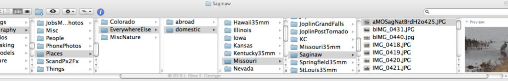
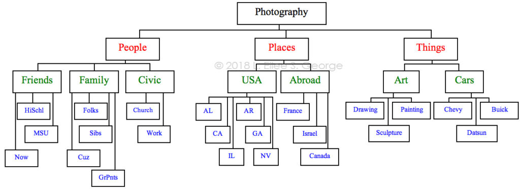
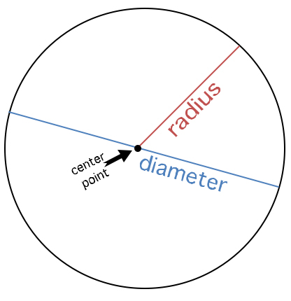
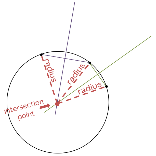
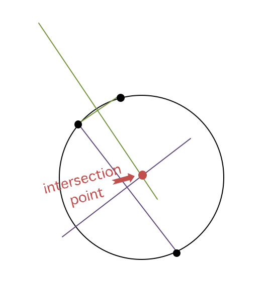
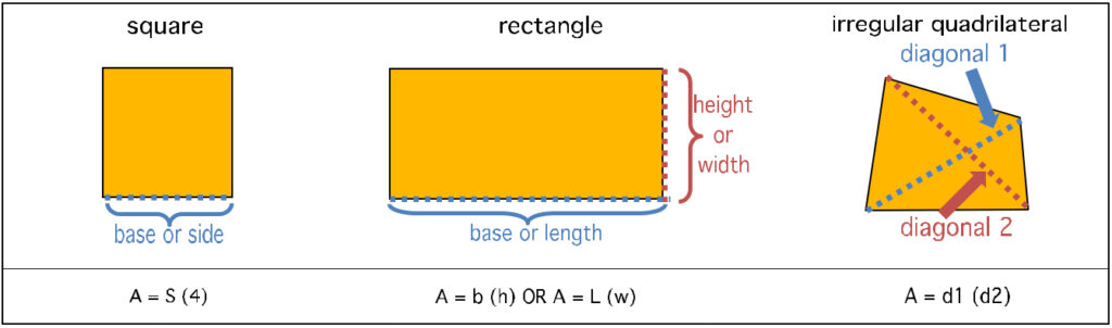
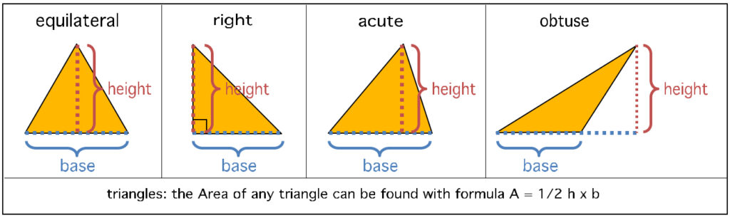
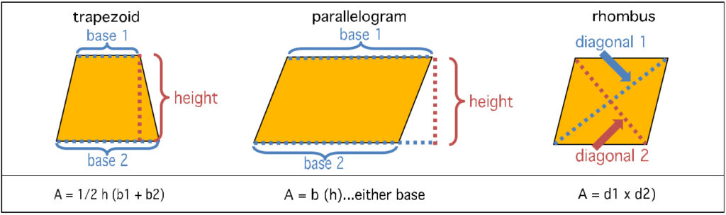
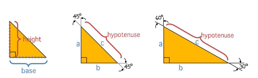
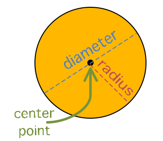

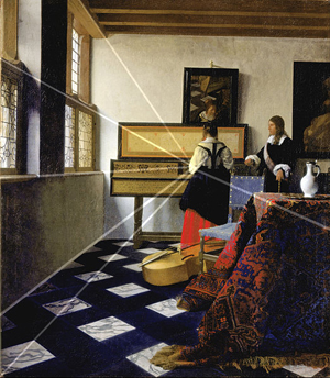
 I’ve used a lot of brands of acrylic paint, but

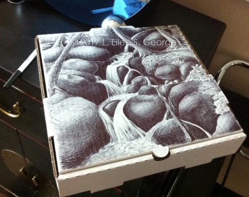
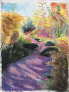
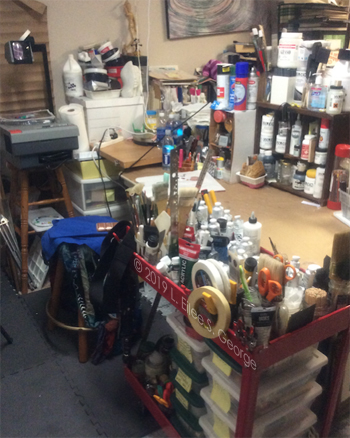
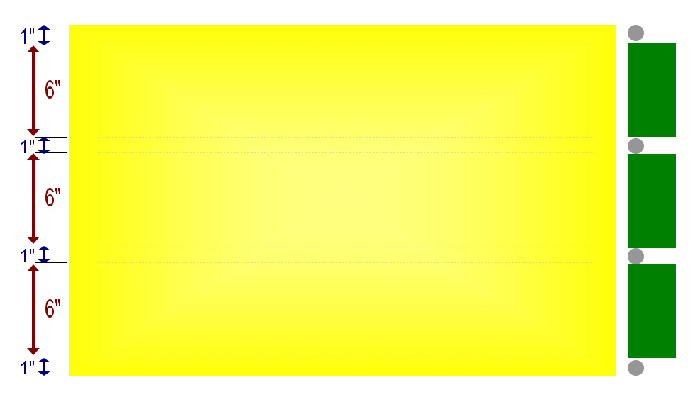
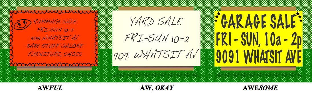
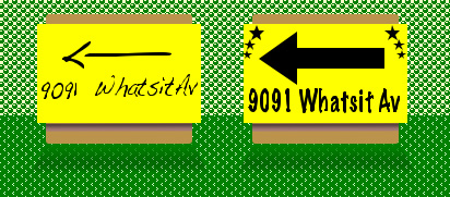
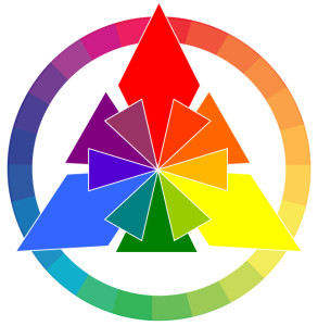
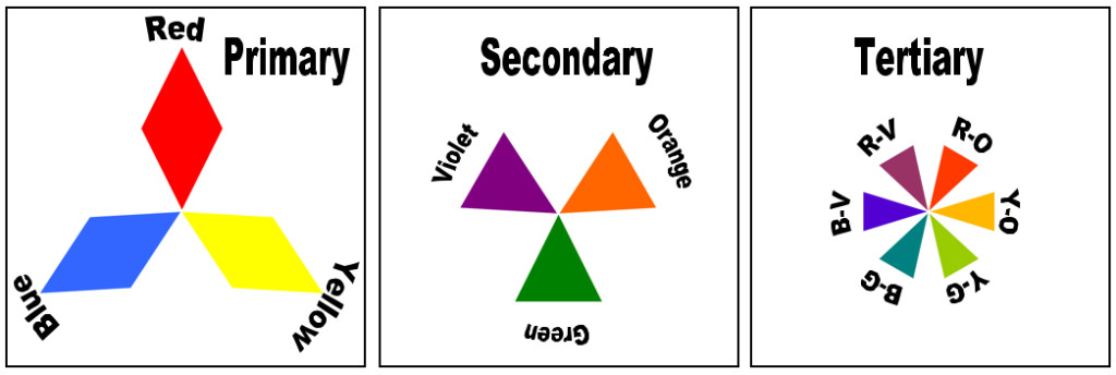
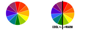
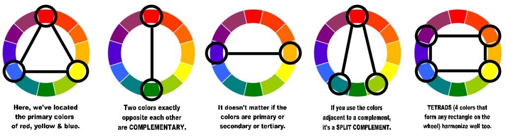

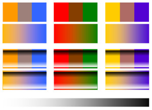

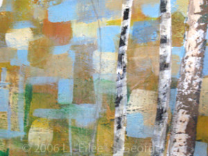
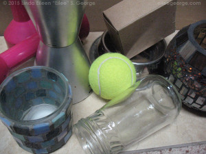
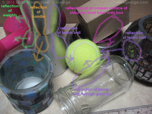
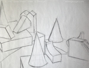
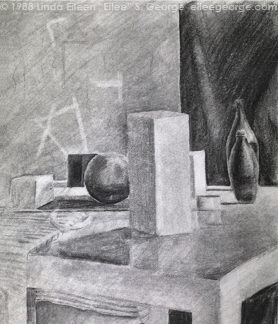


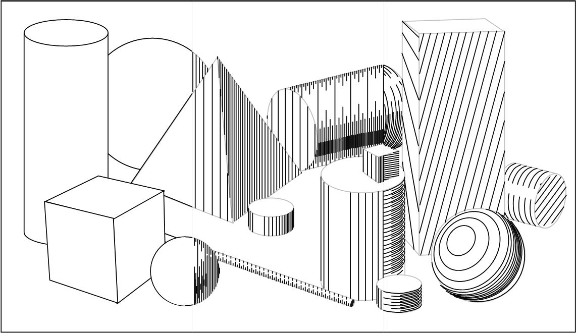