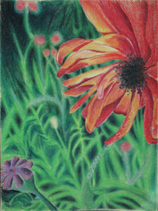
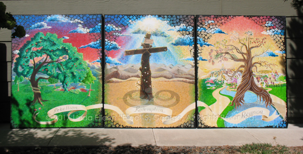
Three Trees is a work I had been considering for a few years, lacking any photographic resources from which to draw. There are three major trees in the story of God and man. Sure, there are other trees, like the fig tree that Jesus caused to die because it wasn’t bearing fruit, and the tree that temporarily shaded Jonah while he fought the Lord, but none so impacted the fate of mankind as the stories of man’s fall, and Jesus’s offer of salvation, and the promise of eternity in Heaven with God. The possible exception is the burning bush, and it’s not technically a tree, and deserves its own painting, and at any rate, I wanted to stick with a triptych to reference the Trinity.
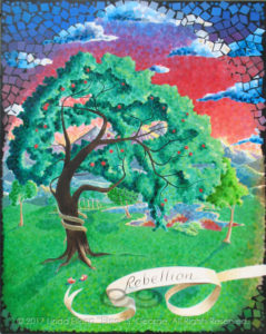
The first painting is The Tree of Knowledge of Good and Evil, the catalyst by which Adam, and through him, mankind, fell. This is The Rebellion. You can see the two pieces of fruit at the base of the tree, each with a bite removed from it, representing the Original Sin. The serpent wrapped around the trunk, returned to the scene of his crime, of course represents Satan and his power over mankind in this life.
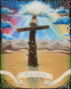
The second painting is The Tree of the Cross, the site where Jesus took the pain and punishment for all our sins in order to offer to us a way to salvation, to avoid damnation, to return to our right relationship with our Father. This is The Redemption.
I chose to depict the cross as a more naturalistic form that still harkens back to the tree from which it was constructed. Researchers have found that sometimes when finished timbers were in short supply, crucifixions were actually performed upon olive trees outlying the city, along the road as a warning to ne’er-do-wells. This tree is not the proud, straight cross often shown as the instrument of Jesus’ death; it, like Him, bows in humble obedience. At the top of the Cross is the sign with the inscription, “King of the Jews” in three languages: Hebrew, Latin, and Greek. At the base of the Cross is a dogwood sapling, long symbolic of the Cross in our own culture with its four blood-stained petals. It is indigenous to neither here nor Israel, but is native to the Mid-US from which the artist harkens.
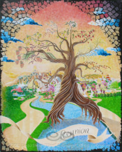
The third painting is The Tree of Life, which was removed from the Garden of Eden when man sinned, so that he would not eat of it and remain in a sinful state for eternity – thus giving him the chance to accept God’s gift of salvation and receive the reward of eternity with Him and all the kept promises of Heaven. This is The Reunion. The massive tree reappears in New Jerusalem, growing either side of the River of Life, which flows from the Almighty’s throne, bearing a bounty of twelve fruit and grains every month for the partaking by residents of this Holy place. Fruits depicted are not listed verbatim in the Bible, but research has given the artist a good guess with the Seven First Fruits and other plants native to the land at the time of Jesus’ life on earth among us. The Tree’s leaves heal the nations, represented by the City’s many architectural styles.
This triptych tells the story of God’s relationship with mankind in a succinct summary of major turning points, of mercy, discipline, and grace. It is told in the context of a Protestant Christian viewpoint of pure scripture in both the Old and New Testaments. The format of the paintings abstractly suggests Gothic stained glass windows and mosaic works (akin to those in cathedrals) to which my work was often compared even before this series; they are rendered in pigments derived from minerals of the earth onto canvas woven from plants of the earth by a human who was ultimately the result of another human rendered by God from the earth. I am honored to share the action of creation with my Creator, and joyful to share His Message and Promise with you.
– L. Eilee George
Prints of these works are available through special order. Contact the artist directlyhere.
When you have been creating art for *mmgfrgm* decades – ahem…you have sampled a LOT of different products, and found that some really perform well consistently, while others fall far short of that distinction. When you’re new to it, you kind of wish you had someone to guide you when looking at shelves of products; someone who is not compromised by the prospect of a sales commission. Here I am.
There are brands of sketchbooks I wouldn’t touch now because of the texture of the paper and the way it makes erasures smear rather than erase. There are colored pencils so waxy that the color saturation is all pastel, preventing any depth or contrast. There are paints that are of the consistency of tar and sand. If you’ve been burned by bad art supplies, your self-preservation takes over and catalogues what to avoid and what to seek. I thought I’d share my catalogue with you today.
In this post, I will mention brand names only of my favorites – not to suggest that there are no other good ones in each category that I will still use from time to time – and I will not name the ones that I dislike at all – indeed, a few of them have already gone out of business, since I’m sure many other artists felt about them the way that I did, or people just retired or got bought out. Nobody is paying me to say nice things about their product or company. If that ever changes, I will update the post to inform you of that development.
I guess I’ll go by medium.
PAINTING
I’ve used a lot of brands of acrylic paint, but Golden acrylic paints go on smooth “like buttah”. Where some brands are grainy and textured, Golden brand never lets me down, with a creamy consistency that makes mixing and painting a joy. For my purposes, I use heavy body paints, but they also offer fluid, open (for longer drying times, which I achieve instead with a combination of medium and a very small amount of retarding liquid), and high flow, which is for airbrushing now (use a respirator and ventilation please). I have not used every other brand out there, but now that I’ve tried Golden I don’t need to – I’m so impressed with its products that I won’t buy anything else now. They cost a little more, but you totally get what you paid for; it’s worth it. No more fighting grainy goo!
Golden Soft Gel is awesome for wet-in-wet and texture or isolation layers. You can get it in gloss, semi-gloss, or matte. The matte is a little harder to work, as it dries very quickly and leaves a bit more of an atmospheric fog behind – which is great if that’s the look you’re aiming for. I prefer semi-gloss myself. Gels also come in regular, heavy, extra heavy, and high solid textures; I haven’t tried all of these yet, and will update this section when I do. It takes a little getting used to doing a wet-in-wet with gel, because it goes on reasonably opaque (but dries clear), so you have to both envision what you’re doing without really seeing it at the time, and be open to serendipitous surprises. You can brush layers of it over a base layer of paint to make things look atmospheric. You can whip it up like frosting and then put paint into it while it’s still wet. You can do a dry-brush technique over it once it’s dry. It’s fabulous for creating an eerie sense of depth in 2-D.
Likewise, Golden Glazing Liquid is great for atmosphere in a much more consistent, delicate application. I’ve done some really nice lighting effects by applying multiple, slightly-tinted-with-paint layers over a painting to create a glowing light, blending around the edges; it’s also great for subtle transparent overlays of color to soften an area. Either way the results are magical. This is yet another product I can use to extend my drying time to facilitate much finer blending than I would be able to achieve with straight paint and water (too much water inhibits the polymers in the paint adhering to your work anyway). Yes, I’m a Golden fan.
Good old Prang watercolors are what I came through grade school with, and they’ve always been adequate for me. There are far fancier-looking ones out there named after great master artists, but I can’t say that watercolor has been a major focus for me personally. The one thing that irked me was painting around white areas, and that was remedied when I was introduced to (1) frisket (an example can be seen here but I haven’t tried this brand; my old one is no more), and (2) gouache, or opaque watercolors, which can come in tubes rather than trays – including white! Opaque watercolors sit on top of the paper and on each other, rather than soaking into the substrate. Winsor & Newton gouache has been perfect for my needs whether applied by brush or airbrush; I’ve never had a problem with it. I also like watercolor pencils, and have been experimenting with ones by Artist’s Loft of late. As far as the old-fashioned Prang paint tin is concerned, my all-time favorite is the one my brother custom decorated for me as a gift when I was in grade school; I refill the trays whenever I can.
Brushes are a matter of taste, and in my case, abuse. I don’t like to buy high-end brushes because I’m quite rough on them and it’s cost-prohibitive to always get the best if that’s your modus operandi. I’ve gotten adequate use out of the cheapest of brushes, but I aim for the middle ground as far as cost. I’m not loyal to any brand here: I use natural-hair brushes for watercolor and gouache, and synthetic ones for acrylic, except for fine blending applications. I keep a wide variety of styles and sizes for different uses. You’ll just have to experiment and find what works for you and your art.
Remember the cheap colored pencils you used in grade school? You could never get really dark, true colors out of them no matter how hard you colored. In some cases, sub-standard art supplies can only produce sub-standard art. Prismacolor pencils have the intensity of paint pigment, unlike those waxy, washed-out box-retail specials. The first time I used them it was like seeing for the first time after a veil had been lifted from before my eyes. I use them on white, black, and different colored papers as a base. They blend very well; they’re able to be quite opaque; they’re sturdy and bold. The only other good pencils out there are the ones that are copying them.
Vine charcoal is very versatile for unique styles and techniques. It’s put out by a lot of companies, and the one I used for some twenty years has long gone out of business, so I’ve switched to Art Alternatives, which is sold at many retailers and does the job. Some people seem to hate this stuff because it’s a little messy, but they haven’t learned to appreciate their potential. These little charred sticks allow you to wear them into the shape you need with a few strokes, and you can use their end or their side, or you can angle them to get a broad, velvety stroke. You can use them softly for light tones; they blend well with blending stumps (tortillons) or cotton balls, and they can mark down to a dark-medium value even though they’re still what I would call delicate. Add compressed or brick charcoal for deep darks to blend in with them; they work very well together (especially love General’s #15 Charcoal Kit). Combine them with kneaded erasers and you can do some real magic….
Kneaded erasers are the ultimate in control and technique for erasers. Not only can you mold and point them to erase in the tiniest corner of a drawing, you can turn them into a drawing and blending tool under the right conditions. They don’t leave crumbs, so you won’t need a brush or risk smearing your work with your hand swiping them away, and any little squiggles that do occur from aggressive erasing are easily picked up by the rest of the eraser and easily worked back in. They also don’t go “bad” (rock-hard, greasy, or otherwise useless) like many rubber erasers do with time. There are many great brands of kneaded erasers, but I trust Prismacolor ones most. I’ve also had good luck with General’s and Prang Design ones, and there are many more. Above I mentioned that these work well with vine charcoal. What I used to do a lot was to turn the vine charcoal on its side to make a nice all-over gray tone. Some drawings I would do that to the entire page before drawing anything. Then I’d lightly sketch some outlines of things with the tip of the vine charcoal. I’d figure out my light source and where highlights and such would be – and I’d take my kneaded eraser and erase out the highlights from the colored-gray background; you can also dab or roll them on surfaces for various degrees and textures of erasure. Then I’d darken shadows with a firmer pressure on the vine charcoal by using the tip, and for dark darks, I would move to a compressed charcoal pencil or brick charcoal and blend that in where appropriate. This works similar in concept to chalk and charcoal on gray paper, but you’ve made the paper gray, and it has a very cloudy, dreamy look. Another thing you can do, and this takes a bit of practice, is use a very charcoal-dirty and smooth area of the eraser to blend with (it doesn’t remove as much charcoal as a tortillon). Then when you need a fresh clean area for a starker, white erasure, you just stretch it, knead it, pull it inside-out and fold and mold it like Silly Putty to find and shape one tailor-fit to the area. This rejuvenating capacity renders this type of eraser good for use for many, many years. Brilliant!
Good old #2 pencils are fine for everyday drawing. I grew up using the ones with my dad’s job’s logo; never been without one. I still use them today, even though he’s gone and he had retired some twenty years ago. It’s kind of a comfort thing to hold onto them. In my artistic history, such commonplace implements pre-date my more official art tools. It forced me to do more with less: I can get all the light and dark I need from just a plain old #2 pencil. To be specific, I mean 2B…B leads are soft and can get pretty dark, and I never had a lot of use for H leads because I can use a B with a steady, soft touch (but H’s smear less, so there’s that). Sure, I have the fancy drawing pencils, but these are like an old loyal friend, and despite the existence of fantastic pencils out there and even in my studio (my old Venus pencils, and Pentalic brand), I always gravitate to one of Dad’s old pencils for old time’s sake, as I did several works for him with those, and continue to in spirit. So I guess you can choose supplies for sentimental cause.
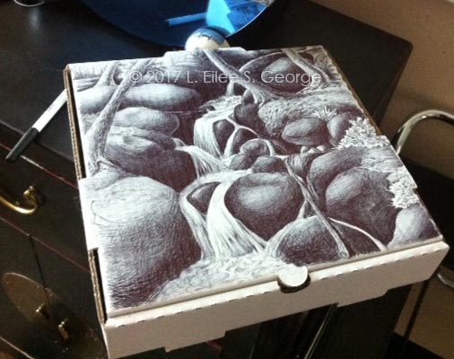
“Fall to Your Knees” – ball-point pen on a pizza box, L. Eilee S. George
I loves me some Bic ball-point pens for drawing! When I’m on the go and just must draw something now I will grab anything to draw with and on. These were a nice surprise; I love how adaptable they are, especially when you control the pressure you’re using (there’s more than one darkness, folks). I don’t even use their fancy ones; I use the discount writing ones, but this brand is better than lesser-known brands that can skip and blob and ruin your doodle. Bic pens are ubiquitous and affordable choice you can get anywhere. If people can spray-paint abandoned buildings, then I can pen-draw on used pizza boxes!
Strathmore produces sketch paper with just enough tooth that it is smear-resistant. Time was that I would buy any cheap sketchpad out there, but I learned my lesson. Cheap papers smear irreparably if you try to erase; they lack tooth and can ruin some otherwise good drawings. Yes, occasionally artists do have to erase – especially if you block in some wire-frame type structure lines that later need to be removed. Not all sketch papers are made the same. Some of them just are not good, and when I find something I like, I stick to it. Strathmore isn’t quite as high-end as Canson (which is truly excellent), but it is affordable in bulk and perfectly fine for any drawing needs, and comes in a vast array of types for different media uses.
I have to say I haven’t worked much with pastels (do not confuse with colored chalk) and oil pastels (I’ve used Grumbacher a little), but they seem pretty consistent from brand to brand. I’ve used Faber Castel Designno, now they’re called Prismacolor Nupastels and the more compressed Prang Pastello pastels; the former is firmer and seems a little easier to blend for me. I definitely recommend using them with a pastel-specific paper with a very coarse tooth for better blending capacity and durability; Canson has a great selection of pastel papers. Some of you artists out there may argue that pastels should be under the paint category instead of the drawing category, but you will not win that argument with me. It’s still a dry medium.
OTHER STUFF
Occasionally I still construct models or sculptures using acrylic sheet and super glue. Sometimes working with it, it gets scratched. Novusplasticpolish is fantastic for buffing small scratches out of acrylic. It comes in different viscosities for different depths of scars, and it requires some elbow grease and a little patience, but it can save your project outright.
Epoxy works best for joints needing a tiny bit of flexibility. I’ve used various super glues, because I like the wicking properties to get them into tiny cracks, as well as accelerators to get glue curing quickly, but these can become very brittle on non-porous surfaces. If your project needs to shift a little or is going to be under strain, an epoxy is often a stronger, more flexible bond. I don’t really have a brand preference on this because I’ve never run into a bad one; JB Weld, Loctite, and Gorilla all make good versions as well as others. You want the two-part type that you mix together. Don’t be intimidated; it’s really easy.
When you want to mount something to a board, spray mount is the way to go. For years people used rubber cement, and I hated it going through university. It was what all our professors used when they were going to school, so it’s what they had us use. But rubber cement is terribly messy and lingeringly fumy; the built-in brush always gets messed up; it’s hard to keep the can clean enough to close and not partially dry up; it doesn’t age well; it gets stringy and goes on in blobs and is hard to apply smoothly so that it doesn’t show through with bumps. On top of that, after twenty years, the project fails completely and the rubber cement doesn’t stick any longer. Then the parts are stained with some nasty brown smearing that won’t take other adhesives to put it back together. But one professor introduced spray mount to us, and it was like a godsend. 3M Super 77 spray mount renders the old-school rubber cement “boogers” obsolete. Yes, you should have a spray booth, or point it downwind, outside, with a large disposable drop cloth or liberally spread newspapers for overspray – but it goes on smoothly, and none of my projects with this have failed. You can even carefully lift, shift and re-position the work you’re mounting at first, in case you didn’t get it aligned quite right, so that short initial flexibility in curing time is another super perk.
X-Acto is X-actly what’s needed, but Olfa kicks butt too. I’ve used X-Acto for years and love all the different blade attachments that come with them, not to mention the custom carrying case. Sometimes I do paper cutting and it’s so much more accurate than using scissors. While I was a modelmaker I had chance to use a retractable Olfa blade – the kind with the scored blade where you can use pliers to break a dull region off the end, to have a fresh new blade where you broke it off – and I loved the idea. Since it’s retractable it’s easily transportable, and since sometimes I’m doing little set-design jobs off-site, that’s important. It’s also easy and safe to store when not in use.
More modern media also reside in my portfolio. Photography is a supplement art to my stickier medias, as I do a lot of my own photography of my work as well as art photography for its own sake. I use a Canon Rebel T3i for the really good stuff, and a Canon A630 for quick pix. I miss my old manual Minolta X-700; it was damaged by someone I once lent it to. But that forced me to learn that digital photography is far cheaper than film and developing. AdobePhotoshop is a vital tool with my digital photos, as I use it for color correction in the case of color correction (say, a green tint from an old fluorescent fixture), for cropping, for stitching things together, and for artful editing of all sorts when I’m feeling really experimental. I use Adobe Illustrator for vector graphics like logos I design in my branding business. I use Adobe InDesign for a lot of my graphics jobs, and of course I design all of my web sites on a WordPress platform (if you’re not a web DIY’er and don’t want to self-host, visit here instead).
WHERE TO BUY
I certainly haven’t shopped everywhere, or anywhere online for that matter, but from my artist friends I’ve heard good things about JerrysArtarama.com, CheapJoes.com and DickBlick.com. There are other online venues that are, I assume, also good, and others who certainly too big to need my humble promotion. Brick-and-mortar stores I’ve gone to of course include Hobby Lobby and Michael’s, as well as the Denver giant, Meininger. Some supplies can be gotten (perhaps more cheaply) at hardware stores like Home Depot, Lowe’s or Ace, or at office supply stores like OfficeDepot or Staples, or even big box discount stores, supposedly. I’ve found that framing and hanging hardware is much cheaper at hardware stores, but I’ve heard it’s even cheaper online, and you can get it discounted in bulk. Cameras I’ve picked up both at specialty shops and big-box retailers, and software I get from the developers.
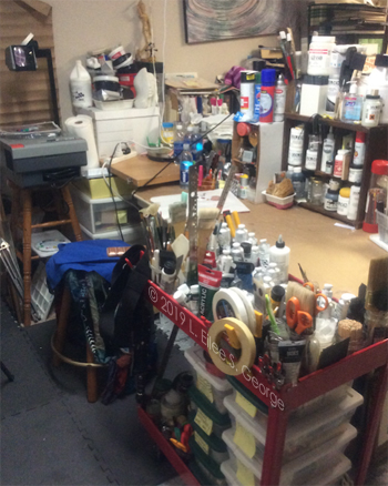
Part of Eilee’s art studio
Please email me via my CONTACT page if you have questions about other media; I haven’t mentioned every category that I work in on this post. I have experience in various types and media of sculpture, ceramics, and I’ve recently procured two kilns and a lot of china-painting supplies from my mother, who has retired from the practice after creating a beautiful legacy of work (I’ll be teaching myself and my mother in-law this art after I finish a few commissions and we both find the time). In more traditional painting, I also have worked in oils, but acrylics are my preference, since they can be manipulated to resemble various other types of painting, and are far less toxic than oils and don’t require the ventilation that oils would demand to be truly safe (turpentine, anyone?). I understand that there are turpentine replacements out there, but they are still stinky, and I just plain like to work faster than oils do. The only time acrylics are toxic is when basically atomized through an airbrush (don’t just do that unless you want something like black lung disease! Use gouache instead, and always use a respirator!) So, yeah, I’m kind of prejudiced against oils, although I did some lovely ones back in the day. If you’re willing to deal with their challenges, more power to you; it’s just not me. It’s probably best to consult someone besides me on oils.
The links in this article are, as much as I could manage it, to the original manufacturer rather than a retail destination, which I only provided when I couldn’t find the maker. I cannot guarantee the quality of any products I have reviewed here, as companies sometimes change their processes or even go out of business, without consulting little old me – nor do I guarantee forever function of any of the links here, as some webmasters seem to like to move stuff around arbitrarily, and I can’t police all these links every week. My apologies in advance for any links that may become outdated in the future. I would like to point out again that there are no ads on my site and none of these companies have compensated me in any way for these recommendations (they likely don’t know I exist); these are the same recommendations I would make to any friend, and I don’t get paid for that either. 🙂
Truth be told, to help fund my work, I am very interested in learning how to monetize the site eventually, and should any of these links become income in the future, I will let you know in a short legal disclaimer statement in close proximity to the relevant reference. Until then, I hope you have found something helpful here. 😉
I have heard some people actually be less willing to do something because of the mess involved. However, the old axiom holds true that an ounce of prevention is worth a ton of cure – while perhaps not a literal ton, at least it does save much frustration and extra toil.
Let’s give some examples of what I mean.
Art time is no time to wear a prom formal or your favorite shoes. Have some old sweats and an old work shirt or smock available for painting days. I’ve used old shirts of my dad’s, shop aprons, or whatever I could find depending on the job being done and the temperature in which it is done (sometimes I paint outdoors). I have designated “paint socks”, since shoes aren’t really necessary in the studio, but I don’t care to stick to the floor in my bare feet either. Of course, if you’re working with heavier things than paint, old flip-flops or steel-toed boots may be appropriate.
I realize that many who wish to paint or sculpt or carve (or whatever) have neither an appropriate room at home to convert to a studio, nor the budget to rent a dedicated space elsewhere. I have made a temporary studio out of my living room in the past, and been able to protect everything there. In my current home I have a studio in the basement, and I added better lighting as well as a couple of large scraps of linoleum to protect the existing floor.
Large, clear plastic drop “cloths” are incredibly cheap at the hardware store, and can be re-used over and over. Even the plastic that is shrink-wrapped over your canvases can be used to cover smaller work surfaces, although this stuff is flimsy and will likely last only one or two uses, if you’re careful not to tear it while removing it from the canvas to begin with.
If you’re particular about preserving your nail work, stock up on latex gloves – there are plenty of sizes available and you can get them either powdered to facilitate putting them on, or non-powdered, for those whose skin is susceptible to rashes arising from clogged pores when the powder mixes with sweat (they’re not really that much harder to don). I prefer function to form as far as my hands go, so I just use gloves to avoid painful chapping if I’m doing a painting marathon or using something that requires lye soap and steel wool to scrub off.
Having long hair is a definite problem when working on anything messy, so I have an arsenal of implements to pull it back, up, and away from my face and work. It’s long enough to sit on if I don’t, so it usually takes more than one tool to handle it all. I sometimes finish it off with a bandana over it, especially if I do any spray-painting.
Safety equipment is essential while spraying anything, as well as if you’re cutting anything. I always have in stock safety goggles, dust masks, work gloves, and knee pads (to ease working on large pieces on the studio/garage floors). Always understand directions to use any equipment you employ in making art, and make sure it is in good working order.
If you’re painting in a medium that will require brush cleaner to get it out of your brushes, by all means, make sure you have ample supply ready, along with some jars and a good sink handy – before you start working. Wash your brushes right after finishing your work – or even if you plan to come back later – so they’re not ruined (leaving them in there bends the hairs). It’s so much cheaper than replacing them.
If you’re working in a clay that needs to dry slowly and evenly, make sure first that you have some plastic to wrap your work-in-progress or finished work awaiting the kiln, so that it doesn’t crack and then explode in the kiln. If you’re sculpting in plaster but can’t finish building up the form in one session, be sure you have a vessel large enough to soak the entire piece in before you add more plaster to it, or the existing dry plaster will suck all the water out of the second coat and prevent adhesion. If your sculpture needs an armature to give it strength, make sure it’s not made of metal that will rust from the plaster’s moisture or wood that will rot of it, or use a tested method of sealing the skeleton first, lest your sculpture stain or fail.
You know…stuff like that.
Being prepared also means avoiding health issues while working in many media: understand the dangers of whatever you’re using. If you want to airbrush, never use acrylic without a full respirator and a strong ventilation system near the application site. Sprayed acrylic is the only form in which it is toxic – this is because it breaks down into polymers that are so fine that when they are inhaled they clog up the lungs – forever – like black lung disease suffered by miners. It is far preferable to use gouache or enamels, and still with the respirator and the ventilation, by the way. If you’re using some form of permanent glue, be prepared with a solvent just in case some of your own parts take an unexpected liking to each other. If you’re working in oils you need ventilation, too, because things like turpentine are very bad things to breathe. Spray paint should obviously be used with the same precautions as airbrushing. Read all cautions with each product and tool you utilize.
I have actually seen a coworker drill a hole through his own thumb because he thought a few seconds was too long to clamp his work down instead of holding it. As much as the image sticks in my mind, I’m sure the victim has a daily reminder the rest of his life. Always secure/guide your work when using tools! Never put yourself in harm’s way; the price you pay may be permanent. Sometimes the ounce of prevention is preferable because there IS no cure.
Feel free to use the Contact form if you have other specific questions, or do a few detailed searches online or consult with qualified experts. Your best tool is common sense. If you don’t know about something, then knowing how to find out – and using that information properly – is the key to success.
I did an audit and I run a simple, clean site. WordPress puts cookies only when signing in or commenting (you can't do either here so there's no cookies to accept or deny), and none of my plugins use cookies. If you want cookies, go to the bakery!
You can revoke your consent any time using the Revoke consent button.

 I’ve used a lot of brands of acrylic paint, but