
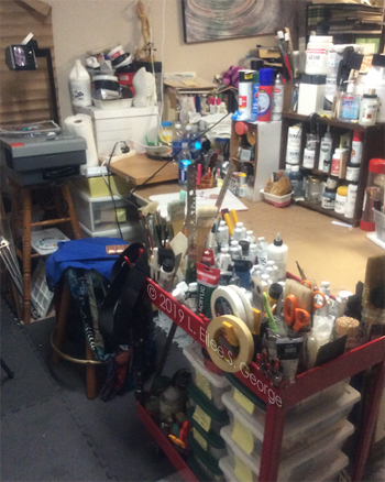
Eilee’s Favorite Supplies & How They Earned the Distinction
When you have been creating art for *mmgfrgm* decades – ahem…you have sampled a LOT of different products, and found that some really perform well consistently, while others fall far short of that distinction. When you’re new to it, you kind of wish you had someone to guide you when looking at shelves of products; someone who is not compromised by the prospect of a sales commission. Here I am.
There are brands of sketchbooks I wouldn’t touch now because of the texture of the paper and the way it makes erasures smear rather than erase. There are colored pencils so waxy that the color saturation is all pastel, preventing any depth or contrast. There are paints that are of the consistency of tar and sand. If you’ve been burned by bad art supplies, your self-preservation takes over and catalogues what to avoid and what to seek. I thought I’d share my catalogue with you today.
In this post, I will mention brand names only of my favorites – not to suggest that there are no other good ones in each category that I will still use from time to time – and I will not name the ones that I dislike at all – indeed, a few of them have already gone out of business, since I’m sure many other artists felt about them the way that I did, or people just retired or got bought out. Nobody is paying me to say nice things about their product or company. If that ever changes, I will update the post to inform you of that development.
I guess I’ll go by medium.
PAINTING
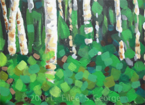 I’ve used a lot of brands of acrylic paint, but Golden acrylic paints go on smooth “like buttah”. Where some brands are grainy and textured, Golden brand never lets me down, with a creamy consistency that makes mixing and painting a joy. For my purposes, I use heavy body paints, but they also offer fluid, open (for longer drying times, which I achieve instead with a combination of medium and a very small amount of retarding liquid), and high flow, which is for airbrushing now (use a respirator and ventilation please). I have not used every other brand out there, but now that I’ve tried Golden I don’t need to – I’m so impressed with its products that I won’t buy anything else now. They cost a little more, but you totally get what you paid for; it’s worth it. No more fighting grainy goo!
Golden Soft Gel is awesome for wet-in-wet and texture or isolation layers. You can get it in gloss, semi-gloss, or matte. The matte is a little harder to work, as it dries very quickly and leaves a bit more of an atmospheric fog behind – which is great if that’s the look you’re aiming for. I prefer semi-gloss myself. Gels also come in regular, heavy, extra heavy, and high solid textures; I haven’t tried all of these yet, and will update this section when I do. It takes a little getting used to doing a wet-in-wet with gel, because it goes on reasonably opaque (but dries clear), so you have to both envision what you’re doing without really seeing it at the time, and be open to serendipitous surprises. You can brush layers of it over a base layer of paint to make things look atmospheric. You can whip it up like frosting and then put paint into it while it’s still wet. You can do a dry-brush technique over it once it’s dry. It’s fabulous for creating an eerie sense of depth in 2-D.
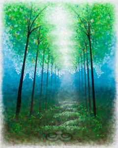
Likewise, Golden Glazing Liquid is great for atmosphere in a much more consistent, delicate application. I’ve done some really nice lighting effects by applying multiple, slightly-tinted-with-paint layers over a painting to create a glowing light, blending around the edges; it’s also great for subtle transparent overlays of color to soften an area. Either way the results are magical. This is yet another product I can use to extend my drying time to facilitate much finer blending than I would be able to achieve with straight paint and water (too much water inhibits the polymers in the paint adhering to your work anyway). Yes, I’m a Golden fan.
Good old Prang watercolors are what I came through grade school with, and they’ve always been adequate for me. There are far fancier-looking ones out there named after great master artists, but I can’t say that watercolor has been a major focus for me personally. The one thing that irked me was painting around white areas, and that was remedied when I was introduced to (1) frisket (an example can be seen here but I haven’t tried this brand; my old one is no more), and (2) gouache, or opaque watercolors, which can come in tubes rather than trays – including white! Opaque watercolors sit on top of the paper and on each other, rather than soaking into the substrate. Winsor & Newton gouache has been perfect for my needs whether applied by brush or airbrush; I’ve never had a problem with it. I also like watercolor pencils, and have been experimenting with ones by Artist’s Loft of late. As far as the old-fashioned Prang paint tin is concerned, my all-time favorite is the one my brother custom decorated for me as a gift when I was in grade school; I refill the trays whenever I can.
Brushes are a matter of taste, and in my case, abuse. I don’t like to buy high-end brushes because I’m quite rough on them and it’s cost-prohibitive to always get the best if that’s your modus operandi. I’ve gotten adequate use out of the cheapest of brushes, but I aim for the middle ground as far as cost. I’m not loyal to any brand here: I use natural-hair brushes for watercolor and gouache, and synthetic ones for acrylic, except for fine blending applications. I keep a wide variety of styles and sizes for different uses. You’ll just have to experiment and find what works for you and your art.
DRAWING
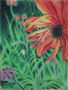
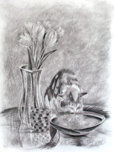
Remember the cheap colored pencils you used in grade school? You could never get really dark, true colors out of them no matter how hard you colored. In some cases, sub-standard art supplies can only produce sub-standard art. Prismacolor pencils have the intensity of paint pigment, unlike those waxy, washed-out box-retail specials. The first time I used them it was like seeing for the first time after a veil had been lifted from before my eyes. I use them on white, black, and different colored papers as a base. They blend very well; they’re able to be quite opaque; they’re sturdy and bold. The only other good pencils out there are the ones that are copying them.
Vine charcoal is very versatile for unique styles and techniques. It’s put out by a lot of companies, and the one I used for some twenty years has long gone out of business, so I’ve switched to Art Alternatives, which is sold at many retailers and does the job. Some people seem to hate this stuff because it’s a little messy, but they haven’t learned to appreciate their potential. These little charred sticks allow you to wear them into the shape you need with a few strokes, and you can use their end or their side, or you can angle them to get a broad, velvety stroke. You can use them softly for light tones; they blend well with blending stumps (tortillons) or cotton balls, and they can mark down to a dark-medium value even though they’re still what I would call delicate. Add compressed or brick charcoal for deep darks to blend in with them; they work very well together (especially love General’s #15 Charcoal Kit). Combine them with kneaded erasers and you can do some real magic….
Kneaded erasers are the ultimate in control and technique for erasers. Not only can you mold and point them to erase in the tiniest corner of a drawing, you can turn them into a drawing and blending tool under the right conditions. They don’t leave crumbs, so you won’t need a brush or risk smearing your work with your hand swiping them away, and any little squiggles that do occur from aggressive erasing are easily picked up by the rest of the eraser and easily worked back in. They also don’t go “bad” (rock-hard, greasy, or otherwise useless) like many rubber erasers do with time. There are many great brands of kneaded erasers, but I trust Prismacolor ones most. I’ve also had good luck with General’s and Prang Design ones, and there are many more. Above I mentioned that these work well with vine charcoal. What I used to do a lot was to turn the vine charcoal on its side to make a nice all-over gray tone. Some drawings I would do that to the entire page before drawing anything. Then I’d lightly sketch some outlines of things with the tip of the vine charcoal. I’d figure out my light source and where highlights and such would be – and I’d take my kneaded eraser and erase out the highlights from the colored-gray background; you can also dab or roll them on surfaces for various degrees and textures of erasure. Then I’d darken shadows with a firmer pressure on the vine charcoal by using the tip, and for dark darks, I would move to a compressed charcoal pencil or brick charcoal and blend that in where appropriate. This works similar in concept to chalk and charcoal on gray paper, but you’ve made the paper gray, and it has a very cloudy, dreamy look. Another thing you can do, and this takes a bit of practice, is use a very charcoal-dirty and smooth area of the eraser to blend with (it doesn’t remove as much charcoal as a tortillon). Then when you need a fresh clean area for a starker, white erasure, you just stretch it, knead it, pull it inside-out and fold and mold it like Silly Putty to find and shape one tailor-fit to the area. This rejuvenating capacity renders this type of eraser good for use for many, many years. Brilliant!
Good old #2 pencils are fine for everyday drawing. I grew up using the ones with my dad’s job’s logo; never been without one. I still use them today, even though he’s gone and he had retired some twenty years ago. It’s kind of a comfort thing to hold onto them. In my artistic history, such commonplace implements pre-date my more official art tools. It forced me to do more with less: I can get all the light and dark I need from just a plain old #2 pencil. To be specific, I mean 2B…B leads are soft and can get pretty dark, and I never had a lot of use for H leads because I can use a B with a steady, soft touch (but H’s smear less, so there’s that). Sure, I have the fancy drawing pencils, but these are like an old loyal friend, and despite the existence of fantastic pencils out there and even in my studio (my old Venus pencils, and Pentalic brand), I always gravitate to one of Dad’s old pencils for old time’s sake, as I did several works for him with those, and continue to in spirit. So I guess you can choose supplies for sentimental cause.
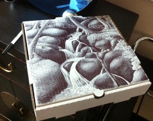
I loves me some Bic ball-point pens for drawing! When I’m on the go and just must draw something now I will grab anything to draw with and on. These were a nice surprise; I love how adaptable they are, especially when you control the pressure you’re using (there’s more than one darkness, folks). I don’t even use their fancy ones; I use the discount writing ones, but this brand is better than lesser-known brands that can skip and blob and ruin your doodle. Bic pens are ubiquitous and affordable choice you can get anywhere. If people can spray-paint abandoned buildings, then I can pen-draw on used pizza boxes!
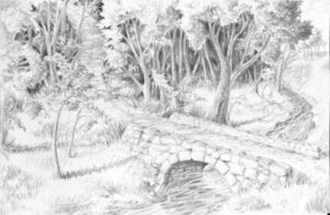
Strathmore produces sketch paper with just enough tooth that it is smear-resistant. Time was that I would buy any cheap sketchpad out there, but I learned my lesson. Cheap papers smear irreparably if you try to erase; they lack tooth and can ruin some otherwise good drawings. Yes, occasionally artists do have to erase – especially if you block in some wire-frame type structure lines that later need to be removed. Not all sketch papers are made the same. Some of them just are not good, and when I find something I like, I stick to it. Strathmore isn’t quite as high-end as Canson (which is truly excellent), but it is affordable in bulk and perfectly fine for any drawing needs, and comes in a vast array of types for different media uses.
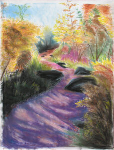
I have to say I haven’t worked much with pastels (do not confuse with colored chalk) and oil pastels (I’ve used Grumbacher a little), but they seem pretty consistent from brand to brand. I’ve used Faber Castel Design no, now they’re called Prismacolor Nupastels and the more compressed Prang Pastello pastels; the former is firmer and seems a little easier to blend for me. I definitely recommend using them with a pastel-specific paper with a very coarse tooth for better blending capacity and durability; Canson has a great selection of pastel papers. Some of you artists out there may argue that pastels should be under the paint category instead of the drawing category, but you will not win that argument with me. It’s still a dry medium.
OTHER STUFF
Occasionally I still construct models or sculptures using acrylic sheet and super glue. Sometimes working with it, it gets scratched. Novus plastic polish is fantastic for buffing small scratches out of acrylic. It comes in different viscosities for different depths of scars, and it requires some elbow grease and a little patience, but it can save your project outright.
Epoxy works best for joints needing a tiny bit of flexibility. I’ve used various super glues, because I like the wicking properties to get them into tiny cracks, as well as accelerators to get glue curing quickly, but these can become very brittle on non-porous surfaces. If your project needs to shift a little or is going to be under strain, an epoxy is often a stronger, more flexible bond. I don’t really have a brand preference on this because I’ve never run into a bad one; JB Weld, Loctite, and Gorilla all make good versions as well as others. You want the two-part type that you mix together. Don’t be intimidated; it’s really easy.
When you want to mount something to a board, spray mount is the way to go. For years people used rubber cement, and I hated it going through university. It was what all our professors used when they were going to school, so it’s what they had us use. But rubber cement is terribly messy and lingeringly fumy; the built-in brush always gets messed up; it’s hard to keep the can clean enough to close and not partially dry up; it doesn’t age well; it gets stringy and goes on in blobs and is hard to apply smoothly so that it doesn’t show through with bumps. On top of that, after twenty years, the project fails completely and the rubber cement doesn’t stick any longer. Then the parts are stained with some nasty brown smearing that won’t take other adhesives to put it back together. But one professor introduced spray mount to us, and it was like a godsend. 3M Super 77 spray mount renders the old-school rubber cement “boogers” obsolete. Yes, you should have a spray booth, or point it downwind, outside, with a large disposable drop cloth or liberally spread newspapers for overspray – but it goes on smoothly, and none of my projects with this have failed. You can even carefully lift, shift and re-position the work you’re mounting at first, in case you didn’t get it aligned quite right, so that short initial flexibility in curing time is another super perk.
X-Acto is X-actly what’s needed, but Olfa kicks butt too. I’ve used X-Acto for years and love all the different blade attachments that come with them, not to mention the custom carrying case. Sometimes I do paper cutting and it’s so much more accurate than using scissors. While I was a modelmaker I had chance to use a retractable Olfa blade – the kind with the scored blade where you can use pliers to break a dull region off the end, to have a fresh new blade where you broke it off – and I loved the idea. Since it’s retractable it’s easily transportable, and since sometimes I’m doing little set-design jobs off-site, that’s important. It’s also easy and safe to store when not in use.
More modern media also reside in my portfolio. Photography is a supplement art to my stickier medias, as I do a lot of my own photography of my work as well as art photography for its own sake. I use a Canon Rebel T3i for the really good stuff, and a Canon A630 for quick pix. I miss my old manual Minolta X-700; it was damaged by someone I once lent it to. But that forced me to learn that digital photography is far cheaper than film and developing. Adobe Photoshop is a vital tool with my digital photos, as I use it for color correction in the case of color correction (say, a green tint from an old fluorescent fixture), for cropping, for stitching things together, and for artful editing of all sorts when I’m feeling really experimental. I use Adobe Illustrator for vector graphics like logos I design in my branding business. I use Adobe InDesign for a lot of my graphics jobs, and of course I design all of my web sites on a WordPress platform (if you’re not a web DIY’er and don’t want to self-host, visit here instead).
WHERE TO BUY
I certainly haven’t shopped everywhere, or anywhere online for that matter, but from my artist friends I’ve heard good things about JerrysArtarama.com, CheapJoes.com and DickBlick.com. There are other online venues that are, I assume, also good, and others who certainly too big to need my humble promotion. Brick-and-mortar stores I’ve gone to of course include Hobby Lobby and Michael’s, as well as the Denver giant, Meininger. Some supplies can be gotten (perhaps more cheaply) at hardware stores like Home Depot, Lowe’s or Ace, or at office supply stores like OfficeDepot or Staples, or even big box discount stores, supposedly. I’ve found that framing and hanging hardware is much cheaper at hardware stores, but I’ve heard it’s even cheaper online, and you can get it discounted in bulk. Cameras I’ve picked up both at specialty shops and big-box retailers, and software I get from the developers.
Please email me via my CONTACT page if you have questions about other media; I haven’t mentioned every category that I work in on this post. I have experience in various types and media of sculpture, ceramics, and I’ve recently procured two kilns and a lot of china-painting supplies from my mother, who has retired from the practice after creating a beautiful legacy of work (I’ll be teaching myself and my mother in-law this art after I finish a few commissions and we both find the time). In more traditional painting, I also have worked in oils, but acrylics are my preference, since they can be manipulated to resemble various other types of painting, and are far less toxic than oils and don’t require the ventilation that oils would demand to be truly safe (turpentine, anyone?). I understand that there are turpentine replacements out there, but they are still stinky, and I just plain like to work faster than oils do. The only time acrylics are toxic is when basically atomized through an airbrush (don’t just do that unless you want something like black lung disease! Use gouache instead, and always use a respirator!) So, yeah, I’m kind of prejudiced against oils, although I did some lovely ones back in the day. If you’re willing to deal with their challenges, more power to you; it’s just not me. It’s probably best to consult someone besides me on oils.
The links in this article are, as much as I could manage it, to the original manufacturer rather than a retail destination, which I only provided when I couldn’t find the maker. I cannot guarantee the quality of any products I have reviewed here, as companies sometimes change their processes or even go out of business, without consulting little old me – nor do I guarantee forever function of any of the links here, as some webmasters seem to like to move stuff around arbitrarily, and I can’t police all these links every week. My apologies in advance for any links that may become outdated in the future. I would like to point out again that there are no ads on my site and none of these companies have compensated me in any way for these recommendations (they likely don’t know I exist); these are the same recommendations I would make to any friend, and I don’t get paid for that either. 🙂
Truth be told, to help fund my work, I am very interested in learning how to monetize the site eventually, and should any of these links become income in the future, I will let you know in a short legal disclaimer statement in close proximity to the relevant reference. Until then, I hope you have found something helpful here. 😉
– Eilee
All content on this site © 2013-2018/present L. Eilee S. George; all rights reserved.
 Location:
  I’m Eilee George, and I like to write anecdotal and how-to blog posts in several creative areas. A lot of my art lesson posts are collected under the Art menu heading above, but you can find them here, too, along with a lot of other topics. I am a strong believer that ANYONE can draw if they want to learn – it’s a set of skills and principles like anything else. As a prolific writer (although not always online), I prefer to use an unstructured, informal sort of prose as my writing style; thus I chose “prose” over the word “blog” in the menu tab title…but it is essentially a blog. On my own time, I write short stories, essays and lots of poetry and songs. Here, I try to categorize topics by media. The following table of contents will, for now, serve only as a teaser as to what you may be able to look forward to reading later on, if you’re continuing in your creative quest and if I find more time to write; some things may change. If you see a link I’ve already posted it. I’ll throw other unplanned entries in as special events occur. If the presentation gets confusing, shoot me an email