Month: May 2013

And We’re Live….

And We’re Live….

Well, it has been a fantastic adventure designing this new site, just as it was to have done the old one. I must say I have gotten no less than stellar customer service from my hosting provider; I could not have pulled this site off as fast as I did (well less than a week with lots of long breaks) without the assistance of many of their dedicated employees, who never once made me feel like I asked a “stupid” question (although I’m quite sure I did). Thank you GoDaddy! (Disclaimer: I get no compensation for saying this; I didn’t even tell them I was going to say this; it’s just an honest opinion. I just happen to believe in giving kudos in a world where too many folks only complain, that’s all.)

I had studied xhtml and CSS somewhat myself, but knowing code is a little different than knowing how it all works and goes live – it’s probably really easy for some, but when you’re unfamiliar with it, it’s all very mysterious. Really I just needed a little kick into foreign territory and I adapted quickly after all my fear and whining subsided. It’s good to know that both hemispheres of my brain are still working.

My “old” site (I had designed it a long time ago but only went live with it earlier this year) was designed in the now-defunct FrontPage. Had I known it would be a pain to edit and maintain, I might have used something else to begin with – but it was a good first web-building experience nonetheless. It was sort of like coursework for me…since I never took a single class in this stuff – just bought a giant book on codes and dove in. Now I’ve learned so much more about WordPress.

Even back then, I thought that I might be able to design sites for others…now that I’m working in WordPress, I know I can. I can keep it simple, and can maintain it for clients as well, if they get (or tell me) the content and images that they want on it. I’m a photographer and typographer, and I can do a wide variety of computer graphics and generated every background, animated GIF, and other type of image on both of the “eilee” sites from scratch. I’m good at organizing information and writing intelligent, articulate and grammatically competent copy. I am learning more about SEO every week, and I’m working on additional site aspects for the future.

I already have three other sites lined up to build after the festival (see previous post). Not bad.


All content on this site © 2013-2018/present L. Eilee S. George; all rights reserved.


Art Festival News

Art Festival News

I recently joined the legions of artists who show at art festivals. I had put it off because of the up-front expense involved, but was encouraged by artist friends that it would be fun and also a great way to meet a lot of great people, and to get some exposure and broaden my horizons. They were right on all accounts.

My next show is right here in town! I will be showing at the Downtown Denver Arts Festival on Memorial Day Weekend: May 24, 25, and 26 (Friday – Sunday) at the Denver Performing Arts Complex. Some 160 artists will be showing from 4-8pm on Friday, 11-8pm Saturday, and 11-5pm Sunday.

You can see information on the festival at:

http://www.downtowndenverartsfestival.com

NOTE: the above link now shows more current information than when I participated, but you can read about what the festival is up to now. With their newest (new) location, it’s too sunny for me to endure after all my radiation treatments. Continuing back to the post…

My work specifically is represented under 2013 Artists / 2D under “L. Eilee George”, and on the YouTube Video at the top of the same page at about 1:21 – the sample work is entitled “Catreedral”. After decades of painting, I’ve only very recently started to actually market my work. This is exciting!

I have viewed the other participants’ work, and I must say I am in very talented company. There is original art in all sizes and types for every budget, and a great bunch of people in a beautiful venue. If you’re in the area, please come join us – and enjoy the lovely spring weather, the art, the community, and the other great events going on downtown this weekend!

See you there!

Downtown Denver Arts Festival
15th Annual Downtown Denver Arts Festival


All content on this site © 2013-2020/present L. Eilee S. George; all rights reserved.


LINE: The Most Basic Element

LINE: The Most Basic Element

Hello…this is artist and teacher Eilee George. Here is Line: The Most Basic Element, the first in-depth lesson of my series on the Elements and Principles of Design, which I introduced in the previous post, Introduction to the Elements and Principles of Design, a glance at which you may find helpful, if you happen to be unfamiliar with these.

Line – In Theory:

Some would argue that a point is more basic than a line. I think of a point as a really short line or a really small shape; unless you’re going into Pointillism there’s no point to my pointing out points! I’ll leave that to Edwin Abbot’s Flatland for the geometrically- and philosophically-minded.

Lines, however, have a great deal more personality and use. Obviously they can be straight, curved, angular, fat, thin, dashed, frayed, or implied. They can outline things, which is probably how we all first used them with our fat crayons (flash back to: “What a nice tree, Honey” / “No, that’s Daddy!”) Lines can create a grid tracing over the contours of three-dimensional entities. Lines can be organized to create visual perspective. Lines can be placed in sequences to create the illusion of value. Lines can be combined in random or ordered fashion to achieve textures. Lines are used to design letters for alphabets to write language and communicate. In short, lines rock.

Line – In Practice:

A quick exercise I can offer you to illustrate some uses of line extending beyond the obvious is one I used to give to my Art I high school students. This exercise teaches not only a bit about line but also value. Value is the lightness or darkness of an object or background. One way that you can create light and dark values in an artwork is by using nothing more than lines!

On a reasonably large sheet of paper, lightly draw the outline of the objects you have set up in a still life on a tabletop (with the simplest objects that you have available), and place a strong light source to the left. Make sure your composition covers the entire page. In the example I show below, there are variations on the basic forms, for ease of depiction. (I know – we haven’t gone over form yet, but you have to draw something; these won’t overwhelm you, and you’ll learn more about form soon enough. You will also soon see how much these elements and principles overlap, and I will make sure you learn a few things at once.) Now, with your pencil, lightly draw two vertical lines dividing this drawing into three equal side-by-side sections. At this time, your drawing should look a little something like this:

Forms Still Life Blank

Please be kind to yourself and don’t expect perfection in your drawing technique. Certainly don’t compare your work to this example drawing, which I in all laziness generated digitally (later I will scan actual drawings in, for more complicated lessons that involve less mechanical shading techniques and so on). If you feel a need to use a straightedge and a compass or templates feel free, but it’s best to practice drawing freehand. A big hint to smoother lines, be they straight or curved, is not to draw with your fingers and wrists so much as to draw using motions from further away, like your shoulder – practice on some scratch paper until you’re comfortable if you like. Remember we have computers and printers to make mechanical-looking art. If you’re going to draw, let your art look like a human did it. There is true beauty in a little honest imperfection.

Now, in the left section, go over your refined outline in your choice of ink – and then do nothing more to it. Just stop your outlines right there at your vertical pencil border, don’t close in the empty ends of shapes; just stop there. (Note: it will look more interesting, by the way, if your borders bisect objects in the composition, rather than only fitting objects tidily in groups between the borders.) In the center section, using only vertical lines, place the lines so that they simulate the illusion of light and shadow by putting them closer together or further apart. The closer together the lines are, the darker the area will look. If the object is curved, some vertical lines may start and stop several times; that’s just fine. It’s also okay if you use a ruler, if you’re not comfortable drawing straight lines freehand – but again I encourage you to practice drawing them freehand, because you won’t have templates for all different kinds of lines! Once that middle section is done, move on to the right-hand third. Here, you will be using lines in a similar fashion to “shade” your still life, but this time you’ll be angling or even curving them appropriately, to show the shape and “direction” of each individual object. If you are drawing a cube, the lines will likely be straight, but may be diagonal, to show relation to, or opposition to, the direction the light is coming from. Let your instinct guide you on your choice of line direction…”feel” which way the form is moving from you. On curved, volumetric objects like a ball or a vase, let your lines curve along with them, interpreting the direction of the material, preferably also with relation to the light and how it plays upon the object. The lines need not be perfectly parallel, but at this point we’re not crossing them, in order to avoid going into more complex areas of shape and texture; those have whole other lessons. Here’s an example of what the earlier picture looked like after all the lines were put in:

Forms Still Life Shaded With Lines

Of course, yours may look entirely different than this because you used different objects and that’s just fine. The point in these exercises is just to get the general idea of how these elements and principles work in art, and then you get a big toolbox of tricks to use in your artwork that you can combine in your own unique way to say what you want to say. You’ve just taken the first step on a journey to artistic self-discovery. Keep practicing and experimenting!

Lines – In Master Works and Cyberspace – Look These Artists Up Online!

HonoreDaumier_CrispinAndScapin
Honoré Daumier’s “Crispin and Scapin”
VanGogh_DaubignysGarden
Vincent van Gogh’s “Daubigny’s Garden”

Some well-known artists in whose work line features prominently are: Piet Mondrian, who reduced his works to the simplest components in a style known as de Stijl; Alphonse Mucha, who purposely flattened his beautiful allegorical female depictions with stark decorative outlines during the Art Nouveau period; Honore Daumier, who used a gestural-drawing approach in many of his works; Aubrey Beardsley, whose theatrical works had delicate outlines; and Vincent van Gogh, a Post-Impressionist whose works reverberated with the energy of many thick painterly lines that filled his canvases.

Be sure to check back occasionally for more lessons on the Elements and Principles of Design.

If you have any questions or need clarification concerning any of these design concepts, feel free to contact me using the Contact Form.

Be sure to put the words “Lesson Question” in the Subject line (but the quotation marks aren’t necessary). I run several sites as well as my fine arts production projects, so I will get back to you as quickly as I can. Thanks!

 – Eilee

Also – be sure to see the next lesson on Shape in Simple Space.


Royalty-free images of Master paintings for educational purposes provided by the old Ookaboo.com

All other content on this site © 2013-2020/present L. Eilee S. George; all rights reserved.

Introduction to the Elements & Principles of Design

Introduction to the Elements & Principles of Design

Hi there – I’m Eilee George, and I am an art teacher and tutor offering lessons in the Greater Denver area. I’ll start this first lesson out with information for you about my background and philosophy as a teacher. If you already read it on the main page, skip three paragraphs to “This is the first…”.

I was certified as a K-12 educator in Missouri in the 90’s; I have a BSEd in Art from Missouri State University. I have additional studio, art business and shop training in my Associate of Applied Arts degree from a now defunct Art Institute (one of many school-victims of corporate greed, not of inadequacy). In that I studied Industrial Design Technology, enhancing all of my fine arts experimentation. I have now lived in Colorado for almost 20 years, where, for some time, production held a higher priority than teaching in a public classroom setting–but I have always tutored, and love the custom-tailoring I can offer to 1-4 students at a time; it is more fulfilling for my students as well. Not knowing the age of whomever is visiting my site (and is interested in this subject matter), I will teach with my normal vocabulary; an understandable risk in a situation of anonymity. I chose this way because my teachers and my mother proved early on that it is pointless to talk down to children; they are very bright and capable when you show that you believe in them, and the dictionary is their friend! Baby-talking discourages growth; kids are amazing, well-equipped learners with brains in optimal mode for devouring knowledge! My vocabulary also makes the lessons more palatable for adult learners, who really hate being talked down to – not surprising! I believe in elevating and empowering all of my students.

Art teaches higher, more intuitive thinking skills than those that are typically utilized in English, History, Math and sometimes even Science, which focus more on the lower three levels. The lower three levels are Knowledge (rote memorization), Comprehension (understanding what you know), and Application (using what you know). The upper three are Analysis (describing what you know and how it is used), Synthesis (adapting knowledge and principles of application to unrelated areas from where you learned them), and Evaluation (assessing and improving the knowledge and applications as you observe and can better implement them). A good art class will work in all 6 levels through each unit.

I am a strong supporter of DBAE or Discipline-Based Art Education. It involves four key components: Art Production, Art History, Art Criticism, and Aesthetics. Creating art gets enhanced when integrating these other aspects; you learn to create in a context to the past that built up to your present; to develop taste and discernment. All of this works together to produce a better artist.

And now at last, the lesson!

This is the first in a sub-series of lessons in my Art Blog, on the Elements and Principles of Design. This short lesson is an introduction and brief overview. Once lessons begin in earnest, I will focus first on the Elements.

WebBackground03sThere is a language in art; it is technical and subjective at the same time, as is the nature of art itself. In fact, there are many texts and resources that can’t even agree on a consistent list of exactly what all of the Elements of Design and Principles of Design are – although there are many similarities, there is fluctuation, depending on which source is consulted. I will try to encompass all of the classic elements and principles in my upcoming articles, focusing on them in more detail, and showing their interaction.

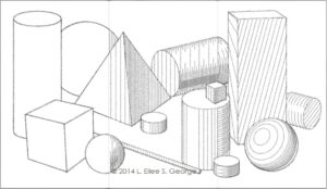
Elements of Design are basically the visual tools that we use to create a composition. These can include line, shape, form, hue, value, intensity, texture or pattern, space, proportion, and scale. You can create a piece using nothing but line, or with shapes. If you modulate the shapes to make them appear three-dimensional, you are in effect creating form, and you are probably incorporating different values to achieve the illusion of light and dark that describes that form, be it smoothly or via texture. You can create textures with lines and/or shapes. If your piece is in color, you’re using hue, and can use different intensities of the hues there to render things accurately, or to create mood or even to create a sense of space, which can also be achieved through the placement and scale of your shapes.

As you can see, you can use these tools in a lot of combinations, and not just in those I mentioned above. How you use them is where the Principles of Design come in. These are more conceptual tools you use to organize and manipulate the Elements. The Principles include balance, emphasis, dominance, unity, harmony, variety, contrast, rhythm, repetition, pattern, and movement. As you can already see, there is a little overlap between some of these terms, and they can be used in different combinations, too. It can be very powerful to plan a work around even one or two of these principles; it gives the work a razor focus, an edge, and a personality that stands out to the eye.

I will present lessons on most of these elements and principles, combining some that are closely related. I strongly believe these to be essential, useful learning for anyone who wants to become a better artist. Art isn’t a free-for-all; it has a structure, and one must learn the rules before one can break them with any success. I understand that the subject matter may at first sound a little dry for an eager beginner, but these quick exercises can awaken you not only to the possibilities of focus in your own art, but to seeing their existence and use in the world around you – a truly global language.

This was Lesson #1 on the Elements and Principles of Design. Here are links to the next few lessons, in order since I sometimes refer to and build upon previous lessons:

#2 – LINE: The Most Basic Element

#3 – Elements of Design: SHAPE in Simple SPACE

#4 – Elements of Design: FORM, TEXTURE and PATTERN

#5 – Elements of Design: HUE, VALUE and INTENSITY

Or, to see all of them en masse (note they are in reverse chronological order, so read the bottom one first, etc.), try the category Elements and Principles of Design (or use these links here in order)

For a wider choice of even more lessons and topics, visit the Blog Intro.

Be sure to check back occasionally for more lessons on Elements and Principles of Design & more.

If you have any questions or need clarification concerning any of these design concepts, do feel free to contact me using the Contact Form. Be sure to put the words “Lesson Question” in the Subject line (but the quotation marks aren’t necessary). I run several sites as well as my fine arts production projects, and now occasional music gigs too, so I will get back to you as quickly as I can! Thanks!

– Eilee


All content on this site © 2013-2020/present L. Eilee S. George; all rights reserved.

PROSE – Blog Intro

PROSE – Blog Intro

Location: PROSE > Blog


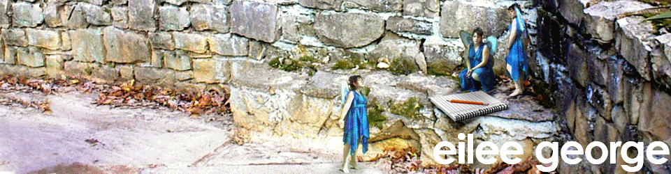
I’m Eilee George, and I like to write anecdotal and how-to blog posts in several creative areas. A lot of my art lesson posts are collected under the Art menu heading above, but you can find them here, too, along with a lot of other topics. I am a strong believer that ANYONE can draw if they want to learn – it’s a set of skills and principles like anything else. As a prolific writer (although not always online), I prefer to use an unstructured, informal sort of prose as my writing style; thus I chose “prose” over the word “blog” in the menu tab title…but it is essentially a blog. On my own time, I write short stories, essays and lots of poetry and songs. Here, I try to categorize topics by media. The following table of contents will, for now, serve only as a teaser as to what you may be able to look forward to reading later on, if you’re continuing in your creative quest and if I find more time to write; some things may change. If you see a link I’ve already posted it. I’ll throw other unplanned entries in as special events occur. If the presentation gets confusing, shoot me an email here and let me know; I’ll try to fix it. For now, check the sidebar for what I’ve actually posted. I’m still figuring out my preferred blog organization and categories etc. So…let’s learn together!

DRAWING AND PAINTING
Elements and Principles of Design – Introduction
Elements of Design: Line
Elements of Design: Shape in Simple Space
Elements of Design: Form, Texture and Pattern
Elements of Design: Hue, Value, and Intensity
Elements of Design: More on Space, Proportion and Scale
Principles of Design: Balance
Principles of Design: Create Drama with Contrast
Principles of Design: Variety versus Unity and Harmony
Principles of Design: Movement, Rhythm and Repetition
Principles of Design: Emphasis and Dominance
How to Create a Pleasing Two-Dimensional Composition
The Color Wheel: Primary/Secondary/Tertiary Colors
The Color Wheel: Value: Tints and Shades
The Color Wheel: Intensity, Compliments and Tones
The Color Wheel: Triads, Tetrads and Other Combinations
Color Psychology
Linear Perspective Atmospheric Perspective
Dissecting the Human Body: Finding Proportion in Figure Drawing
How to Break Down Proportion in a Face
Media Techniques: Working with Graphite
Media Techniques: Working with Charcoal
Media Techniques: Working with Pastels
Media Techniques: Working with Colored Pencil
Media Techniques: Working in the Acrylic Paint Medium
Media Techniques: Working in Other Paint Mediums
Style: A Wealth of History to Inspire the Future
Style: Interpretation and Finding your Unique Viewpoint
Style: Some Tips on Methods of Abstraction
Inspiration and Influences: You Don’t Live in a Vacuum
My Favorite Supplies and How They Earned the Distinction

DIGITAL PHOTOGRAPHY
How to Organize Your Inventory
Getting Up Close and Personal: Using the Macro Lens
Digital Photography: Framing Your Shot
Filters Aren’t Everything
Practical Uses For Digital Photography

OTHER ART TOPICS
Closer Look: 3 Trees Triptych
New Church Art Dedicated!
Eilee’s Favorite Art Supplies & How They Earned the Distinction
Evolution in Faith & Art
The Mind’s Artistic Eye
An Ounce of Prevention…
How to Safely Remove Various Paint Stains/Adhesive Residues

MUSIC SUBJECTS
New Videos Page!
New Music Page!
Studio Days

CRAFT PROJECTS
How to Affix Weird Things to Each Other
Mini Model Mentor: Episode 1: A Model Love Story
How to Make a Working Lamp
Going the Extra Mile in Costume Concept and Construction
Making a Faerie or Angel Costume For Someone? Make Your Own Wings, Too
Doing Simple Sewing Repairs the Right Way (Or the Fast Way in a Jam)
How to Make Homemade Gifts They’ll Love

GRAPHIC DESIGN
The Beauty of Contrast and Clarity
How to Make a Legible Garage Sale Sign
Design a Simple Logo
Prioritizing information

BUSINESS
How & Where to Protect Your Work (Intellectual Property)
Artist Pitfalls in Business
Build a Brand and Be Consistent
How to Retain Clients, Vendors, Assistants, and Associates

ART IN RELATION TO OTHER SUBJECTS
Your Passion is Not an Island to Itself
ARTithmetic: Geometry Ordered My Artistic World

COOKING
How to Make a Beautifully Presented Rice Side Dish
Cooking Easy, Healthier Orange Chicken
Gluten-Free Beef Stroganoff
Mini Pizza hors d’oevres
Embellished Croissants
Russian Potato Salad
Medicinal Properties of Herbs and Spices
Cooking for Kids and Other Picky Eaters
Little Kitchen Tips and Tricks

LIFE’S UPS AND DOWNS, AND MISCELLANEA
Failure Redefined
How to Keep Your Sanity When You’re Laid Up for Months
The Best Selfish Things You’ll Ever Do
How to Keep Your Perspective When You Lose a Loved One
Facing Your Own Mortality and the Big C
Training a Kitten to Walk on a Leash
Dealing with Multiple Food Intolerances
What Faith Has Done for Me
Stuff I Learned By 40
Our Keys to a Fantastic Marriage
How to Keep Your Identity in a World of Conformity
Create if You Feel Like It (Doggone It)!

ANECDOTES, POEMS, RANTS, PROVERBS, AND/OR STORIES
(These just might end up on a new web site.)
Independence Day
New Music Page!
Upgrading Imagery
A Sampler of Colorado Beauty
A Priceless Gift
A Little Poetry
When Appetites Attack


And Who Knows What Else…


AND, not part of the blog, but visit my MUSIC and VIDEOS pages!


<><><><><><><><><><><><><>


All content on this site © 2013-2020/present L. Eilee S. George; all rights reserved.

Theme: Overlay by Kaira Extra Text
Cape Town, South Africa