
New Church Art Dedicated!
On April 29, 2017, artist Eilee George dedicated with Calvary Community Baptist Church of Northglenn nine new works, many of massive proportions, depicting significant sites in the walk of Jesus, and including a triptych featuring three key trees in the Bible. Knowing that people often want to know the background, reasoning, symbolism, technique and inspiration for works in order to make a deeper connection with the art being viewed, the Church asked the artist to give a presentation explaining the works in the context of meaning and method.
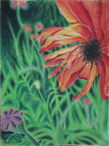
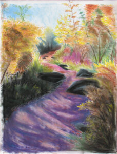
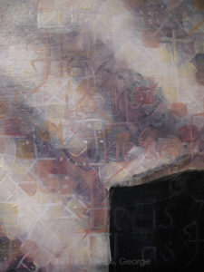
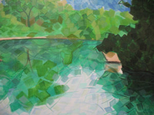
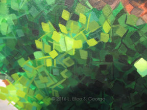
![]()
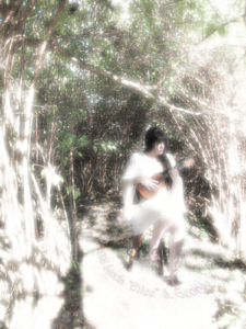
![]()
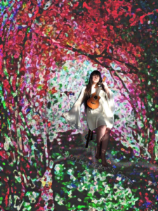
![]()
[To jump down in the post directly to one of the works, click a thumbnail above or a title below: Garden Tomb; Gethsemane; Jordan; Galilee; Calvary; Ancient Tree; 3 Tree Triptych; Rebellion; Redemption; Reunion.] [To read in more detail about the Triptych, go here.]
This post shows a longer draft of the speech than actually given, with more detail than time constraints at the event allowed, but all of the key points are present in both versions. Several attendees specifically requested that I publish a copy of this. A Power Point presentation was used as a visual aid to illustrate each of the paintings as they were being discussed. The presentation was whittled down to eight minutes from the original twenty, and was well received. An edited adaptation of the original presentation follows, with painting illustrations:
I’ve been asked to give some context to these paintings you suddenly see everywhere. Pastor Brian is a brave man to ask someone as verbose as I am to make a “brief” presentation – but I’ll do my best!
When I was asked to highlight our renovation with some artwork two years ago, I jumped onboard with both feet. I was very honored and intimidated and full of hope. I had full artistic license to do whatever I wanted – creatively, an artist’s dream commission. I took my responsibility very seriously and had plans to study my brains out.
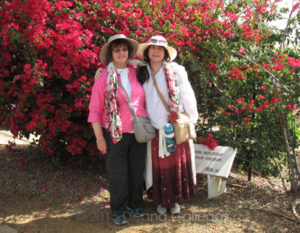
Not twenty-four hours after I was given this opportunity, another one fell in my lap. My mother in-law, Sheryl, called and said their tour group to Israel needed another body to hit quota. She offered it freely, no obligation to me but to show up and have her back – and she offered it without any knowledge that I had received a request to paint art for a church. God’s will mobilized both her and myself. There was no other way I could have afforded to go. I had never been out of the US and had no passport and just a short time to get one, but God moves in very purposeful ways. Is there any more perfect trip to gather resources for church paintings than eleven days in Israel? Amazing. Now, I feared traveling so far, and flying in general, but cast fears to His care, and He got us through a very difficult flight and a few exciting episodes while abroad, and got us all home safe, praise the Lord. It’s a trip every believer should take.
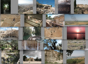
I was looking at sorting through some 10,000 photos I had taken. I kid you not, I’m very OCD. I needed material for this work and I had one chance at it. Once home, I had to choose images to paint that weren’t just great photos, but also would gel well with my very patterned, Neo-Pixelist style. Not just any work will do; it needs a balance of space and detail. When I paint, the patterns create an entirely different painting up close than you see when all the strokes melt together from a distance. This involves a lot of walking back and forth across the room while painting, squinting, and juggling different types of eyewear, in my case. The technique displays the particulate nature of all matter – that on an atomic level, we’re all made of the same stuff – but more than that; we’re molecular and systemic and all connected; relationships are key between us, and that parallels our relationship as the created to our own Creator. It’s atomic Gestalt theory in pigment: the whole is greater than the sum of the parts.
After months of sorting, choosing, revising and second-guessing, I chose what to paint. Then I had to get enough courage to put brush to canvas. I didn’t feel talented enough for such a mission! But God doesn’t call the equipped; He equips those He calls. When I prayed for His help, I literally felt the Holy Spirit guiding my decisions and my brush until I had enough confidence to persevere. I listened to a huge playlist of inspiring music while I worked, and eventually just listened to sermon after sermon on Grace FM to paint by. I sang hymns and cried and prayed and laughed, and it all worked out very well I think.
So on each of the individual paintings, a few words. There’s the triptych, here behind me…a word that refers to 3 artworks shown side by side as a unit. Then there are six smaller ones.
We’ll start with the six. Each depicts a site that is significant in the life of Jesus, and each features a scripture that directly relates to that site. In most of them, I purposely worked the scripture into the pattern of my brush strokes for a reason: it is subtle, in order to force you come closer, to pay attention, to meditate on the work – just the way one should meditate and linger in the Word, to increase comprehension and mindfulness.
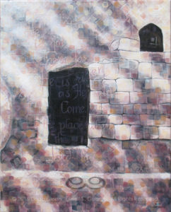
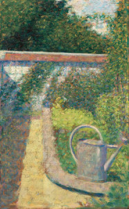
The Garden Tomb
The first work I did was the Garden Tomb. There are differences of opinion among different denominations as to actual site of the tomb; being so long ago many sites were “best guesses” but you still felt something “real” at times. We went through Church of the Holy Sepulcher but I did not feel Him there like I did in the area of the Garden Tomb. For this work I decided to go with theories that seem more compatible with Baptist beliefs. The Garden Tomb area is more peaceful, humble, and simple – and a place of quiet contemplation – devoid of icons/idols, rituals and dogma. For me it had to be the Garden Tomb.
This little 16″ x 20″ jewel was the first of the series, and I did a lot of experimenting. As I paint, I shoot progress shots with my camera to show its development, and this one had a lot of initial experimentation in technique; I recorded having put 22 layers on this relatively tiny work.
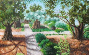
The Garden of Gethsemane
The Garden of Gethsemane is actually split in half by a narrow street; one half is adjacent to the Basilica of the Agony. This painting is from the the Basilica side of the street, although I saw the other side to be more restful for meditation. The trees are certainly ancient. In my test versions of planning, I tried both day shots and night shots. I wanted to think about doing a night scene because it’s my impression it was night when Jesus went there to pray right before His arrest. In the end I thought that a night scene would not have the right color palette for a church and I went with daylight. This 30″ x 48″ work has 33 layers of paint to achieve its molecular effect.
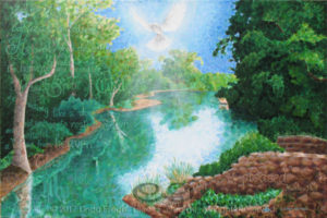
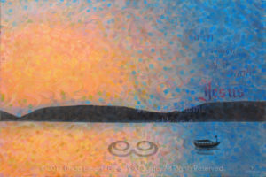
The River Jordan
Next: the River Jordan, a 24″ x 36″. Few sites are available to tourists who are getting baptized in the Jordan as we were. We went to Yardinit, a deep area of the river except on the side of the baptismal stations. Much of the structure in this area is obviously modern, so I replaced with interpretations of random rocks and plant life, reminiscent of an early ruin, once I got around to Photoshopping my concept. The area we were in was lush, and it spoke to me of new life – like that represented by baptism itself – so I kept that aspect in my own version. I weighed the possibility of actually depicting Jesus and John the Baptist in the act of baptism, but sometimes depictions of Biblical persons can be controversial for a few reasons, and I am mostly a landscape artist, and that is what I was known for when I was asked to do the work, so to keep all of the work consistent I stayed with landscape, deviating only to superimpose a luminescent dove representing the Holy Spirit. The water is where my style really started getting flexible and curvy, and it developed even more in the next painting.
The Sea of Galilee
For a while I considered the simple shots I had taken of the Sea of Galilee, testing them for compatibility between my style and their composition; I found that they could be terribly dull unless I really stretched out of my comfort zone. Looking at all that sea and air, and painting the way I do bringing life and vision to smaller elements of matter, I decided to imagine both the air and water currents and those elements swirling around in them. This, plus sunset colors, made my 24″ x 36″ Galilee look psychedelic in the early phases, but many layers of tinted glazing took the edge off and gave it harmony. I briefly considered including a ghostly image of Christ walking on the water, but again, I decided to stay consistent and retain the original scope of landscape art, which is often contemplative on its own.
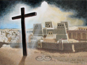
Calvary
Calvary…in front of the Old City in the Second Temple Period…while in Jerusalem, we went to the Israel Museum, which had an enormous model of the Old City during the Second Temple Period, the time Jesus walked among us. I planned this painting, like I did with most of them, on Photoshop, but it was more complex, in that I had to remove the walls and tourists, and figure a more fitting background, and I had to choose an appropriate angle for the emotional impact I had in mind. I scrutinized the legend of the model, and guesstimated the approximate historical location of Golgotha and the cross in relation to it. You only see a beginning of the Temple’s Women’s Court on the right; mostly featured is the adjacent Antonia Fortress. This structure seemed to mirror the hardness of the chronical it faced, so I superimposed from my photography portfolio a dramatic post-storm sky from our very own Colorado that seemed to hold God’s light. This canvas is rather imposing at 36″ x 48″.
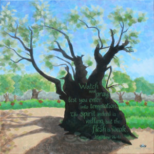
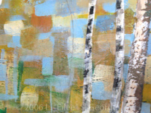
Ancient Tree of Galilee
This Ancient Tree of Gethsemane is adjacent to the Basilica of the Agony and is estimated to have been there at the time of Jesus’ life. Today the trunk’s girth measures more than 13 feet. It is weathered and scarred, showing the wounds of a long and fruitful life. To reflect this, the painting shows this survivor with a sturdy, solid trunk, but tissue-paper collage delicate greenery. It was overwhelming to be in the presence of such an ancient olive and consider that He may have prayed at the root of this very tree. This work is 24″ square.
So that’s the six. Now the triptych.
Triptych Intro
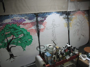
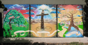
The Three Trees Triptych were by far the most challenging of the group – I had no photographs to lean on; only Scripture and my imagination. For the group as a whole, I decided after long consideration and several other failed ideas to simulate the idea of the gothic-arch frame, along with an exaggerated version of the mosaic/stained-glass effect that my work is known for – an appropriate technique…for paintings to be hung in a sanctuary!
I kept a log through all the paintings and took progress photos as I went. This got really complicated with the triptych because I had to regularly work among them in order to coordinate colors, align adjacent elements, and figure the direction of the light. I even had to rearrange my entire studio in order to accommodate three such monsterous works side by side (each canvas is 48″ wide and 60″ tall), and they barely fit in the dim little basement cave that I call my studio. Just finishing them was a small miracle. Let’s take a look at each of the three works individually.
Rebellion: The Tree of Knowledge of Good and Evil
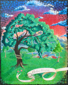
Rebellion is the first panel of the triptych. Not a lot is available for source material to paint the Garden of Eden. There are scriptural references of course, but much is left up to the imagination. The area of the intersection of the Tigris and Euphrates Rivers is suspected, and any river valley should be lush, as was the Garden itself from all extrapolation. This Tree is the hardest of the three to depict, as it has no distinguishing characteristics by which to recognize it. To reveal its identity, I wrapped a serpent around the trunk, adding two hastily-dropped half-eaten pieces of fruit in his shadow.The concept is loosely based on the account in Genesis. This scene was the catalyst for the fall of man in his relationship with God – a rebellion.
Redemption: The Tree of the Cross
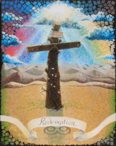
In Redemption, I turned the composition to face Jericho’s distant barren hills, and to include the sun bursting through dark clouds as on the day of the crucifixion. This also serves as the main light source for all three paintings of the triptych, the throne in New Jerusalem scene to the right notwithstanding. Inclusion of the non-indigenous dogwood sapling is a nod to our own culture and its symbolism in the four white, blood-stained petals that draw a parallel to Christ on the Cross. It isn’t even native to Colorado, but it is very much from the place where this artist grew up. The vines emanating from the base of the Cross symbolize the new life offered to us in the presence of our God for all eternity by Christ’s sacrifice and atonement for our sins.
Reunion: The Tree of Life
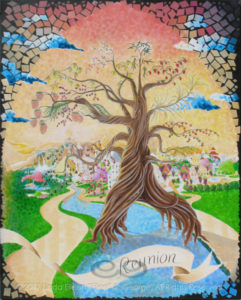
I thought I had a decent idea of what to do with the last panel, called Reunion – until I started comparing Revelation to Ezekiel. I had several meetings with Pastor Brian and others on these seeming conflicts, and consulted various tomes including Randy Alcorn’s book entitled “Heaven”. I pored through heavenly depictions through art history; I watched videos that alluded to it; I read online comparisons between accounts by different prophets and apostles. I prayed hard on it and decided to go with a version from Revelation, realizing it is likely not any inherent “contradiction” but rather speaking of a different time from Ezekiel (eternity versus the 1000 years); therefore it makes sense that there would be some differences. Showing the great City from the inside out also presented a challenge, as many descriptions talk about the gates and foundations that would not be visible from the interior of such a vast place, and descriptions aren’t highly detailed from that perspective. The Bible reveals that the Tree of Life grows on EITHER side of the River of Life, so I had to resolve how that works. The Seven First Fruits and other native crops were used for the twelve crops on the Tree. Combining the reference to the healing of nations as well as Christ’s promise to go and prepare a place for us in His father’s house of many mansions, gave me license to show architecture of many cultures in close proximity and harmony.
Conclusion
These works are a labor of love. The whole time I painted them, I prayed that they might inspire someone to seek God, to seek closer relationship with Him, to seek their own spiritual gift and to dedicate themselves to honoring Him with those gifts. I did this and found that the gift again is to me, and at this crossroad I look for God to guide me to His will for my next steps. Thanks, Sheryl, for taking me on the trip of a lifetime; thanks Greg for your steadfast support through all of this; thank you to my families by blood, marriage and here at the church for your inspiration; I couldn’t have done it without you; thank God for His help and facilitating my spiritual and artistic growth. Thank you for sharing my journey.

Prints of these works are available through special order. Contact the artist directly here.
See better pix of these works in THE GALLERY.
Speech derived from this copy © Linda Eilee S. George and performed live April 29, 2017 at Calvary Community Baptist Church, Northglenn CO. Visit their site to learn more about CCBC. You can find them at 11980 Irma Drive (at 120th), Northglenn, CO 303-452-0056; services at 10:30 am Sundays.
All content on this site © 2013-2018/present L. Eilee S. George; all rights reserved, unless otherwise noted.
 I’ve used a lot of brands of acrylic paint, but


