Author: Aiii

The Mind’s Artistic Eye

The Mind’s Artistic Eye

StylesVery recently, the question was posed to me: “Is it harder to paint realistically, or in that style you do?” and I went a little bit into auto-pilot and didn’t really consider all the points to tackle that I should have in answering. In this post I will address the subtler differences between the two terms realism and abstraction, and clarify the sometimes interchangeably used pair representational and non-representational – terms that are often incorrectly used in their place. The conversation had lingered in my mind and I slept on it, and on waking I knew it deserved a better response, so…here I am.

My answer to the question was incomplete. Mostly it was one-sided – how I went about my stylized abstraction, but I did not compare and contrast it to depicting things with more realism. I didn’t really acknowledge anything about realism, and I have to guess that it’s because I still take realism so for granted.

The fact that artists can see in a nearly infinite number of ways can be overwhelming; I understand all too well – I’m in the thick of it. But I can see how it also would be daunting for a non-creative who is observing from the other side of the looking glass. People who have known me for many years have seen me create in a number of styles because I push and change my own way of seeing as I develop as an artist. This diversity of creativity, which happens on the individual as well as the mass scale within the creative community, is what creates a breathing, dynamic culture – so there’s something for everyone.

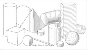
Something that few people already know about me is that, at an early age, I worked and worked myself into being a photorealist. I learned about linear and atmospheric perspective, and observed properties of light and shadow and their effects on colors and textures; I studied in depth anatomy, construction, and the mathematical basis beneath it; I poured over color theory, as well as learning a variety of different media before I concentrated on my favorites. All of this and more gave me a solid foundation for later experimentation: you cannot effectively break the rules without knowing them first. Without that structure, you can’t employ restraint or focus, and without those, all that comes out is meaningless chaos.

That isn’t to suggest that abstracted and non-representational art, those misunderstood stepchildren of the art world, are wantonly chaotic. Frankly, it’s absurd that they are still viewed by a few as far too controversial, in this day and age. But folks often reject what they don’t understand, and many go on the offense by making harsh judgments out of self-defense of a (this is the key word:) curable lack of art knowledge. Learning the difference is really not that painful, and it will enrich your enjoyment of art and design overall.

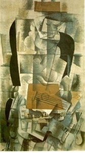
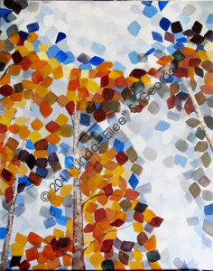
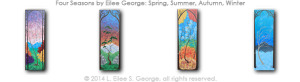
Simply put, representational art looks something like what it’s depicting (to one extent or another), while non-representational art isn’t even meant to particularly look like anything comparable that you can sit and observe. Representational art can be realistic, or abstracted to any number of degrees. Even my abstracted trees are representational, because in my stylized way, I’m still representing something recognizable: trees, sky, ground, mountains – making up landscapes. (Incidentally my paintings are a fusion of realism and abstraction, as I often make the trunks and branches more realistic to give context to those square leaves and backgrounds.) Picasso, who also evolved through many styles, pushed it even further with his Cubist works – Three Musicians, Les Demoiselles d’Avignon and Guernica most certainly are representational of very specific subject matter – although the exact style he chose in that period included play in pattern, time, space, symbolism and refraction as well as other cerebral expressions – but no one would deem it realistic, because people and events don’t actually look the way he painted them. Using the technique he used – essentially warping the subjects in a particular way – created tension, symbolic movement and emotional impact within the viewer that wouldn’t have happened so effectively in a more realistic style.

Millet_Gleaners_m
Jean-François Millet, “The Gleaners”, 1857

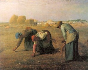
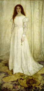
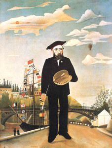
“Realistic” describes a style that adheres as closely to how an object actually appears as is possible or practical for the artist to draw or paint or sculpt. Realism is, in one technical use, a term attached to a specific Western art movement at a certain time, in this case it began in France in around the mid 1800’s and spread from there; it was also sometimes called Naturalism, and portrayed scenes of common everyday life. Another example would be Magic Realism, begun after the WWI era (it includes works by Andrew Wyeth and Henri Rousseau), or Surrealism (that includes works by Salvador Dalí and René Magritte.)

Whistler, Symphony in White
James Abbot McNeill Whistler, “Symphony in White”

These last two movements mentioned used very realistic depiction of what at first seems like everyday scenes, but upon closer inspection, they include increasingly fantastical elements in them. Other types of Realism, like Contemporary Realism, followed. Realism also is used as a more general term used to describe this accurate vision applied in art in many different art periods through history (such as the incredibly realistic way that the human form and its environment were represented in ancient Greece and Rome).

Rousseau Self Portrait
Henri Rousseau, “Self-Portrait”, 1890

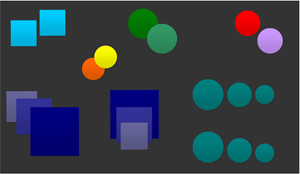
The term that gets most people confused is the word “abstract”. Most people who haven’t devoted studies to art automatically default to thinking that abstract art doesn’t look like anything. But it does, in a way, after running through the filter of an artist’s eye, or concept. You see, when you paint abstract art, the subject is abstracted from something. It’s an abstracted version of a tree, or of a person, or of a landscape, or a still life – it’s still representing something; therefore, it’s representational. People mistakenly brand non-representational art as abstract, and it just ain’t so. It is also worthy to note that there are infinite degrees of abstraction possible, from slight to extreme.

Braque Woman with Guitar
Georges Braque, “Woman with a Guitar”, 1913

So what is “non-representational” art then? On this there is debate, even within the art world. Some insist that it can represent emotions, symbolizing things with colors and textures of the brushwork, or it can represent cognitive concepts, like when it demonstrates manipulations of chosen elements and principles of design. Hardliners, however, will tell you that it can’t represent anything at all – it’s just art for art’s sake. Well, many artists choose to not draw what they see, but instead what they think and feel, which is interpreting something. When I did my Grief series, I called it hard-core abstraction, but did so rather emotionally. Some would say that since you couldn’t sit down and see an emotion itself (as opposed to how it surfaces in the words and expressions of a human being), that these are nonrepresentational works. But I say in a sense they are representational, in that they evoke a definite feeling and, in essence, represent these stages of grief. Even if you can’t see them in normal life, many people see the feelings when they look at my works. Every time I’ve shown them they elicit passionate reactions. So it must represent something to the viewers, too – and people bring their own life experiences with them when they look at art, and that colors their perception. I can generally tell right away if it’s someone who has lost someone very close to them; they know that feeling – and they recognize it in my work. And, they may bring something different to that painting when viewing it, than I did in making it. Together, we create a complete experience.

L. Eilee George, Grief: Anger
L. Eilee George, “Grief: Anger”, 2008

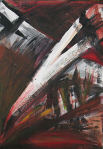
What those Grief paintings are, regardless of the non/representational question, is abstract. I have worked in several degrees of abstraction, that series being the far reaches and most abstract – the abstraction of the very intense feelings that I had to either get out or burst. What I had been through recently in real life preceding those five paintings was incredibly difficult, and I suspect I was on the verge of a breakdown, but the art helped me to get the feelings out and process them, and it was better than any therapist would have been (my apologies to therapists, but I’m lucky to have no need of you personally – between faith, a supportive family, and art – really, the bases are covered). Those paintings, which you can view here, are both abstract and, to me and several others, representational – although to others they are also nonrepresentational since you can’t recognize an object or scene. See? There’s gray area even for artists, so if you’re confused have comfort that you’re not alone! (Not to confuse you further, but what these five paintings really are is Expressionistic, but that’s another blog post.)

L. Eilee George, Colorussia IV
L. Eilee George, “Colorussia IV”, 2011

And my various tree series are also abstract. They are a style that I developed when trying to find my own voice and my own unique eye; I applied a philosophy and related a technique to it. And that brings me back to the question at the beginning of this post:

Is it harder to paint realistically or in that style you do?

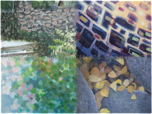
The fact of the matter is, after you learn how to draw and paint realistically, it is way easier to work in realism than to stylize and to abstract it. Don’t get me wrong: it was no easy task to learn, for years, the myriad skills demanded in order to depict people, places and things the way they really look – and I have respect for artists who can do that, of course. But that is, quite simply, a skill; I believe just about anyone could learn it given enough time – and there isn’t a lot of individuality to simply regurgitating what’s already laid out in front of you. And these days we have cameras for that…so what can the artist bring to the table, to improve upon that? There are countless answers, and combinations of them. One can assert one’s uniqueness by depicting rather unrealistic things realistically (flying elephants anyone?), which wanders into Magic Realism or Surrealism and is a fat lot of fun. Another way to go is to filter your subject matter through a style. Or, you can make it about the message (which some do brilliantly, but my personal preference is not to get very political in my own art; it’s not in my nature – and knowing yourself is important as an artist). Or an artist may develop a radical technique in his or her medium that rather steals the show from the subject matter. The Impressionists did it with their little brush strokes or with dots of primary and secondary color that only “blend” into tertiary, quaternary and further-blended colors as the viewer steps back from the painting, letting their eyes do the work. My Neo-Pixelism (or Neo-Pointillism as it is sometimes called) is similar to that, except that instead of colors that the viewer’s eye is putting together at a distance, I lead the eye to do that with patterns, shapes and lines.

Essentially, in my Neo-Pixelist paintings, I’m painting two paintings at the same time: the one you see from a distance, with all the blobs and strokes falling together into a recognizable landscape (thanks to the brilliant anatomy of your wonderful eyes), and the second one you see up close, where you fall into an abstract forest of square dibs and dabs and patterns. That isn’t easy. It takes a lot of incessantly oscillating thought and careful planning. It takes concentrated decision making the entire time I execute it. I’m constantly trying to balance out the density of strokes to have a certain desired effect far away, and the desired effects change in different areas of each work. I have taught myself ways to simplify the process, but it remains complex. None of it is there in front of me when I see the landscape it’s based on. It has to be generated by my imagination, and continually controlled and shaped by my will, with no other roadmap. My artistic alchemy pays off by producing a unique, beautiful object with my own personal stamp. It’s something that anyone who calls oneself an artist should strive to achieve: individuality.

Some may say that the technique I apply is “formulaic”, as if it were an insult. The thing is, an artist has a narrow line to walk with style. We are expected to be consistent in style by collectors, gallery owners, art dealers, consultants, critics, auctioneers, and even other artists, although few of us like to be pigeonholed. Stability in style shows maturity as an artist and confidence in one’s abilities; it also makes the art a better risk for investors (if you want to get into the dirty subject of “business” – that’s another way to be “realistic”.) Despite the fact that we owe it to ourselves and the craft to experiment and take chances in many directions, you have to be discriminating and not just show every single thing you do. One could throw the same word, formulaic, at any artist (including the Masters) who developed a consistent style for a time, but there’s a difference between mere gimmick and a well-developed method, and only a discerning eye and questioning mind will learn the difference. Of course, it’s also career suicide to find something that works, and then to never grow beyond it, just to keep making sales (which would eventually fail anyway). A good artist evolves. The art should show a progression. Experimentation may seem a little scary, but it’s not life threatening. You must try new things – and even make mistakes (sometimes lots of them) – in order to grow and to find new exciting successes – plus, you’ll never be bored. And that’s as true for life as it is for art.

So…it’s definitely harder to think for yourself…but the reward is more than worth it.

–Eilee

Styles


Master painting images courtesy of the old Ookaboo.com

All other content on this site © 2013-2018/present L. Eilee S. George; all rights reserved.

New Work and a New Exhibit

New Work and a New Exhibit

4 Seasons ThumbsI’ve participated in a few events since I last updated the site, and regrettably I have been remiss in reporting them. Among other things, I’ve been represented by Carla Wright Gallery in Denver for years, and more recently participated in a special exhibit at my church for a fundraiser. I am working hard on developing a new series, but first I thought I’d let you know that I just finished a new group of paintings!

I have finally finished my Four Seasons series. Check out the Painting Gallery here in order to see Spring, Summer, Autumn, and Winter; they’re listed close to the top now. The concept and planning stages of these works were intensive, as I had a very specific vision for these paintings, and execution was key. Planning paid off, and I am very happy with how they turned out!

Additionally, I have decided to put some work into a little open-call exhibit at CORE New Art Space at 9th and Santa Fe in Denver. Much of the art that is on display is also for sale, so come on over to find a unique collection of beautiful little “jewels” of art. The show is titled “Grand Petit – Small Art” and features works that are 12″ or smaller in any and all dimensions. It’s juried by Charles and Michele Whitley, Publishers of ArtScape Colorado, the brilliant free guidebook of all things arty in Denver that is ubiquitously available in almost every gallery.

I submitted for jury my works entitled Poetree, Unitree, and Entree, which also can be viewed in the Painting Gallery. Apparently CORE got quite a lot of entries, and there was a real rush going on when I arrived with mine. Soon I was notified and congratulated by the gallery that my work was accepted but I don’t yet know which works made it in – so I’ll update this when I know. [Update: all 3 got in, and Poetree and Entree both sold on opening night!]

So join us at the opening at Core New Art Space, 900 Santa Fe Drive, Denver, on November 14, 2014; from 6pm-9pm, or any open hours through November 30 (Th 12-6, F 12-9, Sat 12-6, Sun 1-4). It’s going to be a fun night. [It was!]

Eilee


All content on this site © 2013-2020/present L. Eilee S. George; all rights reserved.

Digital Photography: Framing Your Shot

Digital Photography: Framing Your Shot

Photography – Tell a Story

With the prevalence of digital cameras and cell phones with excellent camera function, everyone can become an instant recorder of whatever is in front of them. However, not everyone is happy with the results they get for their efforts.

Whether you are shooting photos of people, products, landscapes, food, pets, buildings or whatever, there are different things you need to consider before you point and shoot. Getting the shot right the first time trumps any post-production fun you have in photo-editing software (if you care to invest in it). Why? Because there are some things that filters and manipulation on a computer cannot fix (or fix well) – and you can save yourself a ton of work and valuable time by learning how to shoot better photographs in the first place.

This mini-article addresses what I consider to be the three most important aspects of making a good photo: lighting, composition, and handling of subject matter.

Lighting – You Need Plenty of Light!

Are you outdoors? Is it sunny? What angle is the sun at? A cloudy day can produce a boring, nearly colorless photo – which is only good if that’s the look you’re going for – say, for a low-contrast background for text, or an illustration for a sad story, or a more restful feel. Noonday sun illuminates the landscape in a direct, bright manner, but it can look a little generic. If the sun is pointing the same direction as your camera, the image will look flat, which is rarely attractive and occasionally hard for a viewer to mentally process. Mid-morning or mid-afternoon sun can create much more interesting shadows, and of course sunrise and sunset will bring more exciting color.

Are you indoors? Is the lighting incandescent, halogen, or fluorescent? Different artificial light casts different colors on things, so be careful. Is the light too dim to see things very clearly? Dim light creates a graininess and annoying artifacts in your digital photos that weren’t so prevalent in old-school film photos. If you need more light, by all means, get some! Just keep in mind that some proper lighting kits, like for portraiture or product photography, can get a little pricey, but you do want spectrum-balanced light, and possibly diffusers, reflectors, or even options for gels or filters, depending on what you’re up to.

If you’re setting up objects to shoot for selling online, be it your original sculptures, or household junk you want to unload, take care to get a solid-color background (butcher paper, even a solid-color bed sheet if wrinkles are steamed out), and light the scene from slightly above from a 45-degree angle from both left and right, and if you can, additionally use what’s called a “fill light” on the background, to make the unsightly cast shadows of your object from those lights disappear. A professional lighting kit can cost several hundred dollars, but if you’re computer-graphics savvy and already have gooseneck lamps or construction lights and tripods or some way to hang them at an appropriate height above and to the side of your subject, then you can use minimal color correction in a photo-editing program to correct the color of light to something more neutral. Since I haven’t yet budgeted for a lighting kit, I resort to this for now myself. Or, in good weather, there is another option: daylight is cheaper than any of this, and quite flattering. I use it for many of my web photos of my artwork, although I have a professional shoot the high-def stuff for prints. Depending on the size of objects you’re shooting to sell online or whatever, if you have a good window, you can get a big sheet of vellum from the art store and tape it to the glass to diffuse the light, reflect it with a spare mirror, set up your objects on a table or the floor by the window, and off you go. Get creative!

Composition – Frame Your Shot in the Viewfinder

What composition do you feel like using with this photo? Formal and pyramidal, like the Mona Lisa? Bilaterally symmetrical, like some of the works of Frida Kahlo and Diego Rivera? Spatial and thoughtful, like the interiors of Edward Hopper? What works with your subject? Do you want to invite the viewer into the composition, or bar him or her from it? Are you aiming for calm, action, tension? How do you frame your shot?

Composition is key no matter what creative endeavor you’re working in, be it painting, photography, sculpture, film, animation, culinary arts, furniture design, architecture, or any other aesthetic pursuit. Composition makes or breaks it. Strive to make every part of what your audience sees interesting, appropriate, and engaging.

Shots can be formal or informal, and a lot of what makes it that way is symmetry and angle. Formal portraits tend to be more professional and less friendly and nearly always eye-level; informal ones can have more creative positioning of the subject against the background and a wider variety of backgrounds from which to choose. Landscapes that are presented in a symmetrical manner have a more static feel; but view more natural, increasingly asymmetrical ones, and you will note that they are increasingly dynamic. Note that there is nothing inherently wrong with something being formal or static; just remember to do it for a purpose, not just randomly or out of habit. There can be great beauty in symmetry – mass admiration of supermodels and super cars attest to that. Still, note that in art, having the bulk of your focal point in certain areas of a composition can be too predictable: the center, the corners, or the center of any edge. Try to work between these areas, and you will get more appealing results. Conversely, when selling products, one should generally go for more formal, symmetrical compositions – dead center is recommended, unless you plan to superimpose some copy to one side to pitch your product. Luckily, most digital camera viewfinders have an indicator that maps out the center and corners with an X or a crosshair in the middle; this can help you find the hotspots to avoid and the safe areas to use as described above.

If you plan to leave space in your photo for text, be it above, below, or to one side, consider the size of the end product (radically different for a web site than for vehicle graphics, garage sale signs, or a billboard), and the size of text that will be necessary for easy readability in its respective context and if there is necessarily a limited time alloted for people to read it (such as while driving). Remember that a very large segment of the population needs vision correction, and as we age, an even larger group has difficulty seeing. Never go below 12-point type on any lap-distance reading, and increase size as appropriate to accommodate all members of your target audience and the venue. Don’t use obnoxious, hard-to-read scripts, and ALL CAPS is a no-no. Restrict superimposed type over the photo to a minimum of absolutely essential information, and on an area that doesn’t have a lot of visual distraction and is a high contrast to the text color – too often I see low-contrast type over a busy picture, and can’t read half of it. Also keep in mind that reading light-colored text on a dark background causes more eyestrain than the opposite, more normal orientation. There are times to step out of the box, and times to exercise restraint; don’t confuse the two. Analyze what precisely it is you want to achieve, and then ensure that every element of what you create adheres to that goal. Don’t get so arty that you defeat your own purpose to communicate.

Subject Matter Treatment – What’s Appropriate for Your Topic

Fun shots of kids or pets can be shot at crazy angles, emphasizing wacky personalities or action. Pensive musician portraits may utilize stark lighting with dramatic shadows if that matches the genre of music they produce. Landscapes at a distance should take care to always keep the understood horizon line absolutely level – just a little bit off looks really bad – or if you’re going to tilt it, do it dramatically enough that it’s clear it’s intentional, and have a solid reason for doing it. Still life is nice with multiple levels of interest, and asymmetrical compositions are more lively and interesting to look at. Photos of hot rods should highlight their best lines and the lighting should show off their shine. Pictures of people or animals looking off to one side generally look better if they are looking toward more space than looking toward a nearby edge. Having a tree in dead center of a varied landscape is very static – feature it off to one side and it will look better, especially if it leans toward a space, just like with shooting people, cars or anything with a front-versus-back to it – have the subject face toward the rest of the picture, not the edge. Another approach to landscape can be contrastingly myopic – focus in on some little vignette; perhaps a collection of leaves whipped up by the autumn wind in an inescapable corner next to an interesting rock or a forgotten toy – anything that speaks to you. Let the emotion you feel while looking at it guide your camera and your framing of it. If something looks small and lonely, frame it in a way that conveys that – contrast it against a large surround of background or spotlight it, rather than getting in its face to loudly shout at the viewer, “It’s small and lonely!” – because sometimes the contrast of the empty space around it, or the isolating light source, will say that very effectively for you. Sometimes to show the personality of a subject, you show it en masse, like a whole frame full of pine needles, emphasizing the collective impact of many parts, creating more of a texture than a focal point. Let the subject give you a cue as to how it can be best portrayed. But know that everything has more than one side to it, and decide what specifically it is you want to say about your topic of focus, to decide how you execute the shot. You can do this with objects or with people. Ideally, know or get to know your subject – find out something on his or her mind, what he or she is passionate about, what quirks in his or her personality are most engaging for a viewer to discover – and go about experimenting to bring that out. Things can have personalities too – you have the ability to superimpose a personality onto things as an artist: humans anthropomorphize objects all the time and you can use that to your advantage and turn those objects into symbolic statements. Find and evoke, or subtly display, the essence of your subject.

Putting Theory to Practice

You’re probably getting the idea now that there are many different variables that make good or bad compositions. Train your eye. Leaf through a magazine or an art book; look at a large variety of pictures of paintings or advertisements or editorial photos, and try to dissect what it is about each one that makes you like it (or not like it). Analyze it and discuss it with others who are willing to analyze it. Is it a particular arrangement of elements within the picture plane? Note how those elements are arranged. Is it high contrast creating drama? Is it well balanced color-wise, or is there something that stands out by contrast of color or value? Is that because that’s what they’re trying to get you to notice? You can do that too. Take notes of tricks and their context, and you can employ those same effects to your work.

Digital photography is a blessing to beginners who don’t want to blow their budget on film and processing while they experiment. You can shoot all you want for practice and not lose a dime. Go through your disk of photos, and note what looks successful and what doesn’t. Don’t let your assessment be swayed by how much you do or don’t like the subject matter when you’re judging composition. If it helps, turn it upside-down to be able to focus better on the balance and arrangements of positive and negative space, of colors, of values, and of shapes. If it’s pleasing upside-down; chances are it’s pretty good right-side up.

This is a vast subject and I’ve only touched on three main issues to consider before you point and shoot. Feel free to ask specific questions about details I have overlooked or taken for granted (as I occasionally am guilty of that). I will be glad to exchange ideas.

Things to consider or discuss:

What emotions have you gotten from different kinds of lighting in a photo, and can you describe the lighting used?

What kinds of compositions attract you? Are there patterns of certain ones that draw you in or repel you?

Which subject matter really interests you?

What do you want to impart or experience from your dream shot?


All content on this site © 2013-2018/present L. Eilee S. George; all rights reserved.

Independence Day

Independence Day

Last night was First Friday Art Walk in, among other areas, the Santa Fe Arts District in Denver, where I am every month, connecting with the people who come to the gallery where I have shown my work for some five years. I meet a lot of really nice and fascinating folks every First Friday, and I strike up conversations pretty readily anymore. I find that strangers and I inevitably find some interesting connection – geographic history, life experience – something – as I explain inspiration behind my paintings when they inquire. Yesterday also happened to be what would have been my father’s 85th birthday, and he was heavy on my mind. Here in a couple weeks, it’ll be four years since he died in our arms from non-Hodgkin’s lymphoma.

Daddy was with me last night; he crept into my conversation with a veteran, mentioned in a context of my father embracing regulation and integrity in his business dealings as well as order in his home life, because Dad had been a Green Beret. He appeared as a brave fighter in another conversation I had with a nurse over his cancer when she was asking about a painting I’d done that hinted that I too am a survivor. And Dad popped up again when I was talking to a nice man named Howard, telling him how full of verve and autonomous my octogenarian mother is, and how stubborn I am, and how Daddy used to call each of us “in-de-damn-pendent”. Howard, a writer, really liked that word; so did Dad. It suited Mom and myself in Dad’s eyes, because he always wanted to help us, and we were so confoundedly self-sufficient it frustrated him to no end. It was a term always laced with underlying respect. He may have been extra protective of me since they had me so late in life, but regardless, I think any loving man with a driven wife or a headstrong child could relate to Pop’s proud, conflicted exasperation.

Dad grew up during the Great Depression in a family that was already floundering financially. Into the beginning of and through World War II, he worked sometimes as many as three jobs as a kid, to help contribute to the family’s survival: bicycle repair tech, newspaper deliverer, and soda jerk. He worked like this often to the detriment of his studies. I think it was early on that he vowed that his children wouldn’t struggle that way, and when that season of life came to pass, like many well-meaning parents are known to do, sometimes he overcompensated.

Of course, in my more naive days, I was willing to take assistance as he gave it, without much thought to it…but I started working in my teens and did realize what effort money entailed. I also had a close friend who lost her father in her mid-teens…and I became acutely aware that my own parents wouldn’t be there forever, and perhaps I should figure out how to stand on my own two feet – and I knew I wouldn’t get good at it overnight.

I had worked for almost a year as a proofreader and typesetter for multiple publications at my local newspaper during my senior year of high school. With that, I funded most of the purchase of a little used 1980 Honda Accord LX hatchback that became my first car. Dad insisted on helping me with the scant rest of the balance – the whole price was a whopping total of $2800. Looking back, I can’t remember how many times someone had to tow that vehicle. Sea-foam green with squeaky brakes, I named it “Cricket” (because we always name our cars in our family). It got me around Springfield when I went to college, despite what seemed like everything on it getting fixed twice: the brakes, the air, the heat, the radiator…but it was my first taste of freedom, and I was terribly sentimental about the thing.

One weekend I came home to visit from college, and saw a brand-new Camaro IROC-Z in the front lawn. For some years I had become accustomed to strange vehicles appearing there and vanishing, ghostlike, as Dad had to repossess cars from time to time for the bank. Parking downtown was limited, so sometimes he would store repos at our place till they sold, or payments were brought back current by their owners; he tried to work with them. Considering how the road we lived on was regularly utilized as a drag strip by local youths, it wasn’t a bad marketing move. Now, a Camaro in the late 80’s lacked the seductive, edgy lines it had in the 70’s – but it was still a coveted car in some circles. It was white and sleek and just plain looked fast, even just sitting there on the gravel next to the garage. I could hear it growling, revving and purring at me, “Come on; let’s scrrream across the countryside together, my darrrling.” Ooh, an American car with a strangely European accent. Well, it was a truly exotic machine in my sphere at any rate. I peered inside – score! It was an automatic – which was all I could drive. I admired its shiny newness, and my little Cricket seemed to deflate a little, whining and waxing melancholy as my eyes caressed the gleaming interloper.

Being in the habit as he was to watch for me whenever I came home, Dad met me on the driveway. He lit a cigarette, returned his lighter to his pocket, and motioned to the Chevy, tendrils of smoke following his hand. “What do you think?” He almost sounded like an announcer on a game show presenting the grand prize.

“It’s nice,” I acquiesced. “Another repo?”

He nodded. “Another fellow over-bought and couldn’t keep up on the payments. It was for his son. The kid doesn’t even have a job.” He puffed on his ciggie; I loitered and toed the ground, wondering if I should go in and say hi to Mom. We exchanged the how’s-school-it’s-fine ritual. He studied me a spell, and then proceeded to do the unthinkable: he offered me the car on a silver platter. Keep in mind that I was eighteen, in school with a part-time, minimum-wage job in the University music department, riding my bike more often than not to save on gas money, subsisting on ramen and Vienna sausages, and he was presenting me a no-strings, free, brand-new muscle car that was basically sex on wheels to anyone with eyes, ears and nerves.

“You’re kidding. That’s not funny,” I said, my face absolutely serious, fists clenched at my sides.

“No – I mean it. I could buy it easy as anyone else,” he stated plainly, shrugging.

“But I couldn’t.”

You don’t have to,” he smiled matter-of-factly.

“Not the issue,” I countered, and pointed to the Honda, on which I had paid off the balance to him by then. “That,” I added with pride of ownership, “is mine.” Cricket straightened her posture, trying in vain to look shiny after a speedy, hot, and dusty ride down I-44, highway 96, and 71 Alternate.

Dad was atypically pulsing with excited nervous energy, and clearly he was growing impatient and eager. I found it mildly disorienting – but more than that, amusing. “Listen,” he said, “I don’t get one of these every day. It’s a good deal. It’ll sell fast – he doesn’t want it back – the kid won’t work for it.” Some birds quarreled in the nearby Bradford pear; smoke eddied around Dad’s head in the still air. I was still secretly breathless from my impetuously swift race home. “Do you want it or not?” he asked bluntly.

One of my thin arms cradled the other’s elbow, which led up to a hand holding and worrying my chin; my face pinched in pensive consideration. I was hard pressed to think of any of my peers with a finer piece of car, or such a generous offer. I knew it would be somewhat more reliable than my little roller skate. I knew it would have a certain allure, a je ne sais quoi if you will, I mused of the flirtatiously foreign-posing domestic. I knew a lot more than that, having grown up with a savvy financier like my father. I suspected a test, but Dad wasn’t that manipulative. He wanted to please me, but I looked at the bigger picture, knowing there was more to this situation than merely that, which bore sober reflection. To myself I dialogued: does he really want me in something that fast? I can’t handle that much car…I’ll wrap myself around a tree…ugh and the upkeep…the cost…and I just plain don’t need it…. He squirmed on his hook; I let him off it.

In a staccato breath, I answered, “Nope. No thanks. Not for me.” I meant it. He knew I meant it.

Still, his jaw dropped. He threw his cigarette down to the ground, John-Wayne-style, and ground it into the gravel with a twist of his sole, rather than dropping it into the old tin peanut can into which he typically deposited expired butts. It wasn’t common for my old man to be speechless. He fidgeted briefly and then pierced my eyes with his as he found his voice. “Do you at least want to give it a test drive?” he tempted.

“Why torment myself?” I answered him. I was starting to think that he wanted me to be a foolish teen! Vicarious? Perhaps. But he already had my brother’s automotive genius in theory and practice, who offered all kinds of wonderful fodder for the wish-I-had-wheels-like-that-at-that-age fantasy. My brother was legendary in the local clandestine drag race circuit. I even suggested that Dad offer the same deal to him. He mumbled something about him having enough cars already that work better than mine. I shrugged; mine was working right then, I observed.

It seemed we were at an impasse. Dad pivoted forth and back, and rubbed his head with a perplexed grin, tousling his salt-and-pepper hair. “Can you tell me one thing…why?” he finally asked, his blue-gray eyes sparkling with curiosity.

“Well,” I answered thoughtfully, and started ticking points off on my fingers as I looked up at the sky where, apparently, my mind had written a list, “It’s a gas guzzler for sure – my monthly costs would go up on that alone. Two, the insurance has to be astronomical. And, it will likely be a target for vandalism and theft by some kids who might be jealous of it – I’d never have that problem with the Honda! Plus the cops would probably target and pull me over in a car like this, whether I sped or not…I don’t need extra tickets either – I already have a lead foot!” I finished with a firm voice, but visually I was likely a contradiction, with round eyes and a forgetfully open mouth – I do recall having surprised myself. “Lastly, it projects an attitude of…I don’t know…aggressiveness, that isn’t in line with my personality and with which I don’t want to be associated.”

I think Cricket was hyperventilating behind me.

Dad’s jaw was slack from awe once more. He took a breath, and slapped his hand firmly on my shoulder; I was a tad anxious. “I sure got a good turn on you,” he proclaimed, his voice breaking a little. “What a sensible listing of reasons – right off the top of your head like that…wow, kid. I didn’t think you listened to me all these years, but clearly you did. I can’t wait to tell the guys at the bank how my teen-aged daughter turned down a new sports car!” He shook his head, beaming at me. “Come here,” he said, grabbing me with a beefy arm and hugging me. I was surprised and teary, and could barely breathe from him squeezing me so. We wobbled apart, and he patted me on the back like a faithful apprentice, and said, “Come inside and say hello to your mother; she’s cooking dinner.” And in we went. Cricket slyly stuck her tongue out at the haughty-yet-wounded Camaro, who – at least in our brief possession – never got a name.

InHiSchl1I fed on that look of pride in my dad’s eyes that day for years; it was worth more than any car he could have offered me, even a McLaren – not that I could drive one (what would be the point of making that with an automatic tranny?) There were times I still let him help me, as I could see it physically hurt him when I refused his assistance. I knew that was part of why he had worked so hard to become successful: to provide for his family and help others – and that this was fused with his very purpose in life. But I picked and chose the circumstances, and didn’t take abusive advantage of him or allow myself to become codependent.

These many years later, I look back, and wonder if Dad ever knew that the Camaro episode was the principle event behind all those intermittent times I subsequently turned down his help and money – because I was “in-de-damn-pendent”, as he called me. I came by it honestly…after all, so was he.

Happy Birthday, Dad.


All content on this site © 2013-2020/present L. Eilee S. George; all rights reserved.


Elements of Design: SHAPE in Simple SPACE

Elements of Design: SHAPE in Simple SPACE

Hello – Eilee George here. Today we’re going to look at two more Elements of Design working together: Shape and Space – and we’re continuing from the previous lesson, Line: The Most Basic Element. But first we’ll discuss Shape. If you’re lost already, then start by checking out the first post in this series: Introduction to the Elements and Principles of Design.

For today’s exercise you need some colored paper, a large sheet of black paper, scissors, and a glue stick – or a simple graphics program you’re already familiar with.

Shape – in Theory:

VincentVanGogh_StarryNight
“Starry Night” by Vincent van Gogh

This element is very nearly an extension of line. In the preceding tutorial on Line, Dutch Post-Impressionist Vincent Van Gogh was listed as an artist who incorporated line into his drawings. But sometimes his lines became so thick that they became shapes in and of themselves. Shapes can come in many different categories. The names for different kinds of shapes enable us to describe them and discuss how they interact in an artwork, as well as helping us to choose among them to create a specific impact in a composition. Among the categories of shapes are: geometric, organic, positive, negative, and symbolic.

We learn simple geometric shapes early in life: circle, square, triangle; rectangle. As we grab our first crayons, our attempts to mimic these shapes fall short of being purely geometric and are, instead, organic shapes. We notice symbolic shapes like stars and hearts and decorate our notebooks with them. As we advance through school and learn higher math levels, we are introduced to further geometry: trapezoids, parallelograms, pentagons, hexagons, octagons, dodecagons and the like. We look around our world, and see every imaginable shape, some of which overlap in category, and many of which have no names.

Shapes can also be divided into two alternate main categories: positive shapes and negative shapes. A positive shape is completely convex: in other words, there is no place in the shape where you can draw a straight line from one edge of it to another edge anywhere else on the shape and go outside of the shape. The standard geometric shapes listed above all serve as examples of this. The other type, a negative shape, doesn’t meet that criterion. In a negative shape, there are places that you can draw a straight line from one point on the edge of the shape to another point on another edge of it, and cross outside the borders of its outline – and perhaps even back in. This can happen with the heart shape (along the top) or the outline of a star, a crescent moon, or a cross (between any of the arms). Negative shapes can create interesting energy in the negative space around them that accompanies them, especially when used in repetition. Keep in mind that even though there are places you can draw lines within negative shapes that do not go outside of them, that does not make them positive shapes – the rule is that it’s a negative shape if there is anywhere that you can draw that straight line outside of the shape from edge to edge. Note also that an organic shape can be either positive or negative; a positive shape can be either geometric or organic; and so on. Some shapes may even have both geometric and organic features. Here are examples of positive, negative, organic, geometric, and symbolic shapes:

Shape types by eileegeorge.com

Shapes can have strength and personality of their own. Some are stable and static. Some are more dynamic and flexible. Strong geometric shapes like quadrilaterals (4-sided: squares, rectangles, trapezoids and parallelograms) can be very ordered and formal either alone or in a strict pattern. Circles tend to give out a more playful vibe. But the personality and formality of a shape can also be manipulated and even contradicted by how it is used and placed. Circles on a grid can seem more serious than squares placed randomly at inconsistent tilts. Equilateral triangles “feel” different than right triangles or isosceles triangles. A triangle shown typically with a wide side to the bottom seems very stable; however the same shape positioned to “rest” on one of its points has a feeling of kinetic energy, (it might fall!) We perceive this partially because of our unconscious awareness of gravity and willingness to attribute it to objects in compositions. Organic shapes can have a softer appeal than their straight-laced brethren.

Shape Static vs Dynamic

Space – In Theory:

Space is an abstract concept when applied to a two-dimensional surface, but applied correctly, it can make an incredible impact through a convincing illusion.

It can be alluded to through several means: position on the page adhering to principles of linear perspective, simple overlapping, relative sizes of similar objects, and relative color of similar objects via atmospheric perspective. Linear perspective can be constructed as either being 1, 2, or 3-point, or in complex groupings, even more vanishing points can be used.

Any element in an artwork can have these space methods used upon them, to manipulate the mind into perceiving the illusion of space, even on a completely flat work of art.

To further illustrate aspects of conveying space, let’s (repeatedly as we scroll down) borrow an image from the upcoming lesson, while I explain in more detail. You’ll see several pairs or trios of shapes next to each other in different placements.

ShapesInSpaceStudySmOne way that you can suggest that an object is “in front of” another object is merely by the positioning of same-size shapes on the background. When we see one object that seems a little bit “up” from another on the page, our eyes perceive it as being further “back” than the lower one (see the light blue squares on the top left). Think of how we view objects in our environment in relationship to our eye level. Thanks to gravity, many things with which we interact are typically below our eye level, or at least begin there: tree trunks, furniture, items on a tabletop or counter, and so on – we’re looking a little bit down at them. Most of the things we work on with our hands are below eye level because our hands are most comfortable working a foot or two below our eyes – that’s how we’re built, and therefore, generally that’s how we design things that we use, and that ergonomic awareness has led us to certain standard heights for chairs in relationships to tables, and heights of counters, and other common things we use every day. When you stand looking at your kitchen counter and there is an apple closer to the edge and an orange, an inch or three off to one side, back toward the backsplash, your eyes will look downward to the closer object – in this case the apple – because it is below your sight line and closer to you, but because of the tenets of linear perspective, when you look at the orange that is further away, even though it is still below your eye level, your eyes will rotate slightly upward (in relationship to how they angled to view the apple) to view the orange. Obviously, the opposite is true when you look upward – say, at the light fixture in the center of the ceiling in front of you, you will look farther up to view it, yet the far corner of the room where the ceiling meets the wall you will look a little further down to view it – again because of linear perspective – there is an invisible vanishing point all of these things recede to in space, and you’re the center of the universe with your viewpoint (your eyeballs) – that vanishing point in most cases is dependent on where your eyes are; it moves along with you. That’s kind of a sketchy explanation for now, but I will take proper time to teach more about perspective in another lesson. Anyway, we don’t spend a lot of our time looking upward – we mostly are accustomed to looking at things around eye level and below. This is where our pre-conditioned brains kick in with their perceptions of “normal”, and assume that whatever is “up” must be further away. The brain assumes many different things like this, based on common daily perceptions. You can use this predictable behavior of the human brain to help you determine your composition and lead your viewer to view art in certain ways, in the order and manner that you wish.

But let’s say that you bend down and look at that apple and orange with your eye right at the edge of the counter – your perspective (and vanishing point) have shifted with you, and the fruits will not appear to be “above” and “below” each other, but instead, side by side. You need other hints to tell you what is where.

Another way that you can imply objects being closer or further away is by overlapping them. There’s no denying that the yellow circle in the example is “in front of” the orange circle, because it overlaps and blocks our view of part of the orange one. If they were side by side on one level, whichever one overlapped the other would be in front.

A third way to suggest near and far in space is with relative size of regular objects. The trio of blue-green circles in the bottom-right corner of the illustration could depict two different scenarios: first, there could be three balls of different size side-by-side in a row all the same distance from you – sure, that could be true. But it also suggests that you are at eye level with the bottom of these circles, and they are all the same size, but the one you see as “biggest” is closest, and the “little” one is furthest away.

A fourth way to give an illusion of objects in space is to alter color. This is part of a practice in what is called atmospheric perspective, which is a little different from linear perspective, which is what I referred to in previous paragraphs. You’ve likely witnessed atmospheric perspective any time you viewed the outdoors on a foggy morning or a hazy afternoon. It’s more pronounced and noticeable at times like that. A color’s intensity, or saturation, will appear in the distance to fade toward a grayer form of that color. It also might shift to a cooler color (or toward the blue family) from what it appears up close. Now, you know that objects don’t just change color in and of themselves. A red ball is a red ball even in the dark. That’s what is referred to as local color. But if you shine a strong yellow light on the left side of that ball and a strong blue light on the right side, you will see what is called relative color. The left side of the ball will be somewhere in the orange family, depending on how bright that yellow light is, because red and yellow make orange – and on the right side of the ball, the ball’s local color of red will be affected by the blue light and they will mix to create a relative color of purple in this example, because red and blue make purple. You see, many things can “change” the look of colors, and atmospheric perspective is one of those things.

Think about photos you’ve seen with mountains in the background – they look bluish or purplish but not very intense blue or purple – yet when you get actually on a mountain, it’s never those colors – it’s browns and greens and reds and yellows – when you’re far away from them, the color change is due to the light and the stuff in the atmosphere reflecting the blue sky between you and it (and clouding your vision, like in the cases of fog, rain, snow, sleet or hail, smoke, and even pollution or swarms of insects). Lastly, it may get lighter in tint; in other words, go toward white – in daylight. The trio of blue squares at bottom left shows such a color relation. The brighter, darker blue is closest, and the grayer, lighter blue is furthest away. Also notice that because cool colors (blue, green, purple) seem to recede or “go back” in space, this means that warm colors (red, orange, yellow) try to advance “forward” in space as well. Look at the red circle and the lavender one. It’s hard to decide which one is closer, isn’t it? That’s because the red is positioned higher (or, as our minds see, “back”), but it’s warm and wants to advance “forward” – and the cool color lavender looks closer because of its positioning, but further because of its coolness. This creates a push-pull conflict and a tension in the viewer. If you are trying to create tension – to get attention to a particular political message you’re trying to portray for example – using color and space to confuse the mind of the viewer on purpose and make them uncomfortable is one of many ways to convey that sort of feeling in a work, giving it stronger impact, if that’s appropriate to your subject and goal for that work. Of course, if you were trying to create a feeling of peace, then this is not a trick you would use!

Note also that you can combine these different aspects of suggesting space. The blue-green circles at right center employ both size and positioning. The trio of blue squares bottom left utilizes size, positioning, color relation, and overlapping. The two green circles at top center combine overlapping and color relation (lighter colors advance beyond darker ones) – so do the orange and yellow circles – but notice that with that pair, there is a purposeful contradiction of a rule – the positioning is denied by the overlapping: the yellow circle is positioned higher on the page which normally makes us think it’s further away – but, the yellow circle overlaps the orange one, which tells us that it is definitely the closer one. This is where our brains step in once again and reason that the yellow circle must be “floating” above the surface that the orange circle rests on (this could be further proven in a lighter background using shadows). This is another way to manipulate the mind of the viewer, if that’s what you want to do – some artists make that a goal: Surrealists play both with and against perspective and placement, along with many other things, challenging our concepts of reality, making us think and engage more with the art piece long enough to start to analyze its symbolic meaning – it makes the art more interactive and interesting.

Another illustration of how you can have one rule contradicting another is the three blue squares in the bottom center. Here, because of overlapping, you will see the biggest and most intense square in the back, and the smallest and dullest square in the front. Overlapping is the strongest, most dominant rule in depicting object order; it trumps all the others and your brain has been conditioned to know that. Therefore, the brain will decide that these are simply the local colors of objects and they’re not in too much atmosphere, and it is an inherently small square in front of a medium square in front of a large square – the brain will just “know” that they aren’t same-size, same-color squares in space, but rather squares that are already different sizes – just placed differently.

Remember that a lot of these rules are based on assumptions: you’re walking about upright (not standing on your head), and you’re viewing the world in noontime daylight, and basically a lot of other “norms”. But there are exceptions to most rules. If you were drawing a landscape at twilight, atmospheric perspective might actually have things get darker as they go away from you rather than lighter – depending on where the sun set, and things like that. Rules have exceptions, and exceptions are interesting. Observe your world carefully in its different conditions, and you will notice patterns and new “rules” in each of the less typical times and circumstances.

Shape and Space – in Practice:

Today’s exercise will require some variety of colored papers (construction paper, clippings from old magazines or whatever as long as it’s preferably a wide variety of bright and dull solid colors), scissors, a glue stick, a ruler, some coins of different denominations, and a piece of black paper for the background. We’re going to play around with shape, and with it some scale, color, and linear and atmospheric space. If you’re lucky enough to have a program with simple graphics capability to help you do this on the computer, you could do that instead. You could mimic the following example in Word if you wanted.

ShapesInSpaceStudySmNow first of all, you don’t have to copy what I’ve done verbatim. The point of this exercise is that you notice several relationships at work that convey a sense of space with these shapes. Leave one big piece of black paper untouched; it will be your background (or draw that background first, if you’re using a computer). Cut out/draw lots of squares and circles in various sizes (but well less than 1/4 the size of your paper) by either tracing around square or circular objects of different sizes, or by measuring and drawing them with a ruler, compass, and pencil, if you’re comfortable with that (or with your mouse…I’ll word the rest of this post as if you’re doing it old school, so adapt as you must). Cut some in both bright and dull versions of the same color in the same and different sizes too, if you can. Start putting them on the background, and push them around in relationship to each other, and watch what they start suggesting about where these shapes are in the space of a composition. Remember what we’ve already discussed about space as you do.

Play around with your shapes, and if you like, you can glue them down to your background in a way that shows different methods of demonstrating space – or you can try them on a different color background and see how that looks, or store them to play with another day.

Today we covered rather shallow depictions of Space. Later we will get into more detail about Space when I do a detailed lesson on Linear and Atmospheric Perspective, which we only just touched on in this lesson. There is much more to know!

When you can arrange simpler shapes with sizes and colors and alignments that suggest a sense of space, then you can graduate to more complicated objects in your compositions. You can do it collage-style, like this lessons suggests, or apply it while you paint or draw. A good way to figure out how to do this is to look at how other artists have done it. Accept any opportunity to go and observe art at museums, galleries, and any other venues that you learn of.

Shape in Cyberspace and in Master Works:

GustavKlimt_TheKiss
“The Kiss” by Gustav Klimt

Some artists who worked well with shape include Paul Gauguin, Gustav Klimt, Georges Braque, Henri Matisse, Pablo Picasso, Joan Miró, Wassily Kandinsky, and Clifford Still.


GeorgesBraque_woman
“Woman” by Georges Braque


If you have any questions about anything in these lessons, please feel free to contact me via my Contact Form, and be sure to put the words “Lesson Question” in the Subject line! I run several sites and projects, so I will answer as soon as I can. Thanks!

– Eilee

P.S. The next art lesson is Elements of Design: Form, Texture and Pattern.


Master painting images courtesy of the old Ookaboo.com

All other content on this site © 2013-2020/present L. Eilee S. George; all rights reserved.


And We’re Live….

And We’re Live….

Well, it has been a fantastic adventure designing this new site, just as it was to have done the old one. I must say I have gotten no less than stellar customer service from my hosting provider; I could not have pulled this site off as fast as I did (well less than a week with lots of long breaks) without the assistance of many of their dedicated employees, who never once made me feel like I asked a “stupid” question (although I’m quite sure I did). Thank you GoDaddy! (Disclaimer: I get no compensation for saying this; I didn’t even tell them I was going to say this; it’s just an honest opinion. I just happen to believe in giving kudos in a world where too many folks only complain, that’s all.)

I had studied xhtml and CSS somewhat myself, but knowing code is a little different than knowing how it all works and goes live – it’s probably really easy for some, but when you’re unfamiliar with it, it’s all very mysterious. Really I just needed a little kick into foreign territory and I adapted quickly after all my fear and whining subsided. It’s good to know that both hemispheres of my brain are still working.

My “old” site (I had designed it a long time ago but only went live with it earlier this year) was designed in the now-defunct FrontPage. Had I known it would be a pain to edit and maintain, I might have used something else to begin with – but it was a good first web-building experience nonetheless. It was sort of like coursework for me…since I never took a single class in this stuff – just bought a giant book on codes and dove in. Now I’ve learned so much more about WordPress.

Even back then, I thought that I might be able to design sites for others…now that I’m working in WordPress, I know I can. I can keep it simple, and can maintain it for clients as well, if they get (or tell me) the content and images that they want on it. I’m a photographer and typographer, and I can do a wide variety of computer graphics and generated every background, animated GIF, and other type of image on both of the “eilee” sites from scratch. I’m good at organizing information and writing intelligent, articulate and grammatically competent copy. I am learning more about SEO every week, and I’m working on additional site aspects for the future.

I already have three other sites lined up to build after the festival (see previous post). Not bad.


All content on this site © 2013-2018/present L. Eilee S. George; all rights reserved.


Art Festival News

Art Festival News

I recently joined the legions of artists who show at art festivals. I had put it off because of the up-front expense involved, but was encouraged by artist friends that it would be fun and also a great way to meet a lot of great people, and to get some exposure and broaden my horizons. They were right on all accounts.

My next show is right here in town! I will be showing at the Downtown Denver Arts Festival on Memorial Day Weekend: May 24, 25, and 26 (Friday – Sunday) at the Denver Performing Arts Complex. Some 160 artists will be showing from 4-8pm on Friday, 11-8pm Saturday, and 11-5pm Sunday.

You can see information on the festival at:

http://www.downtowndenverartsfestival.com

NOTE: the above link now shows more current information than when I participated, but you can read about what the festival is up to now. With their newest (new) location, it’s too sunny for me to endure after all my radiation treatments. Continuing back to the post…

My work specifically is represented under 2013 Artists / 2D under “L. Eilee George”, and on the YouTube Video at the top of the same page at about 1:21 – the sample work is entitled “Catreedral”. After decades of painting, I’ve only very recently started to actually market my work. This is exciting!

I have viewed the other participants’ work, and I must say I am in very talented company. There is original art in all sizes and types for every budget, and a great bunch of people in a beautiful venue. If you’re in the area, please come join us – and enjoy the lovely spring weather, the art, the community, and the other great events going on downtown this weekend!

See you there!

Downtown Denver Arts Festival
15th Annual Downtown Denver Arts Festival


All content on this site © 2013-2020/present L. Eilee S. George; all rights reserved.


LINE: The Most Basic Element

LINE: The Most Basic Element

Hello…this is artist and teacher Eilee George. Here is Line: The Most Basic Element, the first in-depth lesson of my series on the Elements and Principles of Design, which I introduced in the previous post, Introduction to the Elements and Principles of Design, a glance at which you may find helpful, if you happen to be unfamiliar with these.

Line – In Theory:

Some would argue that a point is more basic than a line. I think of a point as a really short line or a really small shape; unless you’re going into Pointillism there’s no point to my pointing out points! I’ll leave that to Edwin Abbot’s Flatland for the geometrically- and philosophically-minded.

Lines, however, have a great deal more personality and use. Obviously they can be straight, curved, angular, fat, thin, dashed, frayed, or implied. They can outline things, which is probably how we all first used them with our fat crayons (flash back to: “What a nice tree, Honey” / “No, that’s Daddy!”) Lines can create a grid tracing over the contours of three-dimensional entities. Lines can be organized to create visual perspective. Lines can be placed in sequences to create the illusion of value. Lines can be combined in random or ordered fashion to achieve textures. Lines are used to design letters for alphabets to write language and communicate. In short, lines rock.

Line – In Practice:

A quick exercise I can offer you to illustrate some uses of line extending beyond the obvious is one I used to give to my Art I high school students. This exercise teaches not only a bit about line but also value. Value is the lightness or darkness of an object or background. One way that you can create light and dark values in an artwork is by using nothing more than lines!

On a reasonably large sheet of paper, lightly draw the outline of the objects you have set up in a still life on a tabletop (with the simplest objects that you have available), and place a strong light source to the left. Make sure your composition covers the entire page. In the example I show below, there are variations on the basic forms, for ease of depiction. (I know – we haven’t gone over form yet, but you have to draw something; these won’t overwhelm you, and you’ll learn more about form soon enough. You will also soon see how much these elements and principles overlap, and I will make sure you learn a few things at once.) Now, with your pencil, lightly draw two vertical lines dividing this drawing into three equal side-by-side sections. At this time, your drawing should look a little something like this:

Forms Still Life Blank

Please be kind to yourself and don’t expect perfection in your drawing technique. Certainly don’t compare your work to this example drawing, which I in all laziness generated digitally (later I will scan actual drawings in, for more complicated lessons that involve less mechanical shading techniques and so on). If you feel a need to use a straightedge and a compass or templates feel free, but it’s best to practice drawing freehand. A big hint to smoother lines, be they straight or curved, is not to draw with your fingers and wrists so much as to draw using motions from further away, like your shoulder – practice on some scratch paper until you’re comfortable if you like. Remember we have computers and printers to make mechanical-looking art. If you’re going to draw, let your art look like a human did it. There is true beauty in a little honest imperfection.

Now, in the left section, go over your refined outline in your choice of ink – and then do nothing more to it. Just stop your outlines right there at your vertical pencil border, don’t close in the empty ends of shapes; just stop there. (Note: it will look more interesting, by the way, if your borders bisect objects in the composition, rather than only fitting objects tidily in groups between the borders.) In the center section, using only vertical lines, place the lines so that they simulate the illusion of light and shadow by putting them closer together or further apart. The closer together the lines are, the darker the area will look. If the object is curved, some vertical lines may start and stop several times; that’s just fine. It’s also okay if you use a ruler, if you’re not comfortable drawing straight lines freehand – but again I encourage you to practice drawing them freehand, because you won’t have templates for all different kinds of lines! Once that middle section is done, move on to the right-hand third. Here, you will be using lines in a similar fashion to “shade” your still life, but this time you’ll be angling or even curving them appropriately, to show the shape and “direction” of each individual object. If you are drawing a cube, the lines will likely be straight, but may be diagonal, to show relation to, or opposition to, the direction the light is coming from. Let your instinct guide you on your choice of line direction…”feel” which way the form is moving from you. On curved, volumetric objects like a ball or a vase, let your lines curve along with them, interpreting the direction of the material, preferably also with relation to the light and how it plays upon the object. The lines need not be perfectly parallel, but at this point we’re not crossing them, in order to avoid going into more complex areas of shape and texture; those have whole other lessons. Here’s an example of what the earlier picture looked like after all the lines were put in:

Forms Still Life Shaded With Lines

Of course, yours may look entirely different than this because you used different objects and that’s just fine. The point in these exercises is just to get the general idea of how these elements and principles work in art, and then you get a big toolbox of tricks to use in your artwork that you can combine in your own unique way to say what you want to say. You’ve just taken the first step on a journey to artistic self-discovery. Keep practicing and experimenting!

Lines – In Master Works and Cyberspace – Look These Artists Up Online!

HonoreDaumier_CrispinAndScapin
Honoré Daumier’s “Crispin and Scapin”
VanGogh_DaubignysGarden
Vincent van Gogh’s “Daubigny’s Garden”

Some well-known artists in whose work line features prominently are: Piet Mondrian, who reduced his works to the simplest components in a style known as de Stijl; Alphonse Mucha, who purposely flattened his beautiful allegorical female depictions with stark decorative outlines during the Art Nouveau period; Honore Daumier, who used a gestural-drawing approach in many of his works; Aubrey Beardsley, whose theatrical works had delicate outlines; and Vincent van Gogh, a Post-Impressionist whose works reverberated with the energy of many thick painterly lines that filled his canvases.

Be sure to check back occasionally for more lessons on the Elements and Principles of Design.

If you have any questions or need clarification concerning any of these design concepts, feel free to contact me using the Contact Form.

Be sure to put the words “Lesson Question” in the Subject line (but the quotation marks aren’t necessary). I run several sites as well as my fine arts production projects, so I will get back to you as quickly as I can. Thanks!

 – Eilee

Also – be sure to see the next lesson on Shape in Simple Space.


Royalty-free images of Master paintings for educational purposes provided by the old Ookaboo.com

All other content on this site © 2013-2020/present L. Eilee S. George; all rights reserved.

Introduction to the Elements & Principles of Design

Introduction to the Elements & Principles of Design

Hi there – I’m Eilee George, and I am an art teacher and tutor offering lessons in the Greater Denver area. I’ll start this first lesson out with information for you about my background and philosophy as a teacher. If you already read it on the main page, skip three paragraphs to “This is the first…”.

I was certified as a K-12 educator in Missouri in the 90’s; I have a BSEd in Art from Missouri State University. I have additional studio, art business and shop training in my Associate of Applied Arts degree from a now defunct Art Institute (one of many school-victims of corporate greed, not of inadequacy). In that I studied Industrial Design Technology, enhancing all of my fine arts experimentation. I have now lived in Colorado for almost 20 years, where, for some time, production held a higher priority than teaching in a public classroom setting–but I have always tutored, and love the custom-tailoring I can offer to 1-4 students at a time; it is more fulfilling for my students as well. Not knowing the age of whomever is visiting my site (and is interested in this subject matter), I will teach with my normal vocabulary; an understandable risk in a situation of anonymity. I chose this way because my teachers and my mother proved early on that it is pointless to talk down to children; they are very bright and capable when you show that you believe in them, and the dictionary is their friend! Baby-talking discourages growth; kids are amazing, well-equipped learners with brains in optimal mode for devouring knowledge! My vocabulary also makes the lessons more palatable for adult learners, who really hate being talked down to – not surprising! I believe in elevating and empowering all of my students.

Art teaches higher, more intuitive thinking skills than those that are typically utilized in English, History, Math and sometimes even Science, which focus more on the lower three levels. The lower three levels are Knowledge (rote memorization), Comprehension (understanding what you know), and Application (using what you know). The upper three are Analysis (describing what you know and how it is used), Synthesis (adapting knowledge and principles of application to unrelated areas from where you learned them), and Evaluation (assessing and improving the knowledge and applications as you observe and can better implement them). A good art class will work in all 6 levels through each unit.

I am a strong supporter of DBAE or Discipline-Based Art Education. It involves four key components: Art Production, Art History, Art Criticism, and Aesthetics. Creating art gets enhanced when integrating these other aspects; you learn to create in a context to the past that built up to your present; to develop taste and discernment. All of this works together to produce a better artist.

And now at last, the lesson!

This is the first in a sub-series of lessons in my Art Blog, on the Elements and Principles of Design. This short lesson is an introduction and brief overview. Once lessons begin in earnest, I will focus first on the Elements.

WebBackground03sThere is a language in art; it is technical and subjective at the same time, as is the nature of art itself. In fact, there are many texts and resources that can’t even agree on a consistent list of exactly what all of the Elements of Design and Principles of Design are – although there are many similarities, there is fluctuation, depending on which source is consulted. I will try to encompass all of the classic elements and principles in my upcoming articles, focusing on them in more detail, and showing their interaction.

Elements of Design are basically the visual tools that we use to create a composition. These can include line, shape, form, hue, value, intensity, texture or pattern, space, proportion, and scale. You can create a piece using nothing but line, or with shapes. If you modulate the shapes to make them appear three-dimensional, you are in effect creating form, and you are probably incorporating different values to achieve the illusion of light and dark that describes that form, be it smoothly or via texture. You can create textures with lines and/or shapes. If your piece is in color, you’re using hue, and can use different intensities of the hues there to render things accurately, or to create mood or even to create a sense of space, which can also be achieved through the placement and scale of your shapes.

As you can see, you can use these tools in a lot of combinations, and not just in those I mentioned above. How you use them is where the Principles of Design come in. These are more conceptual tools you use to organize and manipulate the Elements. The Principles include balance, emphasis, dominance, unity, harmony, variety, contrast, rhythm, repetition, pattern, and movement. As you can already see, there is a little overlap between some of these terms, and they can be used in different combinations, too. It can be very powerful to plan a work around even one or two of these principles; it gives the work a razor focus, an edge, and a personality that stands out to the eye.

I will present lessons on most of these elements and principles, combining some that are closely related. I strongly believe these to be essential, useful learning for anyone who wants to become a better artist. Art isn’t a free-for-all; it has a structure, and one must learn the rules before one can break them with any success. I understand that the subject matter may at first sound a little dry for an eager beginner, but these quick exercises can awaken you not only to the possibilities of focus in your own art, but to seeing their existence and use in the world around you – a truly global language.

This was Lesson #1 on the Elements and Principles of Design. Here are links to the next few lessons, in order since I sometimes refer to and build upon previous lessons:

#2 – LINE: The Most Basic Element

#3 – Elements of Design: SHAPE in Simple SPACE

#4 – Elements of Design: FORM, TEXTURE and PATTERN

#5 – Elements of Design: HUE, VALUE and INTENSITY

Or, to see all of them en masse (note they are in reverse chronological order, so read the bottom one first, etc.), try the category Elements and Principles of Design (or use these links here in order)

For a wider choice of even more lessons and topics, visit the Blog Intro.

Be sure to check back occasionally for more lessons on Elements and Principles of Design & more.

If you have any questions or need clarification concerning any of these design concepts, do feel free to contact me using the Contact Form. Be sure to put the words “Lesson Question” in the Subject line (but the quotation marks aren’t necessary). I run several sites as well as my fine arts production projects, and now occasional music gigs too, so I will get back to you as quickly as I can! Thanks!

– Eilee


All content on this site © 2013-2020/present L. Eilee S. George; all rights reserved.

PROSE – Blog Intro

PROSE – Blog Intro

Location: PROSE > Blog


I’m Eilee George, and I like to write anecdotal and how-to blog posts in several creative areas. A lot of my art lesson posts are collected under the Art menu heading above, but you can find them here, too, along with a lot of other topics. I am a strong believer that ANYONE can draw if they want to learn – it’s a set of skills and principles like anything else. As a prolific writer (although not always online), I prefer to use an unstructured, informal sort of prose as my writing style; thus I chose “prose” over the word “blog” in the menu tab title…but it is essentially a blog. On my own time, I write short stories, essays and lots of poetry and songs. Here, I try to categorize topics by media. The following table of contents will, for now, serve only as a teaser as to what you may be able to look forward to reading later on, if you’re continuing in your creative quest and if I find more time to write; some things may change. If you see a link I’ve already posted it. I’ll throw other unplanned entries in as special events occur. If the presentation gets confusing, shoot me an email here and let me know; I’ll try to fix it. For now, check the sidebar for what I’ve actually posted. I’m still figuring out my preferred blog organization and categories etc. So…let’s learn together!

DRAWING AND PAINTING
Elements and Principles of Design – Introduction
Elements of Design: Line
Elements of Design: Shape in Simple Space
Elements of Design: Form, Texture and Pattern
Elements of Design: Hue, Value, and Intensity
Elements of Design: More on Space, Proportion and Scale
Principles of Design: Balance
Principles of Design: Create Drama with Contrast
Principles of Design: Variety versus Unity and Harmony
Principles of Design: Movement, Rhythm and Repetition
Principles of Design: Emphasis and Dominance
How to Create a Pleasing Two-Dimensional Composition
The Color Wheel: Primary/Secondary/Tertiary Colors
The Color Wheel: Value: Tints and Shades
The Color Wheel: Intensity, Compliments and Tones
The Color Wheel: Triads, Tetrads and Other Combinations
Color Psychology
Linear Perspective Atmospheric Perspective
Dissecting the Human Body: Finding Proportion in Figure Drawing
How to Break Down Proportion in a Face
Media Techniques: Working with Graphite
Media Techniques: Working with Charcoal
Media Techniques: Working with Pastels
Media Techniques: Working with Colored Pencil
Media Techniques: Working in the Acrylic Paint Medium
Media Techniques: Working in Other Paint Mediums
Style: A Wealth of History to Inspire the Future
Style: Interpretation and Finding your Unique Viewpoint
Style: Some Tips on Methods of Abstraction
Inspiration and Influences: You Don’t Live in a Vacuum
My Favorite Supplies and How They Earned the Distinction

DIGITAL PHOTOGRAPHY
How to Organize Your Inventory
Getting Up Close and Personal: Using the Macro Lens
Digital Photography: Framing Your Shot
Filters Aren’t Everything
Practical Uses For Digital Photography

OTHER ART TOPICS
Closer Look: 3 Trees Triptych
New Church Art Dedicated!
Eilee’s Favorite Art Supplies & How They Earned the Distinction
Evolution in Faith & Art
The Mind’s Artistic Eye
An Ounce of Prevention…
How to Safely Remove Various Paint Stains/Adhesive Residues

MUSIC SUBJECTS
New Videos Page!
New Music Page!
Studio Days

CRAFT PROJECTS
How to Affix Weird Things to Each Other
Mini Model Mentor: Episode 1: A Model Love Story
How to Make a Working Lamp
Going the Extra Mile in Costume Concept and Construction
Making a Faerie or Angel Costume For Someone? Make Your Own Wings, Too
Doing Simple Sewing Repairs the Right Way (Or the Fast Way in a Jam)
How to Make Homemade Gifts They’ll Love

GRAPHIC DESIGN
The Beauty of Contrast and Clarity
How to Make a Legible Garage Sale Sign
Design a Simple Logo
Prioritizing information

BUSINESS
How & Where to Protect Your Work (Intellectual Property)
Artist Pitfalls in Business
Build a Brand and Be Consistent
How to Retain Clients, Vendors, Assistants, and Associates

ART IN RELATION TO OTHER SUBJECTS
Your Passion is Not an Island to Itself
ARTithmetic: Geometry Ordered My Artistic World

COOKING
How to Make a Beautifully Presented Rice Side Dish
Cooking Easy, Healthier Orange Chicken
Gluten-Free Beef Stroganoff
Mini Pizza hors d’oevres
Embellished Croissants
Russian Potato Salad
Medicinal Properties of Herbs and Spices
Cooking for Kids and Other Picky Eaters
Little Kitchen Tips and Tricks

LIFE’S UPS AND DOWNS, AND MISCELLANEA
Failure Redefined
How to Keep Your Sanity When You’re Laid Up for Months
The Best Selfish Things You’ll Ever Do
How to Keep Your Perspective When You Lose a Loved One
Facing Your Own Mortality and the Big C
Training a Kitten to Walk on a Leash
Dealing with Multiple Food Intolerances
What Faith Has Done for Me
Stuff I Learned By 40
Our Keys to a Fantastic Marriage
How to Keep Your Identity in a World of Conformity
Create if You Feel Like It (Doggone It)!

ANECDOTES, POEMS, RANTS, PROVERBS, AND/OR STORIES
(These just might end up on a new web site.)
Independence Day
New Music Page!
Upgrading Imagery
A Sampler of Colorado Beauty
A Priceless Gift
A Little Poetry
When Appetites Attack


And Who Knows What Else…


AND, not part of the blog, but visit my MUSIC and VIDEOS pages!


<><><><><><><><><><><><><>


All content on this site © 2013-2020/present L. Eilee S. George; all rights reserved.

Theme: Overlay by Kaira Extra Text
Cape Town, South Africa