Your teacher Eilee George here, with a lesson on color. One of the most obvious properties of a painting is color. Artists (and scientists) have analyzed and categorized them in various ways, in order to understand working with different aspects of how color is used.
Hue (Color) – In Theory
In our world, color can be first of all and most widely broken down into two major categories: additive color and subtractive color. They are separated because they work differently than each other. Additive color is made with light – it’s what you see on your cell phone screen or your TV or computer. Pixels change to different colors to give you an impression of some blend or other, in order to make an image – an image made of light. In additive color, mixing all the colors of light together produce white. Also in additive color, the three primaries are red, blue, and green. This can get very confusing because what most people know a bit about is subtractive color, but I’ll get to that in a little bit. With light, red and green make yellow. The other primaries mix much as they do in subtractive color, but this difference is significant to note. You are probably familiar that if you pass white light through a prism, the colors are refracted differently and a rainbow of color-blocked light results on the other side of the prism. In additive color, white is all color, while black is absence of it.
Unless you plan to work in light, a lot of that won’t be useful…but it has its place. Today I shall focus instead on subtractive color – the realm of the painter.
A first difference you’re likely to know is that in subtractive color, the primaries are red, yellow, and blue – and that red and yellow make orange while yellow and blue make green. Blue and red make purple (usually called “violet”) as always (well, in additive color it’s more magenta). When you mix all the subtractive colors together equally, however, instead of making white, they create black. In subtractive color, white is basically the absence of color – that is, if your paper or canvas is white!
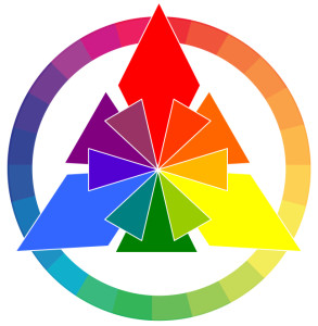
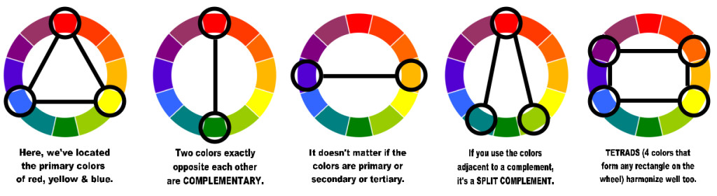
Subtractive color, which I may from here on refer to as just color or hue – another, more technical word for color – can be divided up further, in different ways. First, let’s take a look at a color wheel – a tool to help organize colors and their relationships to each other.
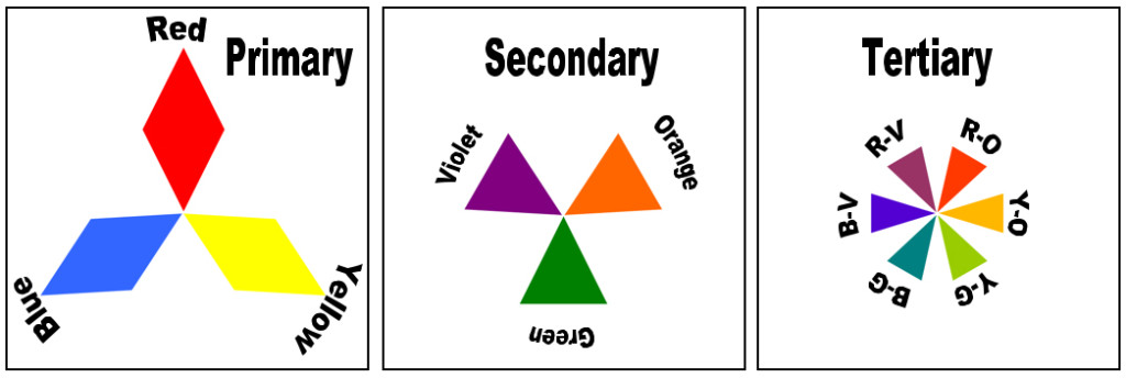
If you take it apart – as I have in the picture below – you can see, from left to right, the Primary colors (red, yellow, blue), the Secondary colors (orange, green, violet), and the Tertiary colors (red-orange, yellow-orange, yellow-green, blue-green, blue-violet, and red-violet). Note that the hyphenated names for tertiary hues are named with the primary color first.
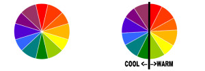
Put them all together and you can see how they relate to each other. This makes it easier to find what colors look really good together. The line shown below separates warm colors from cool colors. Warm colors have a visual “heat” and contain dominant amounts of red or yellow. Cool colors seem to lack “heat”, and mostly have dominant amounts of blue. This is known as color temperature.
Colors that are next to each other on the color wheel are called analogous colors. Examples of analogous color scheme would be blue-green, blue, and blue-violet. Analogous colors are harmonious together and do not contrast strongly against each other. There are lots of ways to use colors together:
So far we’ve only talked about rather pure, basic hues. What happens if you start mixing them up?
Value and Intensity – In Theory
Both black and white are relevant to this topic. They are neutral: one being the very darkest, and one the very lightest. When you add one of them to a color, you create new categories.
Value is how light or dark a color is. If you add white to make a hue lighter, it is then a lighter value. This is known as a tint of that hue. In popular culture, tints are often called pastels. Not all tints have common names, but an example would be if you added some white to red – the resulting pink color is a tint of red. If you add a lot of white in proportion to the red, it’s even a lighter tint of red – but it’s a tint all the same. Conversely, if you add black to make a hue darker, it is a darker value of the same color. That is known as a shade of that color. An example of that would be navy blue – a shade of blue made by adding some black to it. These terms tint and shade, as well as value, are very specific in the art world and it’s best not to confuse or misuse them. The most notable property with tints and shades is that you have NOT altered the base hue’s identity by adding any different hues.
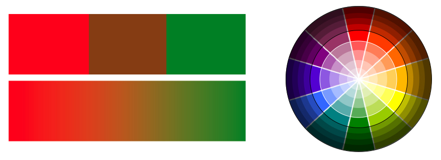
Intensity is a property of a color in relation to how pure it is, versus how much of its complement has been added to it. To really understand this, we must refer to the color wheel again. Note that red and green are complements. If you were to add a little green paint to a lot of red, you would take down the intensity of the red; it would be a less pure, less intense, less true red. (Note that in some texts the word “intensity” is replaced by the word “chroma”; they are the same thing.) Likewise, if you were to add a little red to a lot of green, it would be a lower-intensity green. Any mixture of complements is known as a tone. You can vary the amounts of each of the complements to achieve any tone you wish that is in the range between those two complementary hues. When you reach equal strength of pigment (your colored paint), then you should (ideally) have something close to black (you usually have to tweak it a bit). On either side of black in that middle ground should be some rather muddy-looking colors that possess very low intensity, and are difficult for many eyes to distinguish from what most would consider simply ugly browns. You can see this in the rectangular illustration below to the left. What you get in the middle depends on how much of which colors you’re mixing. It is significant to note that the value contrast between complements yellow and violet is far different to that between, say, red and green. Yellow particularly is not a very strong color in pigment and by its nature is a very light value compared to other primary and secondary colors.
In the circular diagram below right, you can see that all of the lighter tints inside the white circle are tints of all of the hues, and all of the shades outside the black circle are shades of all of the colors. The space in between holds the pure colors without any black or white added. Note that there are no tones in this model, because at no point do any of the complementary hues mix with each other.
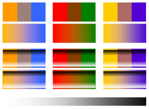
Also note that the complement of any primary is a secondary – made of the other two primaries, which, in effect, means that you’re mixing all the colors together, which is another way toward black. Then, if you add white to make a tint of whatever mixture you’ve made, it’s more of a gray or a lighter brown, or a lighter grayish hue, depending on how much of each paint you added. The same goes for any other complementary pair of hues – you can mix value and intensity modulations to get an infinite number of subtractive colors. Below you can see some ranges between complements, and how tints and shades affect those ranges, as well as a value gradation between black and white.
Note how complements theoretically make a black or dark gray between them, but sometimes you get something else. This is especially true in these samples because I’m generating them on a computer screen, polluting the issue with additive color, since your screen illuminates with light. But once you start mixing paints, you will see what really happens. Play around with it and get familiar with what happens with different combinations.
Hue, Value, and Intensity – In Practice
Of special note for those working with transparent watercolors: since there is no “white” in this medium, you have to thin your paint with water to let the whiteness of the paper show through. If you’re a beginner in paint and you want to get the feel for mixing with actual white pigment, use gouache, which is an opaque watercolor, or acrylic. Oils are more complex and need a certain type of environment to be used safely. You can add water to acrylic because it is a water-based medium, but do not add too much or the paint will not adhere properly to the substrate (paper or canvas). Remember that acrylics can dry quickly, so to keep them workable, get some medium – I like soft gel medium, personally. If you instead find and want to try a fluid retarder for acrylics, then remember to use it very sparingly – or the paint will not dry at all. And do not run acrylics through an airbrush (see previous post). Always read all instructions thoroughly.
For those using drawing media like colored pencils, you can lay them over each other in light, layered overlays; I find that laying lighter colors over darker ones works best, as does altering your stroke direction very slightly and keeping strokes tight to each other while working. If you use pastels, remember that there is a limit to blending because of their texture. You can get nice textured paper to hold more pigment, but think before you blend because once you crush the tooth of that paper, it won’t hold any more…plus you have to seal it heavily with spray fixative or it will smear and disintegrate with time. Oil pastels and crayons blend similarly but with a little less mess. Other drawing/blending tips can be found here, all through the “In Practice” section.
You will find that finer points of blending colors vary from medium to medium, and that’s okay. If you find a medium you particularly enjoy, you can do lots of experimenting to get really familiar with its properties and idiosyncrasies, and develop your technique to an expert level through trial and error and refinement.
Hue, Value, and Intensity – In Cyberspace: Master Works
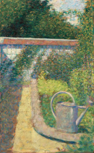
Georges Seurat (French, 1859 – 1891 ), The Watering Can – Garden at Le Raincy, c. 1883, oil on panel, Collection of Mr. and Mrs. Paul Mellon 2014.18.51
You’d be hard pressed to find art that didn’t use some version of the element of Hue. Still, some just sing with it. Artists that seem to have a winning ability with hue are often labeled colorists, but it’s supposed to be a more specific term than is often used. Impressionists like Claude Monet, Pierre-Auguste Renoir and Georges Seurat are probably most popularly associated with special attention to color theory and how it works, even figuratively dissecting how the eye visually blends contrasting colors placed next to each other in small amounts and capitalizing on that to allow the viewer to “complete” the works. Fauvists like Henri Matisse and Maurice Vlaminck used riotous, bright colors in expressive strokes. De Stijl artists like painter Piet Mondrian, architect/designer Gerrit Rietveld and sculptor Georges Vantongerloo reduced hue to its most basic primary colors. Black-and-white photographers like Ansel Adams showed how sparkling value contrasts can be even when limited to a gray scale. Art Nouveau artist Maxfield Parrish liked to work with a complementary color scheme of blue and orange to contrast warm light and cool shadow. Since the works of many of these artists are still under copyright I cannot always put images here, but search these artists online and get a feel for how they use color by studying their works at various great museums, online or, even better, in person.
Be sure to check back occasionally for more lessons on the Elements and Principles of Design.
If you have any questions or need clarification concerning any of these design concepts, feel free to contact me using the Contact Form. Be sure to put the words “Lesson Question” in the Subject line (but the quotation marks aren’t necessary). I run several sites as well as my fine arts production projects, so I will get back to you as quickly as I can. Thanks!
– Eilee
Master work images courtesy of nga.gov (National Gallery of Art)
Hello, this is Eilee George with another art lesson. This one focuses on form, texture, and pattern – they are each Elements of Design. I do recommend going through these in the order posted, since I may refer to previous lessons in subsequent ones. If you don’t know what the Elements of Design or the Principles of Design are, you can read about them here (it will open in a new window). If you like, you can just start from there and you will be led from lesson to lesson in the order of their creation, but plan on reserving a block of time for each in advance.
In this lesson, I won’t include any of the Principles of Design, as these three present LOTS of material to cover on their own. There are explanations as well as theory and illustrations. This entry also includes lots of drawing technique tips in paragraphs that are in italics. All you’ll need for the exercise in this lesson is some sketch paper, a pencil (and eraser), and some good colored pencils. So let’s get to it!
Form – In Theory
Form is the three-dimensional (3-D) extrusion of the two-dimensional (2-D) shape. But first let’s put that in context by going backward to how 2-D shapes work. 2-D shapes exist within an x,y axis – each shape exists within a single flat plane (in which could exist, say, a flat square or circle). 3-D forms exist in an x,y,z axis in space (in which cubes and spheres can exist). A line would theoretically be one-dimensional, if you could perceive it without thickness – it theoretically has a length and no width or height. A rectangle is two-dimensional because it has a length and a width, but theoretically, no height (or depth). A sphere, cylinder, cube or cone is three-dimensional because it has a length, a width, and a depth.
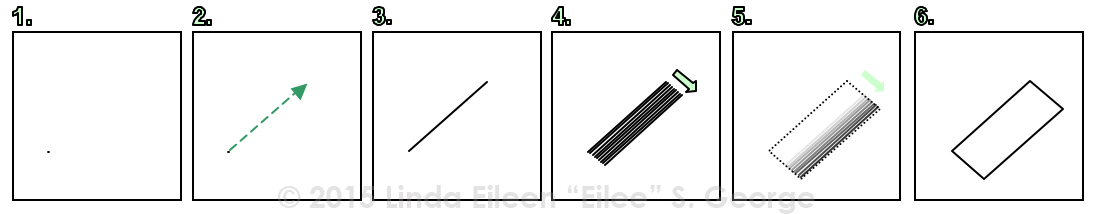
To visualize the difference of some of these, try this: imagine first that you have a point. It really has no thickness – no length, no width, and no depth, but for all practical purposes, it’s a speck. See Figure 1 below. If you were able with magical powers to move that point in one consistent direction for a little while, its path would create a line, as in Figure 2. Now we have an entity: a line, with one dimension: length (see Figure 3). Now (as in Figure 4) take this line, and drag it sideways from its former path, and it leaves a trail of its new path: it would form a rectangle as you go (see Figures 5 and 6). The movement created a second dimension, and a shape known as a rectangle, which has length and width. That’s two dimensions.
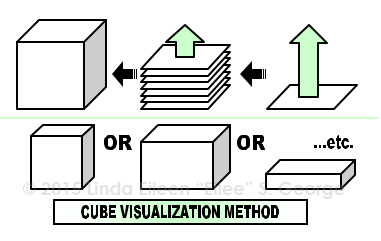
Now, imagine you can move this rectangle in a direction perpendicular to the plane it lives in, and collective path that all its sides create will make the planes of a 3-D box – a box with three dimensions: length, width, anddepth. You could do the same exercise with a square (shape) to make a cube (form), or with a circle (shape) to make a cylinder (form).
So how, you may ask, do you get a cube? In that case you would simply move a vertically-oriented square forward or backward (or, if you prefer, a horizontally oriented one up or down) in space – and only move it the precise same distance as it is from any side to its opposite side. To get different proportions of boxes, simply move differing distances, and/or differing proportions of rectangles to deal with. Here’s an illustration for the cube or various boxes first:
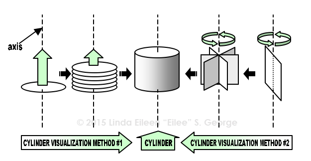
Interestingly, there is more than one way to make a cylinder with a shape. You can also make one with a rectangle or a square. Pretend that there is an invisible line that passes through the center of the length of that rectangle, and you spin the rectangle around that axis in place – really fast. The corners of the rectangle would always be the same distance from the centerline, tracing a radius. Those corners, spinning around that axis at that radius distance, would trace lines around in a circle around that axis. The top (or bottom) edges would at their widest width become the diameter of the circle made when the rectangle is spun. Therefore, the path that its vertical sides traced would in effect illustrate the form of a cylinder. This is the method shown on the right side of the following illustration, whereas the previous explanation of making a cylinder from extruding a circle is on the left half; each results in the same goal of a cylinder.
Similarly, if you spun a triangle around a central vertical axis, it would make a cone, and if you rotate a circle around a central axis, it would produce a sphere. Now, a square, if rotated the same way, would also create a cylinder – just a shorter, wider one than a vertical rectangle would produce. I made an animated gif to better demonstrate the concept; click on the image.
(Please click on image to activate animation; use your Back button to return to this lesson.)
Now you can see why it is important to not use the words shape and form interchangeably – they are quite distinctly different things!
Now that you understand the basic forms…what do you do with them?
Well, we must understand that these basic forms, or some version of them, make up a very large percentage of the objects we see (and draw). Breaking down complex forms into the simple ones that make them up is a far less scary way to analyze and draw things.
Look at your television. It’s pretty much a flat box. Chairs may be a series of long, skinny boxes (or square prisms), or their legs might be cylinders. Spheres are all around in globes, tennis balls, even the rough shape of some more perfect trees, excluding, of course, their cylindrical trunks. Other trees look more like cones (especially those in the evergreen family). Look at your own hand. Your fingers are somewhere between cylinders and cones – they taper toward the end although they don’t come to an absolute point. Yes, there are lots of modulations and bumps but try to look at things in simpler terms, like you did as a little kid. Little kids are naturally gifted at simplifying things: “Every child is an artist. The problem is how to remain an artist once we grow up.” – Pablo Picasso
Knowing what the basic shape is will help you as you decide to draw and to shade the thing you’re drawing. Light wraps around cylinders and spheres in different ways than it bounces off of a cube.
Texture and Pattern – in Theory
You must also take these light-and-shadow characteristics and apply them loosely if you’re drawing something with texture or pattern.
Texture is an element of design that, in drawings, is mostly only simulated, through applying a pattern of pencil strokes to make it look like the thing you’re drawing is made of stone, or burlap, or whatever. It isn’t actually those textures, but it looks like them, and that is what is important. The paper is still smooth-ish in most cases (although we can beat up the paper a little bit, shy of actually tearing through it). Texture can appear smooth, rough, toothy, furry, cobbled, woody, grainy, etc. – whatever look you’re going for. In painting and sculpture, texture can also be literally a tactile surface quality as it would be on an actual object.
Pattern is a similar element of design, and is more of a surface application that looks decorative, like a floral motif, or stripes, or something more graphic in nature rather than trying to depict the way an object feels. Pattern can be on an absolutely smooth surface, like the silk upholstery on a throw pillow, but still have a very busy design -such as polka dots, plaid, stripes or paisley, or a floral pattern. Pattern quite often repeats in a regular fashion, at regular intervals. Texture can be either regular or random, depending, again, on what you’re trying to achieve.
Examples of texture include grass, fishnet, sandstone, woodgrain, velvet, carpet, gravel, bark, or fur. These are things that you can feel the distinctive bumps and consistency of on objects in real life, without even looking. In a drawing, an illusion can be created that suggests that you could feel those bumps and textures – but really on a drawing you would just feel the texture of the paper and perhaps some minor dents created by the pencil or other media (and likely you would ruin it by touching it because it would smudge – so don’t do this literally!) Conversely, pattern you may not be able to feel at all in the real world or in an artwork. A store-bought notebook cover may have a busy design on it that you can see, but when you touch it, it is still just smooth and flat, and you couldn’t tell which (if any) design was on it if feeling it while blindfolded. It doesn’t appear to have a texture, just a flat design.
Understand also that these two elements, texture and pattern, can also both exist together at the same time. An example of this would be a piece of velvet that has been printed with a floral design, or a nubby rug with different colors woven in to make a geometric pattern.
But texture and pattern have to be on something. That something, in your drawing (be it a landscape or portrait or still life), is likely a form of some sort.
Form, Texture and Pattern – in Practice
Let’s start simple. A tennis ball is a sphere, and it’s fuzzy. Know that you needn’t get so detailed as to draw every single hair on it. Although some people like to get into such painstaking detail, it simply isn’t necessary to get the point across. All you have to do is suggest a texture with a few well-placed and well-spaced strokes. Experiment and you’ll get the feeling for it.
You met some of the basic forms in the Line lesson. The still life in that was drawn and “shaded” by using lines in different ways. What you may also notice is that those lines that were used to “shade” those forms – those lines created a pattern. It’s mostly stripes, but that’s still a pattern. The sphere in the example drawing was “shaded” by using concentric lines that seemed to bend around upon the surface of the ball, closer to each other to make darker areas. Those long lines could be replaced by tiny little lines – tiny little lines that go in all random directions that are straight, curved, bent, multi-directional, and rather light and delicate – much like the tiny pieces of fuzz you see on an actual tennis ball. It’s effective to draw the lines very lightly and softly in the areas where light is strong, and as shadow creeps across the ball, start drawing the little lines a little darker. You can even start shading the surface “beneath” the fuzz more smoothly in addition to those darker lines – as long as the “fuzz” lines are a wee bit darker than their background – unless the shadow is dark and heavy, as it would be in a stark spotlight in an otherwise dark room – then the eye tends to lose its perception of detail so you could blend it.
So, you may wonder – why on earth would I draw a tennis ball? Well, for the sake of a drawing exercise, they’re pretty accessible…and you can control the light they’re in and they won’t go bad and they’ll sit still for you – and – they’re a basic form. Hey, lighter and heavier fuzzy textures are on plenty of other drawing-worthy subjects: peaches, puppies, moss, caterpillars; even clouds. The way that you apply your strokes is going to differ with the details of what you’re drawing – peaches have very fine, short, and almost transparent fuzz. Puppies have longer furry fuzz. Moss is a little more stiff; caterpillars have rather long hairs compared to their overall size, and clouds can be kind of…curly or feathery, depending on if they’re cumulus or cirrus clouds (stratus clouds get blended more). The thing with the tennis ball is that it is a simpler form for you to begin with, and then you can work into more complicated, compound combinations of forms in more complex subject matter like animals, still life scenes, and landscapes. Walk before you run. And, whenever it’s possible, draw from something that’s directly in front of you.
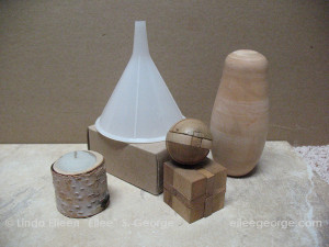
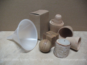
So let’s set up a little still life for you to draw – just regular household items that are representations of the basic shapes as you can find them. It doesn’t matter if you have the same things as I use in my examples; it’s the principles that I point out that are important. If you don’t have a tennis ball, try an orange, or a baseball, or whatever simple spheres you can find that have just a little texture or pattern to them. Grab a roll of toilet paper, a can of beans, a short can of tuna, or some other simple cylinder. Grab a party hat or a funnel or a megaphone or whatever odd cone you have around your place, or make one with a piece of paper and some tape. If you’re desperate, a lampshade might work. Boxes should be abundant in your pantry and all over the house. Just try to find good representatives of each of the basic forms, that are of a size that you can work with. If you can get these things in a solid color, that’s best for the beginner. The fewer patterns and printing on them the better, but feel free to experiment with that if you are more advanced or feel adventurous or confident (practice is always good). Scattered through this I’ll put some still life setups that I gathered. At first the photos will be rather monochromatic (shades and tints of mostly a single color), to ease the translation into a graphite pencil drawing (or charcoal, etc.)
Put the items on a table under a light source, and study how the light and shadow wrap around them. Note how the light and shadow and the gradation between them change depending on how smooth and how reflective they are. Shiny things have stark reflections without a lot of gradation between light and dark. Dull things have a more gradual and even transition between light and dark.
Draw a light outline of the still life once you have the objects arranged in a way that pleases you. Don’t do heavy cartoon outlines; that will flatten things no matter how well you shade them. Save that for more expressive work down the line, if you decide to get all political or emotional about things. For now, let’s just learn to draw what we see – and we don’t see lines around everything in real life; this is just a little guide for you to shade up to, either on the object, or on whatever’s behind it, depending on whichever is darker. You can see in the adjacent illustration that there isn’t even much contrast between the box and the background. It’s up to you whether you want it to stay that way or punch it up to make the box stand out a little more. Take note of the pattern in the tile and the texture on the candle, and the differing wood grains in the puzzles, and the slightly shinier reflectivity as well as the partial translucency of the funnel. And study the different shadow appearances. You’ll note shadows act differently in hard light than in soft light, or in areas with multiple light sources (even more exciting when those light sources are different colors, but let’s not get too advanced yet).
A note about sketching style: I see a lot of beginners drawing short, loose, almost “furry” lines when they aren’t confident about getting the shapes right on the paper. I find that such a technique creates a lot of erasing and mess. Try drawing the outlines in a single line whenever you can. The secret to getting a smooth line is to draw not with the fingers, but with the whole arm, and if you are able to draw at a table or counter standing up, that’s even better because you can move your whole body in a fluid line to get smoother results from your pencil. The further back your force comes from, the steadier the line will be. It’s almost like a graceful dance, or like the fluid motions of Tai Chi. If you’re drawing only from the knuckles in your fingers or even from your wrists, your range of motion is too restricted and you won’t like the results when you’re drawing larger shapes – they’ll look bumpy and stiff. Draw with your whole body if you can find the space to do it. Practice it if you like – that’s how I do straight lines – horizontal, vertical, whatever – and circles, and arcs, and serpentine lines – and the results are fantastic. You won’t have to practice much, just till you get a feel for how all your body joints work in harmony for the common goal.
Once you add color to your still life, you’re going to have to be extra careful to not let that throw you off on light-and-dark values among them. There will be another lesson on value and hue in the near future (here it is), but a little of it was touched upon in the Shape lesson.
Once you have your outlines and they’re nice and clean and you like the proportion, it’s time to start shading in your value modulations. I like to start light and go dark, but it’s a matter of personal preference and not a rule. My rationalization for it is to reduce the possibility of smearing all over the paper by my hand touching some dark spot before I’ve done other areas and “contaminating” an area I really didn’t want dark. One can wear cotton gloves, or put a piece of paper under one’s hand, or position one’s hand in a manner where it wouldn’t rest on the paper (putting your drawing pad on an easel and standing at it is ideal). I don’t know your setup so you’ll have to find what works for you. Another possibility, although it’s rather stiff feeling, is to shade from the corner opposite where your hand is coming from and work your way back. This isn’t really natural, and you get better results working the whole composition rather evenly phase by phase. I used to do detailed areas one after another, leaving other areas completely untouched, and sometimes never finished the drawing, and it looks unfinished because there was this photographic detail in one area and a mere outline in others. Some people dig that, but it’s often better to work around the whole drawing in stages…that way, if you’re interrupted, it’s cohesive and can be developed further, and you can record the stages with a camera if you want to analyze it. This way, if, like I was, you tend to be too tight in your style, you may find that an earlier stage is “enough” and even beautiful in its simpler, stylized or even more abstract form – or you may want to even take off more in that stylized or abstract direction and abandon photorealistic accuracy for expression. You can add life to that still life that only your imagination can breathe into it. But that’s likely not going to happen on an initial still life of a bunch of boring stuff of basic forms. Thank goodness you can choose to only do boring basic forms once or twice or however many times it takes to get you ready for more complex subjects. But this is a fantastic foundation, and I highly recommend it; the payoff is great in the next phase.
Here’s how to shade really light areas: instead of grasping the pencil solidly as one does while writing, hold the pencil loosely between the thumb and index finger, letting the weight of the pencil itself be the only force laying marks onto the surface of the paper. It should be so light it’s hard to see at first, but patience and repetition will let you shade it gradually from white to successively darker values. Eventually you can find where you can hold the pencil more naturally for the mid-tones, and then for the darker values. Make sure you don’t get so regular in your motion that you create edges that shouldn’t be there; move around evenly but randomly, and overlap your strokes so there is no one line between passes, and fade them out at the edges from pass to pass until they blend together seamlessly where they meet. Try to angle your stroke direction to relate to the perceived “direction” or “grain” of the surface you’re modulating.
Now, the difference between shading spheres, cones, and cylinders is largely the shape that the light and shadow take on these forms. Light and shadow follow the “shape” of the forms – on a cone, you will see both highlights and shadows that are triangular – narrower toward the point. On a cylinder, they’ll be more rectangular in nature, and on a sphere they will be in ovals with crescents wrapping around them.
Again, I’m assuming you’re starting with pencil or charcoal or some other drawing medium (pencil is best at first). Whatever drawing medium you use, the stroke of the implement will show as you shade; therefore, care should be taken as to how that stroke is applied. Whether you’re shading an object, a cast shadow, a background or whatever, make your marks and strokes work with whatever you’re depicting.
With cubes, there is very little modulation on the flat planes – but they are rarely completely one flat tone per side. Let atmospheric perspective step in to make a side a little lighter or darker as it recedes away from you or advances toward you – and exaggerate light and dark in a way to create maximum contrast along where the edges visibly meet, to emphasize their sharpness and make them pop. You can do a little of the same with the flat ends of the cylinder versus the curved sides. (You can read about atmospheric perspective on this page about Shape in Simple Space, around the 12th paragraph, between the two colorful flat shape graphics that look exactly alike).
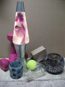
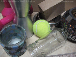
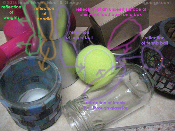
Here are some more photos of objects that show how they reflect upon each other in more detail. Note how the glass jar refracts and warps the shape of the tennis ball as you view it through the bent glass. Note how the reflection of the tennis ball is a duller yellow in some of the objects near it because of those objects’ local color mixing with that reflection, making a relative color. (Local color and relative color are also discussed in the Shape lesson.) See how the silver base of the lava lamp is dull rather than a mirror finish, and how it tones down the color of the objects that it reflects. Notice the reflection on the box from an area we can’t even see from this angle. In the other photos above, note how shadows act under the jar, as they recede away from more opaque objects – they go from sharp to blurry as they go away from the object that casts them (for instance, under the weight). Look at how shiny objects’ reflections are very sharp and sudden, but the highlights on dull objects are smoothly gradated.
If one of your objects has a pattern, design or printing on it, note that within the shadow, you can’t really see as much detail or contrast – embrace that. Remember to draw what you see, not what you know. What that shaded side of the box would look like in good light is unimportant. Draw it as it looks in the shadow you’re looking at now.
If one of your objects is rough, like a box made of rough stone, you can use a loose pattern to depict that roughness, like a toothy crosshatch pattern or a pointillist bunch of dots or even controlled scribbling. On the other hand, if it is smooth, try this:
For shading very smooth objects, shade in light layers over each other, with your strokes a little longer, overlapping randomly as possible, and when you change stroke direction, only change the direction by a couple of degrees, so that they’re almost parallel – this will give you much smoother results.
Also, pay attention to how shadows are cast from the objects onto the surface upon which the objects sit. Note that in most cases, the shadow is darker closer to the object, and the line of the shadow edge is sharper closer to the object. As the shadow travels away from the object, it may become slightly lighter and blurrier. Shadows also follow the form of whatever they fall on, so if that surface bends, the shadow bends with it. Showing shadows accurately will give as much believability to your drawing as drawing the object itself precisely will.
Also note that if the surface the items are sitting on is a bright color or white, it may cast a tiny bit of reflected light (or reflected color) back onto the shaded part of the objects. The usefulness of this is twofold: it helps to make your object pop more – to look more three-dimensional – and it is very useful for making a darkly-shadowed area of an object stand out a little from an area of background or cast shadow that is also dark. You can emphasize that, if necessary, to make your depiction a little easier for the observer to look at and understand what’s going on. This is just another example of “taking artistic license” – manipulating how things look just a little to make the picture “clearer” – or to create a mood or to emphasize an object the artist may feel is especially important. Once you work in color, you will notice on close observation that colors also reflect on each other within an environment, and this can make for very lively work when you freely express those reflected colors. You will come to understand that there is no such thing as a “white” wall, because it reflects everything around it to some degree – as long as there is any other color in the room, that white wall is a rainbow of very subtle variation in relation to those colors, to their intensity, their proximity, and their hardness or softness. Life and art and vision just got a lot more interesting.
A final note on blending in graphite, charcoal or other pencils or chalk pastel:
Although it’s tempting to do so for the convenience, I recommend never, ever using your fingers to blend your work, because the natural oil on your hands will make the paper shiny in those areas when it isn’t anywhere else, and it looks unprofessional and sloppy. Use a tortillon, or a blending stump. These are available in art supply stores near drawing tools. They are tightly-rolled bits of paper that taper at one end to allow for detailed blending. This allows you to control the blended area much better and keeps the quality and matte/sheen of the media consistent with the rest of the work. It also keeps you from transferring, with filthy fingers, color onto areas and objects you may not want it! In a pinch, you can substitute folded bits of tissue, cotton swabs, or fluffy cotton balls, particularly for larger, appropriately scaled areas where detail isn’t an issue.
Form, Pattern and Texture – in Various Examples
It occurred to me that it might be helpful to see some beginning work when learning these lessons. Here are some old student works of mine as I was progressing through the topic in school. Some of them are incomplete, as they were executed under strict time limits and I was still trying to judge how fast and how much detail to go into in relationship to the time given. That being said, it doesn’t reduce the usefulness of these examples to show some of what I’m talking about here. The one thing that bothers me is that in those drawing classes we didn’t do much in the way of color (it was saved that for painting class) and I’m just trying to teach you to draw right now. When I find some basic forms (or pretty basic) I’ve done in color, I’ll insert them. I have an enormous library of archives to sort through.
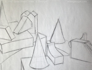
This was an early assignment – yet still after we had done many, many drills on individual forms, one at a time. Now we had to figure out placement, proportion and perspective as they existed together in space. Before we tried shading, we had to accurately draw positions in relation to each other, and to ground. This drawing was done in vine charcoal on large sketch paper. You can see there’s been a lot of erasing. That’s okay.
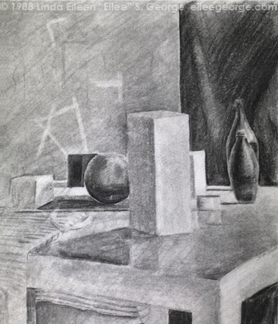
This one is a little more advanced. Bottles have been added, and they represent some composites of different forms together. Also, of course, it’s more than a line drawing; it is shaded to represent the light placed very near the still life and the shadows that the objects cast, not to mention some degree of reflection of the objects on the slightly shinier table. Due to the age of this piece it has smeared, and some of the details have been lost. The strange lines in the background represent random pieces of masking tape stuck to whatever that was (I don’t even remember). Overall, this technique was achieved by taking vine charcoal and coloring the entire page gray with the side of it, blending until it was nearly homogenous, and then darkening objects and shadows with heavy brick charcoal and pressed charcoal pencils, and erasing out the highlights to varying degrees with a moldable kneaded eraser. It’s one of my favorite techniques, giving a soft, sculptural feel to a drawing. I also can’t sing enough praises for kneaded erasers; I simply won’t use any other kind since discovering them years ago during my first art degree program.
This one with the kettle is just a little later and was never finished (due to another time limit I fought with my detail level – I did eventually get that timing thing down very well on much more complex subject matter: figure studies). Here we see a few more complex shapes and then pattern, in the unfinished striped cloth in the foreground, as well as an excellent bent reflection in the shiny surface of the tea kettle. Looking at the dish behind the central bottle, you can see some very odd and unpredictable shadows in its recesses. This sort of thing is precisely why it is best to do still life work from actual objects instead of from your imagination, because it is those quirky, difficult-to-imagine details you see in real life that make a drawing come to life – even if it isn’t finished. It is graphite on paper, totally pencil blended, meaning that nothing was smeared to blend, giving a fresh, lively yet delicate appeal.
I’ll throw in some more student work in future lessons. I thought it might be a little more encouraging than simply showing you master works…but those are good too, to give you something better to aim for. So….
Form, Pattern and Texture – in Cyberspace: Master Works
Try looking up images by these artists for more appreciation of these concepts:
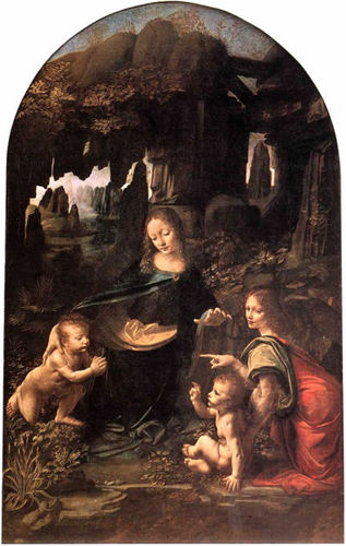
“Virgin of the Rocks”, ~1505-1508, by Leonardo da Vinci
Artists who work well with Form include: Edward Hopper, John Constable, Jacques Louis David, and Leonardo da Vinci.
(More images below…)
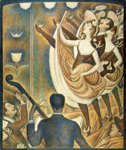
“Le Chahut”, 1889-90, by George Seurat
Artists who work well with Pattern include: Henri Matisse, Gustav Klimt, Jackson Pollock, and Georges Seurat.
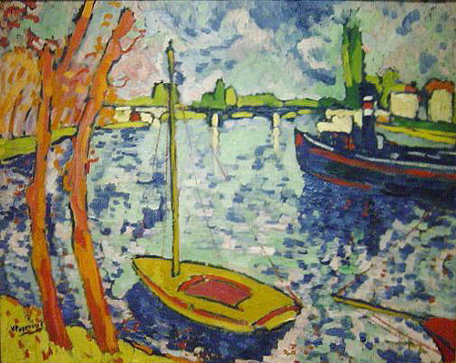
“The River Seine at Chatou”, 1906, by Maurice Vlaminck
Artists who work well with Texture include: Jean-Antoine Watteau, Edvard Munch, Julian Schnabel, and Maurice de Vlaminck.
Be sure to check back occasionally for more lessons on the Elements and Principles of Design.
If you have any questions or need clarification concerning any of these design concepts, feel free to contact me using the Contact Form. Be sure to put the words “Lesson Question” in the Subject line (but the quotation marks aren’t necessary). I run several sites as well as my fine arts production projects, so I will get back to you as quickly as I can. Thanks!
Master painting images in this post courtesy of the old Ookaboo.com
Hello – Eilee George here. Today we’re going to look at two more Elements of Design working together: Shape and Space – and we’re continuing from the previous lesson, Line: The Most Basic Element. But first we’ll discuss Shape. If you’re lost already, then start by checking out the first post in this series: Introduction to the Elements and Principles of Design.
For today’s exercise you need some colored paper, a large sheet of black paper, scissors, and a glue stick – or a simple graphics program you’re already familiar with.
Shape – in Theory:
“Starry Night” by Vincent van Gogh
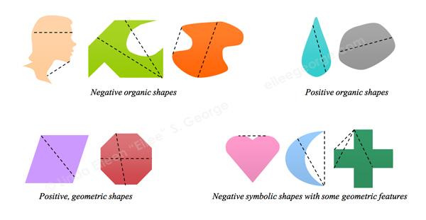
This element is very nearly an extension of line. In the preceding tutorial on Line, Dutch Post-Impressionist Vincent Van Gogh was listed as an artist who incorporated line into his drawings. But sometimes his lines became so thick that they became shapes in and of themselves. Shapes can come in many different categories. The names for different kinds of shapes enable us to describe them and discuss how they interact in an artwork, as well as helping us to choose among them to create a specific impact in a composition. Among the categories of shapes are: geometric, organic, positive, negative, and symbolic.
We learn simple geometric shapes early in life: circle, square, triangle; rectangle. As we grab our first crayons, our attempts to mimic these shapes fall short of being purely geometric and are, instead, organic shapes. We notice symbolic shapes like stars and hearts and decorate our notebooks with them. As we advance through school and learn higher math levels, we are introduced to further geometry: trapezoids, parallelograms, pentagons, hexagons, octagons, dodecagons and the like. We look around our world, and see every imaginable shape, some of which overlap in category, and many of which have no names.
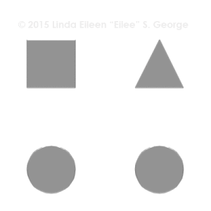
Shapes can also be divided into two alternate main categories: positive shapes and negative shapes. A positive shape is completely convex: in other words, there is no place in the shape where you can draw a straight line from one edge of it to another edge anywhere else on the shape and go outside of the shape. The standard geometric shapes listed above all serve as examples of this. The other type, a negative shape, doesn’t meet that criterion. In a negative shape, there are places that you can draw a straight line from one point on the edge of the shape to another point on another edge of it, and cross outside the borders of its outline – and perhaps even back in. This can happen with the heart shape (along the top) or the outline of a star, a crescent moon, or a cross (between any of the arms). Negative shapes can create interesting energy in the negative space around them that accompanies them, especially when used in repetition. Keep in mind that even though there are places you can draw lines within negative shapes that do not go outside of them, that does not make them positive shapes – the rule is that it’s a negative shape if there is anywhere that you can draw that straight line outside of the shape from edge to edge. Note also that an organic shape can be either positive or negative; a positive shape can be either geometric or organic; and so on. Some shapes may even have both geometric and organic features. Here are examples of positive, negative, organic, geometric, and symbolic shapes:
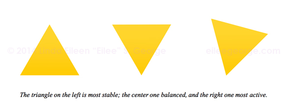
Shapes can have strength and personality of their own. Some are stable and static. Some are more dynamic and flexible. Strong geometric shapes like quadrilaterals (4-sided: squares, rectangles, trapezoids and parallelograms) can be very ordered and formal either alone or in a strict pattern. Circles tend to give out a more playful vibe. But the personality and formality of a shape can also be manipulated and even contradicted by how it is used and placed. Circles on a grid can seem more serious than squares placed randomly at inconsistent tilts. Equilateral triangles “feel” different than right triangles or isosceles triangles. A triangle shown typically with a wide side to the bottom seems very stable; however the same shape positioned to “rest” on one of its points has a feeling of kinetic energy, (it might fall!) We perceive this partially because of our unconscious awareness of gravity and willingness to attribute it to objects in compositions. Organic shapes can have a softer appeal than their straight-laced brethren.
Space – In Theory:
Space is an abstract concept when applied to a two-dimensional surface, but applied correctly, it can make an incredible impact through a convincing illusion.
It can be alluded to through several means: position on the page adhering to principles of linear perspective, simple overlapping, relative sizes of similar objects, and relative color of similar objects via atmospheric perspective. Linear perspective can be constructed as either being 1, 2, or 3-point, or in complex groupings, even more vanishing points can be used.
Any element in an artwork can have these space methods used upon them, to manipulate the mind into perceiving the illusion of space, even on a completely flat work of art.
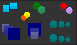
To further illustrate aspects of conveying space, let’s (repeatedly as we scroll down) borrow an image from the upcoming lesson, while I explain in more detail. You’ll see several pairs or trios of shapes next to each other in different placements.
One way that you can suggest that an object is “in front of” another object is merely by the positioning of same-size shapes on the background. When we see one object that seems a little bit “up” from another on the page, our eyes perceive it as being further “back” than the lower one (see the light blue squares on the top left). Think of how we view objects in our environment in relationship to our eye level. Thanks to gravity, many things with which we interact are typically below our eye level, or at least begin there: tree trunks, furniture, items on a tabletop or counter, and so on – we’re looking a little bit down at them. Most of the things we work on with our hands are below eye level because our hands are most comfortable working a foot or two below our eyes – that’s how we’re built, and therefore, generally that’s how we design things that we use, and that ergonomic awareness has led us to certain standard heights for chairs in relationships to tables, and heights of counters, and other common things we use every day. When you stand looking at your kitchen counter and there is an apple closer to the edge and an orange, an inch or three off to one side, back toward the backsplash, your eyes will look downward to the closer object – in this case the apple – because it is below your sight line and closer to you, but because of the tenets of linear perspective, when you look at the orange that is further away, even though it is still below your eye level, your eyes will rotate slightly upward (in relationship to how they angled to view the apple) to view the orange. Obviously, the opposite is true when you look upward – say, at the light fixture in the center of the ceiling in front of you, you will look farther up to view it, yet the far corner of the room where the ceiling meets the wall you will look a little further down to view it – again because of linear perspective – there is an invisible vanishing point all of these things recede to in space, and you’re the center of the universe with your viewpoint (your eyeballs) – that vanishing point in most cases is dependent on where your eyes are; it moves along with you. That’s kind of a sketchy explanation for now, but I will take proper time to teach more about perspective in another lesson. Anyway, we don’t spend a lot of our time looking upward – we mostly are accustomed to looking at things around eye level and below. This is where our pre-conditioned brains kick in with their perceptions of “normal”, and assume that whatever is “up” must be further away. The brain assumes many different things like this, based on common daily perceptions. You can use this predictable behavior of the human brain to help you determine your composition and lead your viewer to view art in certain ways, in the order and manner that you wish.
But let’s say that you bend down and look at that apple and orange with your eye right at the edge of the counter – your perspective (and vanishing point) have shifted with you, and the fruits will not appear to be “above” and “below” each other, but instead, side by side. You need other hints to tell you what is where.
Another way that you can imply objects being closer or further away is by overlapping them. There’s no denying that the yellow circle in the example is “in front of” the orange circle, because it overlaps and blocks our view of part of the orange one. If they were side by side on one level, whichever one overlapped the other would be in front.
A third way to suggest near and far in space is with relative size of regular objects. The trio of blue-green circles in the bottom-right corner of the illustration could depict two different scenarios: first, there could be three balls of different size side-by-side in a row all the same distance from you – sure, that could be true. But it also suggests that you are at eye level with the bottom of these circles, and they are all the same size, but the one you see as “biggest” is closest, and the “little” one is furthest away.
A fourth way to give an illusion of objects in space is to alter color. This is part of a practice in what is called atmospheric perspective, which is a little different from linear perspective, which is what I referred to in previous paragraphs. You’ve likely witnessed atmospheric perspective any time you viewed the outdoors on a foggy morning or a hazy afternoon. It’s more pronounced and noticeable at times like that. A color’s intensity, or saturation, will appear in the distance to fade toward a grayer form of that color. It also might shift to a cooler color (or toward the blue family) from what it appears up close. Now, you know that objects don’t just change color in and of themselves. A red ball is a red ball even in the dark. That’s what is referred to as local color. But if you shine a strong yellow light on the left side of that ball and a strong blue light on the right side, you will see what is called relative color. The left side of the ball will be somewhere in the orange family, depending on how bright that yellow light is, because red and yellow make orange – and on the right side of the ball, the ball’s local color of red will be affected by the blue light and they will mix to create a relative color of purple in this example, because red and blue make purple. You see, many things can “change” the look of colors, and atmospheric perspective is one of those things.
Think about photos you’ve seen with mountains in the background – they look bluish or purplish but not very intense blue or purple – yet when you get actually on a mountain, it’s never those colors – it’s browns and greens and reds and yellows – when you’re far away from them, the color change is due to the light and the stuff in the atmosphere reflecting the blue sky between you and it (and clouding your vision, like in the cases of fog, rain, snow, sleet or hail, smoke, and even pollution or swarms of insects). Lastly, it may get lighter in tint; in other words, go toward white – in daylight. The trio of blue squares at bottom left shows such a color relation. The brighter, darker blue is closest, and the grayer, lighter blue is furthest away. Also notice that because cool colors (blue, green, purple) seem to recede or “go back” in space, this means that warm colors (red, orange, yellow) try to advance “forward” in space as well. Look at the red circle and the lavender one. It’s hard to decide which one is closer, isn’t it? That’s because the red is positioned higher (or, as our minds see, “back”), but it’s warm and wants to advance “forward” – and the cool color lavender looks closer because of its positioning, but further because of its coolness. This creates a push-pull conflict and a tension in the viewer. If you are trying to create tension – to get attention to a particular political message you’re trying to portray for example – using color and space to confuse the mind of the viewer on purpose and make them uncomfortable is one of many ways to convey that sort of feeling in a work, giving it stronger impact, if that’s appropriate to your subject and goal for that work. Of course, if you were trying to create a feeling of peace, then this is not a trick you would use!
Note also that you can combine these different aspects of suggesting space. The blue-green circles at right center employ both size and positioning. The trio of blue squares bottom left utilizes size, positioning, color relation, and overlapping. The two green circles at top center combine overlapping and color relation (lighter colors advance beyond darker ones) – so do the orange and yellow circles – but notice that with that pair, there is a purposeful contradiction of a rule – the positioning is denied by the overlapping: the yellow circle is positioned higher on the page which normally makes us think it’s further away – but, the yellow circle overlaps the orange one, which tells us that it is definitely the closer one. This is where our brains step in once again and reason that the yellow circle must be “floating” above the surface that the orange circle rests on (this could be further proven in a lighter background using shadows). This is another way to manipulate the mind of the viewer, if that’s what you want to do – some artists make that a goal: Surrealists play both with and against perspective and placement, along with many other things, challenging our concepts of reality, making us think and engage more with the art piece long enough to start to analyze its symbolic meaning – it makes the art more interactive and interesting.
Another illustration of how you can have one rule contradicting another is the three blue squares in the bottom center. Here, because of overlapping, you will see the biggest and most intense square in the back, and the smallest and dullest square in the front. Overlapping is the strongest, most dominant rule in depicting object order; it trumps all the others and your brain has been conditioned to know that. Therefore, the brain will decide that these are simply the local colors of objects and they’re not in too much atmosphere, and it is an inherently small square in front of a medium square in front of a large square – the brain will just “know” that they aren’t same-size, same-color squares in space, but rather squares that are already different sizes – just placed differently.
Remember that a lot of these rules are based on assumptions: you’re walking about upright (not standing on your head), and you’re viewing the world in noontime daylight, and basically a lot of other “norms”. But there are exceptions to most rules. If you were drawing a landscape at twilight, atmospheric perspective might actually have things get darker as they go away from you rather than lighter – depending on where the sun set, and things like that. Rules have exceptions, and exceptions are interesting. Observe your world carefully in its different conditions, and you will notice patterns and new “rules” in each of the less typical times and circumstances.
Shape and Space – in Practice:
Today’s exercise will require some variety of colored papers (construction paper, clippings from old magazines or whatever as long as it’s preferably a wide variety of bright and dull solid colors), scissors, a glue stick, a ruler, some coins of different denominations, and a piece of black paper for the background. We’re going to play around with shape, and with it some scale, color, and linear and atmospheric space. If you’re lucky enough to have a program with simple graphics capability to help you do this on the computer, you could do that instead. You could mimic the following example in Word if you wanted.
Now first of all, you don’t have to copy what I’ve done verbatim. The point of this exercise is that you notice several relationships at work that convey a sense of space with these shapes. Leave one big piece of black paper untouched; it will be your background (or draw that background first, if you’re using a computer). Cut out/draw lots of squares and circles in various sizes (but well less than 1/4 the size of your paper) by either tracing around square or circular objects of different sizes, or by measuring and drawing them with a ruler, compass, and pencil, if you’re comfortable with that (or with your mouse…I’ll word the rest of this post as if you’re doing it old school, so adapt as you must). Cut some in both bright and dull versions of the same color in the same and different sizes too, if you can. Start putting them on the background, and push them around in relationship to each other, and watch what they start suggesting about where these shapes are in the space of a composition. Remember what we’ve already discussed about space as you do.
Play around with your shapes, and if you like, you can glue them down to your background in a way that shows different methods of demonstrating space – or you can try them on a different color background and see how that looks, or store them to play with another day.
Today we covered rather shallow depictions of Space. Later we will get into more detail about Space when I do a detailed lesson on Linear and Atmospheric Perspective, which we only just touched on in this lesson. There is much more to know!
When you can arrange simpler shapes with sizes and colors and alignments that suggest a sense of space, then you can graduate to more complicated objects in your compositions. You can do it collage-style, like this lessons suggests, or apply it while you paint or draw. A good way to figure out how to do this is to look at how other artists have done it. Accept any opportunity to go and observe art at museums, galleries, and any other venues that you learn of.
Shape in Cyberspace and in Master Works:
“The Kiss” by Gustav Klimt
Some artists who worked well with shape include Paul Gauguin, Gustav Klimt, Georges Braque, Henri Matisse, Pablo Picasso, Joan Miró, Wassily Kandinsky, and Clifford Still.
“Woman” by Georges Braque
If you have any questions about anything in these lessons, please feel free to contact me via my Contact Form, and be sure to put the words “Lesson Question” in the Subject line! I run several sites and projects, so I will answer as soon as I can. Thanks!
Hello…this is artist and teacher Eilee George. Here is Line: The Most Basic Element, the first in-depth lesson of my series on the Elements and Principles of Design, which I introduced in the previous post, Introduction to the Elements and Principles of Design, a glance at which you may find helpful, if you happen to be unfamiliar with these.
Line – In Theory:
Some would argue that a point is more basic than a line. I think of a point as a really short line or a really small shape; unless you’re going into Pointillism there’s no point to my pointing out points! I’ll leave that to Edwin Abbot’s Flatland for the geometrically- and philosophically-minded.
Lines, however, have a great deal more personality and use. Obviously they can be straight, curved, angular, fat, thin, dashed, frayed, or implied. They can outline things, which is probably how we all first used them with our fat crayons (flash back to: “What a nice tree, Honey” / “No, that’s Daddy!”) Lines can create a grid tracing over the contours of three-dimensional entities. Lines can be organized to create visual perspective. Lines can be placed in sequences to create the illusion of value. Lines can be combined in random or ordered fashion to achieve textures. Lines are used to design letters for alphabets to write language and communicate. In short, lines rock.
Line – In Practice:
A quick exercise I can offer you to illustrate some uses of line extending beyond the obvious is one I used to give to my Art I high school students. This exercise teaches not only a bit about line but also value. Value is the lightness or darkness of an object or background. One way that you can create light and dark values in an artwork is by using nothing more than lines!
On a reasonably large sheet of paper, lightly draw the outline of the objects you have set up in a still life on a tabletop (with the simplest objects that you have available), and place a strong light source to the left. Make sure your composition covers the entire page. In the example I show below, there are variations on the basic forms, for ease of depiction. (I know – we haven’t gone over form yet, but you have to draw something; these won’t overwhelm you, and you’ll learn more about form soon enough. You will also soon see how much these elements and principles overlap, and I will make sure you learn a few things at once.) Now, with your pencil, lightly draw two vertical lines dividing this drawing into three equal side-by-side sections. At this time, your drawing should look a little something like this:
Forms Still Life Blank
Please be kind to yourself and don’t expect perfection in your drawing technique. Certainly don’t compare your work to this example drawing, which I in all laziness generated digitally (later I will scan actual drawings in, for more complicated lessons that involve less mechanical shading techniques and so on). If you feel a need to use a straightedge and a compass or templates feel free, but it’s best to practice drawing freehand. A big hint to smoother lines, be they straight or curved, is not to draw with your fingers and wrists so much as to draw using motions from further away, like your shoulder – practice on some scratch paper until you’re comfortable if you like. Remember we have computers and printers to make mechanical-looking art. If you’re going to draw, let your art look like a human did it. There is true beauty in a little honest imperfection.
Now, in the left section, go over your refined outline in your choice of ink – and then do nothing more to it. Just stop your outlines right there at your vertical pencil border, don’t close in the empty ends of shapes; just stop there. (Note: it will look more interesting, by the way, if your borders bisect objects in the composition, rather than only fitting objects tidily in groups between the borders.) In the center section, using only vertical lines, place the lines so that they simulate the illusion of light and shadow by putting them closer together or further apart. The closer together the lines are, the darker the area will look. If the object is curved, some vertical lines may start and stop several times; that’s just fine. It’s also okay if you use a ruler, if you’re not comfortable drawing straight lines freehand – but again I encourage you to practice drawing them freehand, because you won’t have templates for all different kinds of lines! Once that middle section is done, move on to the right-hand third. Here, you will be using lines in a similar fashion to “shade” your still life, but this time you’ll be angling or even curving them appropriately, to show the shape and “direction” of each individual object. If you are drawing a cube, the lines will likely be straight, but may be diagonal, to show relation to, or opposition to, the direction the light is coming from. Let your instinct guide you on your choice of line direction…”feel” which way the form is moving from you. On curved, volumetric objects like a ball or a vase, let your lines curve along with them, interpreting the direction of the material, preferably also with relation to the light and how it plays upon the object. The lines need not be perfectly parallel, but at this point we’re not crossing them, in order to avoid going into more complex areas of shape and texture; those have whole other lessons. Here’s an example of what the earlier picture looked like after all the lines were put in:
Forms Still Life Shaded With Lines
Of course, yours may look entirely different than this because you used different objects and that’s just fine. The point in these exercises is just to get the general idea of how these elements and principles work in art, and then you get a big toolbox of tricks to use in your artwork that you can combine in your own unique way to say what you want to say. You’ve just taken the first step on a journey to artistic self-discovery. Keep practicing and experimenting!
Lines – In Master Works and Cyberspace – Look These Artists Up Online!
Honoré Daumier’s “Crispin and Scapin”Vincent van Gogh’s “Daubigny’s Garden”
Some well-known artists in whose work line features prominently are: Piet Mondrian, who reduced his works to the simplest components in a style known as de Stijl; Alphonse Mucha, who purposely flattened his beautiful allegorical female depictions with stark decorative outlines during the Art Nouveau period; Honore Daumier, who used a gestural-drawing approach in many of his works; Aubrey Beardsley, whose theatrical works had delicate outlines; and Vincent van Gogh, a Post-Impressionist whose works reverberated with the energy of many thick painterly lines that filled his canvases.
Be sure to check back occasionally for more lessons on the Elements and Principles of Design.
If you have any questions or need clarification concerning any of these design concepts, feel free to contact me using the Contact Form.
Be sure to put the words “Lesson Question” in the Subject line (but the quotation marks aren’t necessary). I run several sites as well as my fine arts production projects, so I will get back to you as quickly as I can. Thanks!
Hi there – I’m Eilee George, and I am an art teacher and tutor offering lessons in the Greater Denver area. I’ll start this first lesson out with information for you about my background and philosophy as a teacher. If you already read it on the main page, skip three paragraphs to “This is the first…”.
I was certified as a K-12 educator in Missouri in the 90’s; I have a BSEd in Art from Missouri State University. I have additional studio, art business and shop training in my Associate of Applied Arts degree from a now defunct Art Institute (one of many school-victims of corporate greed, not of inadequacy). In that I studied Industrial Design Technology, enhancing all of my fine arts experimentation. I have now lived in Colorado for almost 20 years, where, for some time, production held a higher priority than teaching in a public classroom setting–but I have always tutored, and love the custom-tailoring I can offer to 1-4 students at a time; it is more fulfilling for my students as well. Not knowing the age of whomever is visiting my site (and is interested in this subject matter), I will teach with my normal vocabulary; an understandable risk in a situation of anonymity. I chose this way because my teachers and my mother proved early on that it is pointless to talk down to children; they are very bright and capable when you show that you believe in them, and the dictionary is their friend! Baby-talking discourages growth; kids are amazing, well-equipped learners with brains in optimal mode for devouring knowledge! My vocabulary also makes the lessons more palatable for adult learners, who really hate being talked down to – not surprising! I believe in elevating and empowering all of my students.
Art teaches higher, more intuitive thinking skills than those that are typically utilized in English, History, Math and sometimes even Science, which focus more on the lower three levels. The lower three levels are Knowledge (rote memorization), Comprehension (understanding what you know), and Application (using what you know). The upper three are Analysis (describing what you know and how it is used), Synthesis (adapting knowledge and principles of application to unrelated areas from where you learned them), and Evaluation (assessing and improving the knowledge and applications as you observe and can better implement them). A good art class will work in all 6 levels through each unit.
I am a strong supporter of DBAE or Discipline-Based Art Education. It involves four key components: Art Production, Art History, Art Criticism, and Aesthetics. Creating art gets enhanced when integrating these other aspects; you learn to create in a context to the past that built up to your present; to develop taste and discernment. All of this works together to produce a better artist.
And now at last, the lesson!
This is the first in a sub-series of lessons in my Art Blog, on the Elements and Principles of Design. This short lesson is an introduction and brief overview. Once lessons begin in earnest, I will focus first on the Elements.
There is a language in art; it is technical and subjective at the same time, as is the nature of art itself. In fact, there are many texts and resources that can’t even agree on a consistent list of exactly what all of the Elements of Design and Principles of Designare – although there are many similarities, there is fluctuation, depending on which source is consulted. I will try to encompass all of the classic elements and principles in my upcoming articles, focusing on them in more detail, and showing their interaction.
Elements of Design are basically the visual tools that we use to create a composition. These can include line, shape, form, hue, value, intensity, texture or pattern,space, proportion, and scale. You can create a piece using nothing but line, or with shapes. If you modulate the shapes to make them appear three-dimensional, you are in effect creating form, and you are probably incorporating different values to achieve the illusion of light and dark that describes that form, be it smoothly or via texture. You can create textures with lines and/or shapes. If your piece is in color, you’re using hue, and can use different intensities of the hues there to render things accurately, or to create mood or even to create a sense of space, which can also be achieved through the placement and scale of your shapes.
As you can see, you can use these tools in a lot of combinations, and not just in those I mentioned above. How you use them is where the Principles of Design come in. These are more conceptual tools you use to organize and manipulate the Elements. The Principles include balance, emphasis, dominance, unity, harmony, variety, contrast, rhythm, repetition, pattern, and movement. As you can already see, there is a little overlap between some of these terms, and they can be used in different combinations, too. It can be very powerful to plan a work around even one or two of these principles; it gives the work a razor focus, an edge, and a personality that stands out to the eye.
I will present lessons on most of these elements and principles, combining some that are closely related. I strongly believe these to be essential, useful learning for anyone who wants to become a better artist. Art isn’t a free-for-all; it has a structure, and one must learn the rules before one can break them with any success. I understand that the subject matter may at first sound a little dry for an eager beginner, but these quick exercises can awaken you not only to the possibilities of focus in your own art, but to seeing their existence and use in the world around you – a truly global language.
…
This was Lesson #1 on the Elements and Principles of Design. Here are links to the next few lessons, in order since I sometimes refer to and build upon previous lessons:
Or, to see all of them en masse (note they are in reverse chronological order, so read the bottom one first, etc.), try the category Elements and Principles of Design (or use these links here in order)
For a wider choice of even more lessons and topics, visit the Blog Intro.
Be sure to check back occasionally for more lessons on Elements and Principles of Design & more.
If you have any questions or need clarification concerning any of these design concepts, do feel free to contact me using the Contact Form. Be sure to put the words “Lesson Question” in the Subject line (but the quotation marks aren’t necessary). I run several sites as well as my fine arts production projects, and now occasional music gigs too, so I will get back to you as quickly as I can! Thanks!
I did an audit and I run a simple, clean site. WordPress puts cookies only when signing in or commenting (you can't do either here so there's no cookies to accept or deny), and none of my plugins use cookies. If you want cookies, go to the bakery!
You can revoke your consent any time using the Revoke consent button.


