
Elements of Design: SHAPE in Simple SPACE
Hello – Eilee George here. Today we’re going to look at two more Elements of Design working together: Shape and Space – and we’re continuing from the previous lesson, Line: The Most Basic Element. But first we’ll discuss Shape. If you’re lost already, then start by checking out the first post in this series: Introduction to the Elements and Principles of Design.
For today’s exercise you need some colored paper, a large sheet of black paper, scissors, and a glue stick – or a simple graphics program you’re already familiar with.
Shape – in Theory:

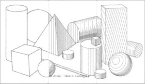
This element is very nearly an extension of line. In the preceding tutorial on Line, Dutch Post-Impressionist Vincent Van Gogh was listed as an artist who incorporated line into his drawings. But sometimes his lines became so thick that they became shapes in and of themselves. Shapes can come in many different categories. The names for different kinds of shapes enable us to describe them and discuss how they interact in an artwork, as well as helping us to choose among them to create a specific impact in a composition. Among the categories of shapes are: geometric, organic, positive, negative, and symbolic.
We learn simple geometric shapes early in life: circle, square, triangle; rectangle. As we grab our first crayons, our attempts to mimic these shapes fall short of being purely geometric and are, instead, organic shapes. We notice symbolic shapes like stars and hearts and decorate our notebooks with them. As we advance through school and learn higher math levels, we are introduced to further geometry: trapezoids, parallelograms, pentagons, hexagons, octagons, dodecagons and the like. We look around our world, and see every imaginable shape, some of which overlap in category, and many of which have no names.
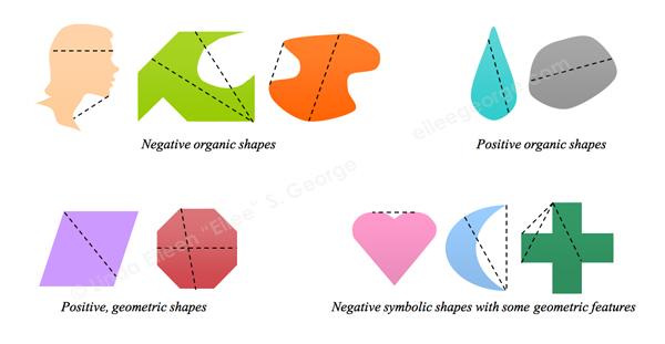
Shapes can also be divided into two alternate main categories: positive shapes and negative shapes. A positive shape is completely convex: in other words, there is no place in the shape where you can draw a straight line from one edge of it to another edge anywhere else on the shape and go outside of the shape. The standard geometric shapes listed above all serve as examples of this. The other type, a negative shape, doesn’t meet that criterion. In a negative shape, there are places that you can draw a straight line from one point on the edge of the shape to another point on another edge of it, and cross outside the borders of its outline – and perhaps even back in. This can happen with the heart shape (along the top) or the outline of a star, a crescent moon, or a cross (between any of the arms). Negative shapes can create interesting energy in the negative space around them that accompanies them, especially when used in repetition. Keep in mind that even though there are places you can draw lines within negative shapes that do not go outside of them, that does not make them positive shapes – the rule is that it’s a negative shape if there is anywhere that you can draw that straight line outside of the shape from edge to edge. Note also that an organic shape can be either positive or negative; a positive shape can be either geometric or organic; and so on. Some shapes may even have both geometric and organic features. Here are examples of positive, negative, organic, geometric, and symbolic shapes:
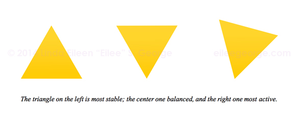
Shapes can have strength and personality of their own. Some are stable and static. Some are more dynamic and flexible. Strong geometric shapes like quadrilaterals (4-sided: squares, rectangles, trapezoids and parallelograms) can be very ordered and formal either alone or in a strict pattern. Circles tend to give out a more playful vibe. But the personality and formality of a shape can also be manipulated and even contradicted by how it is used and placed. Circles on a grid can seem more serious than squares placed randomly at inconsistent tilts. Equilateral triangles “feel” different than right triangles or isosceles triangles. A triangle shown typically with a wide side to the bottom seems very stable; however the same shape positioned to “rest” on one of its points has a feeling of kinetic energy, (it might fall!) We perceive this partially because of our unconscious awareness of gravity and willingness to attribute it to objects in compositions. Organic shapes can have a softer appeal than their straight-laced brethren.
Space – In Theory:
Space is an abstract concept when applied to a two-dimensional surface, but applied correctly, it can make an incredible impact through a convincing illusion.
It can be alluded to through several means: position on the page adhering to principles of linear perspective, simple overlapping, relative sizes of similar objects, and relative color of similar objects via atmospheric perspective. Linear perspective can be constructed as either being 1, 2, or 3-point, or in complex groupings, even more vanishing points can be used.
Any element in an artwork can have these space methods used upon them, to manipulate the mind into perceiving the illusion of space, even on a completely flat work of art.
To further illustrate aspects of conveying space, let’s (repeatedly as we scroll down) borrow an image from the upcoming lesson, while I explain in more detail. You’ll see several pairs or trios of shapes next to each other in different placements.
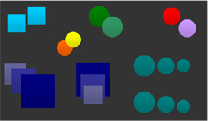 One way that you can suggest that an object is “in front of” another object is merely by the positioning of same-size shapes on the background. When we see one object that seems a little bit “up” from another on the page, our eyes perceive it as being further “back” than the lower one (see the light blue squares on the top left). Think of how we view objects in our environment in relationship to our eye level. Thanks to gravity, many things with which we interact are typically below our eye level, or at least begin there: tree trunks, furniture, items on a tabletop or counter, and so on – we’re looking a little bit down at them. Most of the things we work on with our hands are below eye level because our hands are most comfortable working a foot or two below our eyes – that’s how we’re built, and therefore, generally that’s how we design things that we use, and that ergonomic awareness has led us to certain standard heights for chairs in relationships to tables, and heights of counters, and other common things we use every day. When you stand looking at your kitchen counter and there is an apple closer to the edge and an orange, an inch or three off to one side, back toward the backsplash, your eyes will look downward to the closer object – in this case the apple – because it is below your sight line and closer to you, but because of the tenets of linear perspective, when you look at the orange that is further away, even though it is still below your eye level, your eyes will rotate slightly upward (in relationship to how they angled to view the apple) to view the orange. Obviously, the opposite is true when you look upward – say, at the light fixture in the center of the ceiling in front of you, you will look farther up to view it, yet the far corner of the room where the ceiling meets the wall you will look a little further down to view it – again because of linear perspective – there is an invisible vanishing point all of these things recede to in space, and you’re the center of the universe with your viewpoint (your eyeballs) – that vanishing point in most cases is dependent on where your eyes are; it moves along with you. That’s kind of a sketchy explanation for now, but I will take proper time to teach more about perspective in another lesson. Anyway, we don’t spend a lot of our time looking upward – we mostly are accustomed to looking at things around eye level and below. This is where our pre-conditioned brains kick in with their perceptions of “normal”, and assume that whatever is “up” must be further away. The brain assumes many different things like this, based on common daily perceptions. You can use this predictable behavior of the human brain to help you determine your composition and lead your viewer to view art in certain ways, in the order and manner that you wish.
But let’s say that you bend down and look at that apple and orange with your eye right at the edge of the counter – your perspective (and vanishing point) have shifted with you, and the fruits will not appear to be “above” and “below” each other, but instead, side by side. You need other hints to tell you what is where.
Another way that you can imply objects being closer or further away is by overlapping them. There’s no denying that the yellow circle in the example is “in front of” the orange circle, because it overlaps and blocks our view of part of the orange one. If they were side by side on one level, whichever one overlapped the other would be in front.
A third way to suggest near and far in space is with relative size of regular objects. The trio of blue-green circles in the bottom-right corner of the illustration could depict two different scenarios: first, there could be three balls of different size side-by-side in a row all the same distance from you – sure, that could be true. But it also suggests that you are at eye level with the bottom of these circles, and they are all the same size, but the one you see as “biggest” is closest, and the “little” one is furthest away.
A fourth way to give an illusion of objects in space is to alter color. This is part of a practice in what is called atmospheric perspective, which is a little different from linear perspective, which is what I referred to in previous paragraphs. You’ve likely witnessed atmospheric perspective any time you viewed the outdoors on a foggy morning or a hazy afternoon. It’s more pronounced and noticeable at times like that. A color’s intensity, or saturation, will appear in the distance to fade toward a grayer form of that color. It also might shift to a cooler color (or toward the blue family) from what it appears up close. Now, you know that objects don’t just change color in and of themselves. A red ball is a red ball even in the dark. That’s what is referred to as local color. But if you shine a strong yellow light on the left side of that ball and a strong blue light on the right side, you will see what is called relative color. The left side of the ball will be somewhere in the orange family, depending on how bright that yellow light is, because red and yellow make orange – and on the right side of the ball, the ball’s local color of red will be affected by the blue light and they will mix to create a relative color of purple in this example, because red and blue make purple. You see, many things can “change” the look of colors, and atmospheric perspective is one of those things.
Think about photos you’ve seen with mountains in the background – they look bluish or purplish but not very intense blue or purple – yet when you get actually on a mountain, it’s never those colors – it’s browns and greens and reds and yellows – when you’re far away from them, the color change is due to the light and the stuff in the atmosphere reflecting the blue sky between you and it (and clouding your vision, like in the cases of fog, rain, snow, sleet or hail, smoke, and even pollution or swarms of insects). Lastly, it may get lighter in tint; in other words, go toward white – in daylight. The trio of blue squares at bottom left shows such a color relation. The brighter, darker blue is closest, and the grayer, lighter blue is furthest away. Also notice that because cool colors (blue, green, purple) seem to recede or “go back” in space, this means that warm colors (red, orange, yellow) try to advance “forward” in space as well. Look at the red circle and the lavender one. It’s hard to decide which one is closer, isn’t it? That’s because the red is positioned higher (or, as our minds see, “back”), but it’s warm and wants to advance “forward” – and the cool color lavender looks closer because of its positioning, but further because of its coolness. This creates a push-pull conflict and a tension in the viewer. If you are trying to create tension – to get attention to a particular political message you’re trying to portray for example – using color and space to confuse the mind of the viewer on purpose and make them uncomfortable is one of many ways to convey that sort of feeling in a work, giving it stronger impact, if that’s appropriate to your subject and goal for that work. Of course, if you were trying to create a feeling of peace, then this is not a trick you would use!
Note also that you can combine these different aspects of suggesting space. The blue-green circles at right center employ both size and positioning. The trio of blue squares bottom left utilizes size, positioning, color relation, and overlapping. The two green circles at top center combine overlapping and color relation (lighter colors advance beyond darker ones) – so do the orange and yellow circles – but notice that with that pair, there is a purposeful contradiction of a rule – the positioning is denied by the overlapping: the yellow circle is positioned higher on the page which normally makes us think it’s further away – but, the yellow circle overlaps the orange one, which tells us that it is definitely the closer one. This is where our brains step in once again and reason that the yellow circle must be “floating” above the surface that the orange circle rests on (this could be further proven in a lighter background using shadows). This is another way to manipulate the mind of the viewer, if that’s what you want to do – some artists make that a goal: Surrealists play both with and against perspective and placement, along with many other things, challenging our concepts of reality, making us think and engage more with the art piece long enough to start to analyze its symbolic meaning – it makes the art more interactive and interesting.
Another illustration of how you can have one rule contradicting another is the three blue squares in the bottom center. Here, because of overlapping, you will see the biggest and most intense square in the back, and the smallest and dullest square in the front. Overlapping is the strongest, most dominant rule in depicting object order; it trumps all the others and your brain has been conditioned to know that. Therefore, the brain will decide that these are simply the local colors of objects and they’re not in too much atmosphere, and it is an inherently small square in front of a medium square in front of a large square – the brain will just “know” that they aren’t same-size, same-color squares in space, but rather squares that are already different sizes – just placed differently.
Remember that a lot of these rules are based on assumptions: you’re walking about upright (not standing on your head), and you’re viewing the world in noontime daylight, and basically a lot of other “norms”. But there are exceptions to most rules. If you were drawing a landscape at twilight, atmospheric perspective might actually have things get darker as they go away from you rather than lighter – depending on where the sun set, and things like that. Rules have exceptions, and exceptions are interesting. Observe your world carefully in its different conditions, and you will notice patterns and new “rules” in each of the less typical times and circumstances.
Shape and Space – in Practice:
Today’s exercise will require some variety of colored papers (construction paper, clippings from old magazines or whatever as long as it’s preferably a wide variety of bright and dull solid colors), scissors, a glue stick, a ruler, some coins of different denominations, and a piece of black paper for the background. We’re going to play around with shape, and with it some scale, color, and linear and atmospheric space. If you’re lucky enough to have a program with simple graphics capability to help you do this on the computer, you could do that instead. You could mimic the following example in Word if you wanted.
Now first of all, you don’t have to copy what I’ve done verbatim. The point of this exercise is that you notice several relationships at work that convey a sense of space with these shapes. Leave one big piece of black paper untouched; it will be your background (or draw that background first, if you’re using a computer). Cut out/draw lots of squares and circles in various sizes (but well less than 1/4 the size of your paper) by either tracing around square or circular objects of different sizes, or by measuring and drawing them with a ruler, compass, and pencil, if you’re comfortable with that (or with your mouse…I’ll word the rest of this post as if you’re doing it old school, so adapt as you must). Cut some in both bright and dull versions of the same color in the same and different sizes too, if you can. Start putting them on the background, and push them around in relationship to each other, and watch what they start suggesting about where these shapes are in the space of a composition. Remember what we’ve already discussed about space as you do.
Play around with your shapes, and if you like, you can glue them down to your background in a way that shows different methods of demonstrating space – or you can try them on a different color background and see how that looks, or store them to play with another day.
Today we covered rather shallow depictions of Space. Later we will get into more detail about Space when I do a detailed lesson on Linear and Atmospheric Perspective, which we only just touched on in this lesson. There is much more to know!
When you can arrange simpler shapes with sizes and colors and alignments that suggest a sense of space, then you can graduate to more complicated objects in your compositions. You can do it collage-style, like this lessons suggests, or apply it while you paint or draw. A good way to figure out how to do this is to look at how other artists have done it. Accept any opportunity to go and observe art at museums, galleries, and any other venues that you learn of.
Shape in Cyberspace and in Master Works:

Some artists who worked well with shape include Paul Gauguin, Gustav Klimt, Georges Braque, Henri Matisse, Pablo Picasso, Joan Miró, Wassily Kandinsky, and Clifford Still.

If you have any questions about anything in these lessons, please feel free to contact me via my Contact Form, and be sure to put the words “Lesson Question” in the Subject line! I run several sites and projects, so I will answer as soon as I can. Thanks!
– Eilee
P.S. The next art lesson is Elements of Design: Form, Texture and Pattern.
Master painting images courtesy of the old Ookaboo.com
All other content on this site © 2013-2020/present L. Eilee S. George; all rights reserved.


 Location:
  I’m Eilee George, and I like to write anecdotal and how-to blog posts in several creative areas. A lot of my art lesson posts are collected under the Art menu heading above, but you can find them here, too, along with a lot of other topics. I am a strong believer that ANYONE can draw if they want to learn – it’s a set of skills and principles like anything else. As a prolific writer (although not always online), I prefer to use an unstructured, informal sort of prose as my writing style; thus I chose “prose” over the word “blog” in the menu tab title…but it is essentially a blog. On my own time, I write short stories, essays and lots of poetry and songs. Here, I try to categorize topics by media. The following table of contents will, for now, serve only as a teaser as to what you may be able to look forward to reading later on, if you’re continuing in your creative quest and if I find more time to write; some things may change. If you see a link I’ve already posted it. I’ll throw other unplanned entries in as special events occur. If the presentation gets confusing, shoot me an email